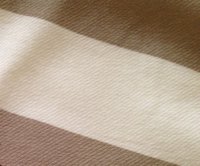
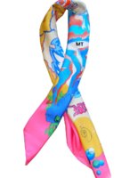
Someone asked this question in the authentication thread, thought I would answer here instead. Yes the beige Aube is kinda muddy looking - the monochrome cw does not make the design pop, whereas a contrasty cw - purple & orange really makes you see the design. I love Aube but sold the purple / orange cw & kept the beige for the following reasons
The design is kinda kooky - what is it with all those new age crystals and planets ??? a graphic design, a very young design - too young ? to me the design + multi color contrasty cw was just too comic book
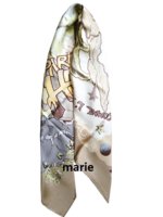
but the dishwatery beige cw downplays the kooky design just the right amount - just can see all the details - crystals etc, but they dont leap out and scream at you , very interesting design to stare at
So, if you love, love , love Peagas Pop & Minuit au Fbg - other comic book designs, then the bright cw is better, but if you want to down play the kookiness, go for a monochrome cw
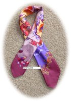
That said, I kept my other contrasty cw of Aube - grape & turq