Reference: Guide to Hermes Scarves

TPF may earn a commission from merchant affiliate
links, including eBay, Amazon, and others

I hope it is okay to ask this question at this thread. I had asked earlier in the mousseline clubhouse but wanted to see perhaps @marietouchet can offer more of your knowledge on certain format availability for vintage design since I was not sure where this information can be found. I tried googling and did not come across anything.

Do you happen to know if Neige D'Antan design comes in the 90 mousseline format? I have only seen one member posted a picture of this design in the 45 mousseline format that was purchased from the bay. Thank you in advance.

I do not have any info one way or the other whether NdA came in 90cm mousse
 
Here's my take on this because there are a number of scarves lately with this "kind" of look. I think they are meant to look like prints of hand painted works. For example, in the upcoming season and also last season there were several "colorbock" styled scarves. Speaking as an artist, my feeling is that the human eye and brain "bond" (for lack a better term this early in the am) with a slightly looser "hand made" rendition or quality of an object, rather than if the same thing had been designed with perfect computer accuracy and straightness. At least, that's my feeling when I look at them. So for example, Centered Rhyme does nothing for me personally (too straight and angular though it may tie well, haven't looked), but I love my Mediterranee mousse with its abstract waves.
This is an interesting topic to me.. I totally see why one can like the artisanal look scarves and be left cold by those with perfect lines
But, that is not what is bothering me about JUMPING, it took a lot of soul searching to be able to express my issue in somewhat adequate words. I am confused by the design - it does not speak to me in one voice . I dont know if it is trying to be - I get mixed messages
It is simultaneously a combo of artisanal, geometric, an homage to the 1950s printing techniques (broken lines) with a soupçon of possible manufacturing defect in the mix (full disclosure - Louise Nevelson does not speak to me either... LOL). Maybe I just prefer designs with a clearer message, the ambiguity is difficult for me. Too much going on? I am kind of like hearing noise... Very odd reaction to this design
 
  • Like
Reactions: bunnycat
This is an interesting topic to me.. I totally see why one can like the artisanal look scarves and be left cold by those with perfect lines
But, that is not what is bothering me about JUMPING, it took a lot of soul searching to be able to express my issue in somewhat adequate words. I am confused by the design - it does not speak to me in one voice . I dont know if it is trying to be - I get mixed messages
It is simultaneously a combo of artisanal, geometric, an homage to the 1950s printing techniques (broken lines) with a soupçon of possible manufacturing defect in the mix (full disclosure - Louise Nevelson does not speak to me either... LOL). Maybe I just prefer designs with a clearer message, the ambiguity is difficult for me. Too much going on? I am kind of like hearing noise... Very odd reaction to this design
And @bunnycat LOL you are mixing metaphors with your love of a Mousse Med -! it is not fair (LOL) to put mousse into the mix - you get a 3D effect with mousse (see through thing) that calls for certain designs more than others. Onde de Chic is superb in mousse
But this JUMPING is in vintage silk - kinda thicker and not see-through at all
 
Last edited:
  • Like
Reactions: bunnycat
This is an interesting topic to me.. I totally see why one can like the artisanal look scarves and be left cold by those with perfect lines
But, that is not what is bothering me about JUMPING, it took a lot of soul searching to be able to express my issue in somewhat adequate words. I am confused by the design - it does not speak to me in one voice . I dont know if it is trying to be - I get mixed messages
It is simultaneously a combo of artisanal, geometric, an homage to the 1950s printing techniques (broken lines) with a soupçon of possible manufacturing defect in the mix (full disclosure - Louise Nevelson does not speak to me either... LOL). Maybe I just prefer designs with a clearer message, the ambiguity is difficult for me. Too much going on? I am kind of like hearing noise... Very odd reaction to this design

I do know what you mean. It doesn't particularly call to me either, execpt to remind me a little of Piet Mondrian mixed with something else...

Strangely, I get the same way with modern art works/installations and so forth. It's only when I actually read more about what the artist was thinking that I tend to become more intrigued by the work (The big 24 hour clock installation in Dallas was like this for me. Once I read the whole piece on it it was fascinating, but just at first glance, not so much....)

bainsclock.jpg

Then again, I am this way with very busy work too. So, I love Alice Shirley, but Nigel Peake...doesn't really call to me so far.....

And @bunnycat LOL you are mixing metaphors with your love of a Mousse Med -! it is not fair (LOL) to put mousse into the mix - you get a 3D effect with mousse (see through thing) that calls for certain designs more than others. Onde de Chic is superb in mousse
But this JUMPING is in vintage silk - kinda thicker and not see-through at all

:lol: sorry 'bout that!
 
  • Like
Reactions: ninakt
For @momasaurus
Speaking of BdG en finesse , I think it was
Start with a photo of BDG en finesse - it has maybe 10 colors (?) and is rendered asa bunch of lines (line drawing, sorry, I lack the nice artistic term). The line drawings are kind of a signature of Florence Manlik. But, this is not a TRUE finesse rendering - despite the title , cf infra
In truth it is a FAUX FINESSE scarf (my term)
 

Attachments

  • 002628S07 Turq CH Beige  (6).jpg
    002628S07 Turq CH Beige (6).jpg
    433.7 KB · Views: 146
Last edited:
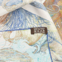
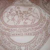
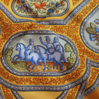
Here is a REAL FINESSE scarf - from the finesse collection ca 1999 - Qalamdan - EXACTLY two colors, field & line drawing. Compare to the full color version. - there are areas of color separated by black lines - like stained glass.
The real finesse scarf is made by taking silk with a colored field ( COLOR 1) and overprinting only the black lines (COLOR 2)
Here the finesse is rendered as beige on beige.
So, there is in essence only 1 screen for finesse - with the line drawing
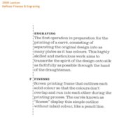
Hermes did a lexicon - which is so badly garbled , and self-contradictory and one of the myriad of interpretations is the two color rendering - but BDG en finesse is not FINESSE style per the lexicon it vaguely refers to the 2 color rendering style of 1999
In any case, QALAMDAN is a real finesse scarf
 

Attachments

  • F1 Beige Field Brown Ink 1.JPG
    F1 Beige Field Brown Ink 1.JPG
    68.8 KB · Views: 146
  • Gold  (4).jpg
    Gold (4).jpg
    1.1 MB · Views: 147
  • 2008 Lexicon FINESSE (8).jpg
    2008 Lexicon FINESSE (8).jpg
    139.7 KB · Views: 152
Last edited:
Here is a REAL FINESSE scarf - from the finesse collection ca 1999 - Qalamdan - EXACTLY two colors, field & line drawing. Compare to the full color version. - there are areas of color separated by black lines - like stained glass.
The real finesse scarf is made by taking silk with a colored field ( COLOR 1) and overprinting only the black lines (COLOR 2)
Here the finesse is rendered as beige on beige.
So, there is in essence only 1 screen for finesse - with the line drawing
Hermes did a lexicon - which is so badly garbled , and self-contradictory and one of the myriad of interpretations is the two color rendering
In any case, QALAMDAN is a real finesse scarf
So, around 1999 began a vogue for 2 color scarves , and then came a vogue for 5 colors or less
 
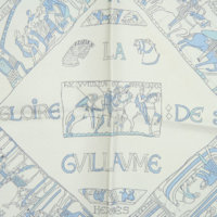
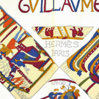
Guillaume was early 2000s in this rendering - it is just a few screens - not the full color rendering, but more than just a QALAMDAN-style line drawing
People called this a finesse rendering at the time, but it is not a real finesse scarf - it a version with a reduced number of screens / colors, the blue blobs of colors are not in hte finesse version of QALAMDAN
Well, what do you call theat ? H never had a term for it, for the word finesse stuck (incorrectly). Finesse is a nice sounding term whereas I would call it a simplified/reduced rendering - cheaper to produce.
So, any way, the term finesse has stuck over the years and now means a line drawing redending in a limited palette. Everything Manlik does is a finesse rendering (per the new definition) and nothing for Honore is finesse style.
Coloriage is yet another finesse-like rendering - kind of a half finesse version - part of the design has not been colored, the rest has not been colored
 

Attachments

  • Wht Lt blue  (6).jpg
    Wht Lt blue (6).jpg
    174.2 KB · Views: 140
  • Navy 4.jpg
    Navy 4.jpg
    380.4 KB · Views: 138
Finally, if you are still confused by the term finesse - dont worry you re not alone. It is a French thing - the imprecise/ varying use of terminology. If you are a French history buff, you may understand the allusion . It is like the term Maison du Roi (under the Bourbons ca Louis XIV) - there was no standard definition of the myriads in the king's household (at any one time). It changed all the time. Some historians like to enumerate the palace personnel, but every list is inexact/incorrect to some extent
Same for Hermes - we all have lists of dubious accuracy...
Finesse was one thing ca 1999 (QALAMDAN) but is different today. ANd it is not as if the glossary/lexicon explains the evolution.
It finally came to me, a less esoteric analogy - a 90cm carre has often not been exactly 90 cm in dimensions over the years, close but no cigar, but we all call them 90s
 
Last edited:
Finally, if you are still confused by the term finesse - dont worry you re not alone. It is a French thing - the imprecise/ varying use of terminology. If you are a French history buff, you may understand the allusion . It is like the term Maison du Roi (under the Bourbons ca Louis XIV) - there was no standard definition of the myriads in the king's household (at any one time). It changed all the time. Some historians like to enumerate the palace personnel, but every list is inexact/incorrect to some extent
Same for Hermes - we all have lists of dubious accuracy...
Finesse was one thing ca 1999 (QALAMDAN) but is different today. ANd it is not as if the glossary/lexicon explains the evolution.
It finally came to me, a less esoteric analog - a 90cm carre has often not been exactly 90cm in dimensions over the years, close but no cigar.

Wonderfully informative! Thank you!
 
  • Like
Reactions: Cookiefiend
Finally, if you are still confused by the term finesse - dont worry you re not alone. It is a French thing - the imprecise/ varying use of terminology. If you are a French history buff, you may understand the allusion . It is like the term Maison du Roi (under the Bourbons ca Louis XIV) - there was no standard definition of the myriads in the king's household (at any one time). It changed all the time. Some historians like to enumerate the palace personnel, but every list is inexact/incorrect to some extent
Same for Hermes - we all have lists of dubious accuracy...
Finesse was one thing ca 1999 (QALAMDAN) but is different today. ANd it is not as if the glossary/lexicon explains the evolution.
It finally came to me, a less esoteric analogy - a 90cm carre has often not been exactly 90 cm in dimensions over the years, close but no cigar, but we all call them 90s
This is funny considering the French were early adapters of the dictionary, and invented academies to regulate language, music, dance, etc. I suppose this pretense of exactitude is why no one would ever buy a French car, LOL.
 
  • Like
Reactions: BBC and Cookiefiend
Top