You are spot on !This is funny considering the French were early adapters of the dictionary, and invented academies to regulate language, music, dance, etc. I suppose this pretense of exactitude is why no one would ever buy a French car, LOL.
You are using an out of date browser. It may not display this or other websites correctly.
You should upgrade or use an alternative browser.
You should upgrade or use an alternative browser.
Reference: Guide to Hermes Scarves
- Thread starter jag
- Start date
TPF may earn a commission from merchant affiliate
links, including eBay, Amazon, and others
More options
Who Replied?
Too funny ... just googled for first dictionary - Diderot does not get the credit - but I was taught at the lycée to think he didThis is funny considering the French were early adapters of the dictionary, and invented academies to regulate language, music, dance, etc. I suppose this pretense of exactitude is why no one would ever buy a French car, LOL.
https://www.google.com/search?q=wor.....69i57j0l5.4464j0j4&sourceid=chrome&ie=UTF-8
This reference counts only the first dictionary in English which is well before Diderot, I bet there was one in Chinese or Sumerian even earlier ...
Yes, but -- as you said (and were taught) WHO GETS THE CREDIT? Lol.Too funny ... just googled for first dictionary - Diderot does not get the credit - but I was taught at the lycée to think he did
https://www.google.com/search?q=wor.....69i57j0l5.4464j0j4&sourceid=chrome&ie=UTF-8
This reference counts only the first dictionary in English which is well before Diderot, I bet there was one in Chinese or Sumerian even earlier ...
Ok back to finesse: here is my Libres comme l’air: 

And because you said it would look weird backward I accepted the challenge. I’m in a hurry, but I think I could make this work!

And here is my men’s C’est la fete 45:

I love these nerdy conversations. Thanks for sharing your expertise, MT
And because you said it would look weird backward I accepted the challenge. I’m in a hurry, but I think I could make this work!
And here is my men’s C’est la fete 45:
I love these nerdy conversations. Thanks for sharing your expertise, MT
I think this is one of the most interesting threads of all 
I just wish - there was some question for which there is a simple, straightforward, one sentence answer. There never is in the world of Hermes.Thank you - was worried I was droning on
Hermes answers are never short and always controversial - cf my unbridled praise (not!) for the Hermes lexicon. The orange gods give us a glossary and here I am picking it apart - ingrate that I am lol
Last edited:
The LIBRES is an honest to good dyed-in-the-wool finesse with the staple contrast hem. The C est La Fete is a modern riff on the classic finesse leitmotif. 1999 Finesses cf LIBRES never had wide borders but CLF has only 2 colors so, I give it a pass.Ok back to finesse: here is my Libres comme l’air: View attachment 4062638View attachment 4062639
And because you said it would look weird backward I accepted the challenge. I’m in a hurry, but I think I could make this work!
View attachment 4062641
And here is my men’s C’est la fete 45:
View attachment 4062642
I love these nerdy conversations. Thanks for sharing your expertise, MT
I think this is one of the most interesting threads of all
I agree!
I think they are even marketing the C'est la Fete as reversible. (menswear - so easy!) I have worn it both ways.The LIBRES is an honest to good dyed-in-the-wool finesse with the staple contrast hem. The C est La Fete is a modern riff on the classic finesse leitmotif. 1999 Finesses cf LIBRES never had wide borders but CLF has only 2 colors so, I give it a pass.
The only one that I could find on the site is the cotton one - not your VS70 oneI think they are even marketing the C'est la Fete as reversible. (menswear - so easy!) I have worn it both ways.
https://www.hermes.com/us/en/product/c-est-la-fete-handkerchief-H172009Gv01/
I dont really know of any other finesse VS70s (I am sure there are some...) nor do I have the relevant mens catalog but I dont doubt that some SA tried that and found it to be a good selling point
I did look at my two real 90cm finesse scarves - botha re Cavalcade de Mai - and the design shows on the back on both, not fainter than on the front
Moma it is interesting, how well it works with the reverse side. Gorgeous!Ok back to finesse: here is my Libres comme l’air: View attachment 4062638View attachment 4062639
And because you said it would look weird backward I accepted the challenge. I’m in a hurry, but I think I could make this work!
View attachment 4062641
And here is my men’s C’est la fete 45:
View attachment 4062642
I love these nerdy conversations. Thanks for sharing your expertise, MT
For @momasaurus
Speaking of BdG en finesse , I think it was
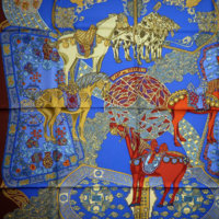
Start with a photo of BDG en finesse - it has maybe 10 colors (?) and is rendered asa bunch of lines (line drawing, sorry, I lack the nice artistic term). The line drawings are kind of a signature of Florence Manlik. But, this is not a TRUE finesse rendering - despite the title , cf infra
In truth it is a FAUX FINESSE scarf (my term)
Here is a REAL FINESSE scarf - from the finesse collection ca 1999 - Qalamdan - EXACTLY two colors, field & line drawing. Compare to the full color version. - there are areas of color separated by black lines - like stained glass.
The real finesse scarf is made by taking silk with a colored field ( COLOR 1) and overprinting only the black lines (COLOR 2)
Here the finesse is rendered as beige on beige.
So, there is in essence only 1 screen for finesse - with the line drawing
Hermes did a lexicon - which is so badly garbled , and self-contradictory and one of the myriad of interpretations is the two color rendering - but BDG en finesse is not FINESSE style per the lexicon it vaguely refers to the 2 color rendering style of 1999
In any case, QALAMDAN is a real finesse scarf
Such interesting info! Thank you mt! I know in silk painting (painting directly on to the fabric not silk screening), the outlining is called a resist (colored or not) and is done with a thick substance called gutta (which can be made of various things) and for the same reason- to keep the colors from bleeding in to one another. Does it have a different name in silk screening? I wonder if when they ink the outline screen for it, the outline screen for the scarf uses a different ink (thicker like gutta) like direct on to the silk method would? When resist outlines are made, the silk is washed after everything is painted and the resist compound itself washes away (except for the ink in it if there was any).
I think they are even marketing the C'est la Fete as reversible. (menswear - so easy!) I have worn it both ways.
I'd never even thought of doing that to it!
Moma it is interesting, how well it works with the reverse side. Gorgeous!
Sometimes I like being contrary....I'd never even thought of doing that to it!
Hermes calls the outline screen the finesse screen. Is it printed with a different ink ? Maybe It is used to isolate regions of different colors - that might bleed unattractively if they touched. So, the black line allowed the colors to bleed onto black. The finesse ink does not wash out in the process. Obviously, now sometimes the Finesse screen is not black , gray is popularSuch interesting info! Thank you mt! I know in silk painting (painting directly on to the fabric not silk screening), the outlining is called a resist (colored or not) and is done with a thick substance called gutta (which can be made of various things) and for the same reason- to keep the colors from bleeding in to one another. Does it have a different name in silk screening? I wonder if when they ink the outline screen for it, the outline screen for the scarf uses a different ink (thicker like gutta) like direct on to the silk method would? When resist outlines are made, the silk is washed after everything is painted and the resist compound itself washes away (except for the ink in it if there was any).
I'd never even thought of doing that to it!
But a finesse screen isnt what it used to be. The signature and copyright used to be on the finesse screen - that is no longer the case, and they (definitely) get special inks & screens and few artists really use a finesse screen, at least not to great advantage. Faivre was a genius at milking the finesse screen - an oldie Art des Steppes ca 1991. The whole design is on the finesse screen - every color is separated.
Compare to the recent Honore - PdS. The outlines dont define the design as much - a lot of shading. So, 30 years later the finesse screen does a lot less. And for amusement I tossed in a photo of the Red PdS in CS.
And PdS is indeed screened, I cannot say that for certain of many of the modern ones
Attachments
Last edited:
Register on TPF! This sidebar then disappears and there are less ads!