OK ladies and gentlemen....We have a serious issue to discuss. It’s not an easy topic to talk about. I don’t want to hurt anyone’s feelings. But I’m going to speak my truth. I’m afraid I’m going to be really unpopular after this post.
It’s about scarves that age us.

The following opinions are just my own ok? You can completely disagree. And that’s ok. I’m just going to give you my observations.
First...format. The most aging format is the 90cm IMO. The least aging is a cashmere 140cm. Unfortunately, it’s also the most expensive. Ugh. 140cm mousselines can also be quite aging. For mouseelines, I think it depends a lot on the design scale and color. In general, 70cm and 45cm scarves help the wearer appear youthful . 140cm giant silks, can go both ways.
Second...the scale of the design. Prints with tiny little flowers and leaves IMO are very aging. I really don’t know why but this is how I feel about Jardin de Sintra just like @frou frou mentioned. In fact, any scarf that has the word Jardin in the title makes warning bells go off in my head. It was on my “buy” list and I really loved the neutral cw that it came in but when I tried it on, I thought it made me look......well.....old. in general scarves with tiny little prints conjure up “granny material” to me. Designs that are mid-large scale appear the most youthful to me. Especially designs that have a modern or abstract quality to them.
Third - color. Any scarves that have a lot of gold in them are going to make us look matronly IMO. Scarves that are light pastel all over also fall into this category. If the scarf is going to have pastels, I think it helps if it has some bolder or more saturated colors somewhere in the scarf. Neutrals are also somewhat dangerous if they are really light. Especially tan, brown, grey colors. And scarves with white backgrounds are just dangerous period.
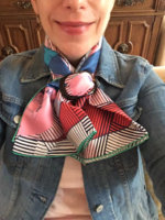
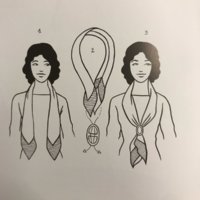
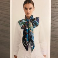
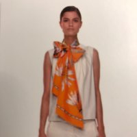
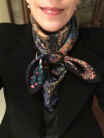
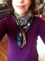
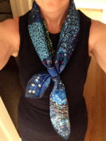
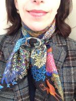
Fourth - your scarf knot. Wtih a 90cm, if you do the typical bias fold secured with a scarf ring in front, be careful. IMO, I think this is the most aging knot because it doesn’t look casual (to my eye). It sometimes looks too proper to me. I think the most youthful knots look a little sloppy and drapey. I think it also helps if the scarf tails are a bit askew and not hanging totally symmetrical. But there is a fine line between “drapey” and “messy” so you gotta be careful.
OK, this scarf business is tough. Sometimes it’s not pretty. And sometimes we make costly mistakes. If you feel you own a scarf that ages you...don’t give up on it right away. Try different knots to help give it a youthful vibe. But in the end...if it doesn’t work for you...Catch n’ Release!
OK, dont’ hate me everyone!! And please chime in if you agree or disagree. I’d love to hear everyone’s opinions about this subject.
It’s about scarves that age us.


The following opinions are just my own ok? You can completely disagree. And that’s ok. I’m just going to give you my observations.
First...format. The most aging format is the 90cm IMO. The least aging is a cashmere 140cm. Unfortunately, it’s also the most expensive. Ugh. 140cm mousselines can also be quite aging. For mouseelines, I think it depends a lot on the design scale and color. In general, 70cm and 45cm scarves help the wearer appear youthful . 140cm giant silks, can go both ways.
Second...the scale of the design. Prints with tiny little flowers and leaves IMO are very aging. I really don’t know why but this is how I feel about Jardin de Sintra just like @frou frou mentioned. In fact, any scarf that has the word Jardin in the title makes warning bells go off in my head. It was on my “buy” list and I really loved the neutral cw that it came in but when I tried it on, I thought it made me look......well.....old. in general scarves with tiny little prints conjure up “granny material” to me. Designs that are mid-large scale appear the most youthful to me. Especially designs that have a modern or abstract quality to them.
Third - color. Any scarves that have a lot of gold in them are going to make us look matronly IMO. Scarves that are light pastel all over also fall into this category. If the scarf is going to have pastels, I think it helps if it has some bolder or more saturated colors somewhere in the scarf. Neutrals are also somewhat dangerous if they are really light. Especially tan, brown, grey colors. And scarves with white backgrounds are just dangerous period.
Fourth - your scarf knot. Wtih a 90cm, if you do the typical bias fold secured with a scarf ring in front, be careful. IMO, I think this is the most aging knot because it doesn’t look casual (to my eye). It sometimes looks too proper to me. I think the most youthful knots look a little sloppy and drapey. I think it also helps if the scarf tails are a bit askew and not hanging totally symmetrical. But there is a fine line between “drapey” and “messy” so you gotta be careful.
OK, this scarf business is tough. Sometimes it’s not pretty. And sometimes we make costly mistakes. If you feel you own a scarf that ages you...don’t give up on it right away. Try different knots to help give it a youthful vibe. But in the end...if it doesn’t work for you...Catch n’ Release!
OK, dont’ hate me everyone!! And please chime in if you agree or disagree. I’d love to hear everyone’s opinions about this subject.

