These threads are archived as part of our reference library, therefore please only post scarves on this thread from the season in the title. If you are not sure, please do a search or ask in the ID this scarf thread before you post. 

TPF may earn a commission from merchant affiliate
links, including eBay, Amazon, and others

Thanks dear, Yodaling already posted all the CWs of Équateur on page 44 and 67. When unsure if something already has been posted, the easiest way to find out is just do a search on this thread.
Hope a tPFer grabbed these so we can see some IRL pics.
Thank you! I did try to search but maybe it wasn't thread specific? Or maybe I didn't look far enough back, both are completely possible. Either way, thank you for being kind in your reply and letting me know
Thank you so much! And I was already following you! Yes!!!My handle is tina0913_ (I know, I really should change that...)
So far I’ve bought cw2; I was choosing between cw1 and 2, and somehow the SA convinced me the red/blue cw2 would be more “winter appropriate” and easier to wear
It IS gorgeous, and I’ve already worn it several times, but cw1 is still very tempting. Good thing the season has barely begun.
Hopefully cw 9 will appear online soon - it looks quite promising (as does 5 and 8!).
I already follow you and IG and always enjoy the knowledge and passion you pour into your posts!
OMG this is breathtaking!Saw the Pegase at Madison a few days ago and it was gorgeous.


Thank you so much for this!(Updated list)
SS 2019 scarves
Women’s:
90cm silk
*A l’Ombre des Pivoines (Octave Marsal and Theo de Gueltzl) H003278S
*Kawa Ora (Te Rangitu Netana) H003274S
*Zouaves et Dragons (Virginie Jamin) H003280S
*L’Esprit de la Forêt (Alice Shirley) H003226S
*Animapolis (Jan Bajtlik) H003275S
*L’Art du Sarasa (Aline Honoré) H003273S
*Harnais de Timon (Florence Manlik) H003279S
*Les Nouveaux Amoureux de Paris (Pierre Marie) H003329S
*Double Sangle (Joachim Metz/Virginie Jamin) H003338S
*Brides de Gala Finesse (Hugo Grygkar)H011266S
*Perspective (A.M. Cassandre) H001570S
*Le Rêve de Gloria (Gloria Petyarre) H003378S
*Duels Oniriques (Pierre Marie) H003328S
*Bouclerie Moderne (Françoise de la Perrière) H583351S
*Brides de Gala Love (Hugo Grygkar) H003132SC 15
90cm wash silks
*Washington’s Carriage Détail (Cathy Latham) H073340S
*Equateur (Robert Dallet) H071798S
*Pierres et Cristaux (Claudia Stuhlhofer-Mayer) H073232S
CSGM (140cm cashmere/silk)
*Zouaves et Dragons (Virginie Jamin) H243280S
*L’Art du Bojagi (Aline Honoré) H243205S
*Cheval à la Couverture H243345S
*Jungle Love Tattoo (Robert Dallet) H243352S
*Faubourg Rainbow (Dimitri Rybaltchenko) H243331S
*Paisley from Paisley H243346S
*Les Cabanes (François Houtin) H242985S
*Double Encadre H213384S
140cm silk
*Sieste au Paradis (Aline Honoré) H243280S
*Sea, Surf & Fun (Filipe Jardim) H433161S
*Robe du Soir POP (Florence Manlik) H433161S
*Harnais Français en Séquences H433347S
*Larubizànà - Le Bouclier de la Beauté (Sefedin Kwumi) H432936S
*Clic-Clac à Pois (Julie Abadie) H432676S
Gavroche (45cm silk)
*Cheval à la Couverture H893345S
*Faubourg Rainbow (Dimitri Rybaltchenko) H893331S
*Paisley from Paisley detail H893353S
*Brandebourgs (Cathy Latham) H891569S
*Sangles (Joachim Metz) H891730S
Bandana (55cm silk)
*Les Léopards (Christiane Vauzelles) H043350S
*Bouclerie Moderne (Françoise de la Perrière) H043351S
*Silk Up (Liz Stirling) H043332S
*Coaching (Julie Abadie) H033147S
Bandana silk mousseline (55cm)
*Ex-Libris (Hugo Grygkar) H032877S
70cm silk
*Les Coupés, jacquard (Françoise de la Perrière) H973341S
*Mythiques Phoenix, jacquard (Laurence Bourthoumieux) H973342S
*Quadrige, jacquard (Pierre Péron) H973387S
*Dots H983383S
140cm silk mousseline
*Brides de Gala (Hugo Grygkar) H343153S
180cm silk mousseline
*(Bi-colour dégradé) H279980S
Stole silk mousseline
*(Bi-colour dégradé) H519980S
Triangle Géant (silk)
*Kachinas (Kermit Oliver) H571823S
*Quadrige Bayadère (Pierre Péron) H573349S
*Bouclerie Moderne (Françoise de la Perrière) H573106S
Twilly (5x86cm silk)
*Les Léopards (Christiane Vauzelles) H063350S
*Quadrige (Pierre Péron) H063349S
*Le Jardin de la Maharani (Annie Faivre) H063070S
*Tree of Song (Ardmore Artists) H063224S
*Maillons (Cathy Latham) H063357S
*Camails (Françoise de la Perrière) H063358S
*Jeu de Soie (Gianpaolo Bagni) H063229S
Twillons (3x193cm silk)
*Double Sangle (Joachim Metz/Virginie Jamin) H053338S
*L’Art du Sarasa (Aline Honoré) H053273S
*Les Nouveaux Amoureux de Paris (Pierre Marie) H053329S
*Coaching (Julie Abadie) H053147S
*Animapolis (Jan Bajtlik) H053275S
Maxi-twilly Cut (20x160cm silk)
*Équateur (Robert Dallet) H093356S
*Passementerie (Marie-Françoise Héron) H093355S
*Camails (Françoise de la Perrière) H093354S
Losanges medium model (48x114cm)
Silk:
*Arrow
Cashmere/silk:
*Couvertures Nouvelles H473211S
*Chasse aux Pois (Michel Duchène) H473249S
*Ex-Libris (Hugo Grygkar) H471063S
Mousseline:
*Alphapois H613290S
Losange mousseline large model
*H629847S
Pointu (silk)
*H883367S
Exceptionals
*Cache-Cache Fleuri Verni (Pierre Marie), CSGM, H713367S
*(Red mousseline with beaded and embroidered hearts) H943380S 02
*Dream, 70cm, embroidered jacquard, H593390S
*Mediterranée, 120cm silk/lambskin, H832185S 02
*Della Cavalleria Gold (Virginie Jamin), beaded and embroidered, silk, 90cm, H593370S 02
*Jungle Love Rainbow (Robert Dallet), beaded, silk, 90cm, H593369S 01
*Pégase au Bloc (Christian Renonciat), beaded, silk, 140cm, H713368S 09
Men’s:
*Maharani (Annie Faivre), 100cm cotton/silk, H103399T
*Tête-à-Tête Equestre (Anne-Margot Ramstein), 100cm cashmere/silk H103398T
*Chevaux en Camouflage (Benoit-Pierre Emery), losange cashmere/silk, H433396T
*Rêve de Mécanique Élémentaire (Vincent Leroy), 65cm cotton, H283392T
*Disc-Jockey (Anamorphée), 100cm cashmere/silk, H103051T
*Tinos (Anamorphée), 63x180cm cashmere/silk, H703204T
*Caducée Rock (Daiske Nomura)
*Summer Party, 63x180cm cashmere/silk
*Rallye, losange
*”scary dinosaurs” (Jan Bajtlik)
(Updated list)
Twillons (3x193cm silk)
*L’Art du Sarasa (Aline Honoré) H053273S
*Animapolis (Jan Bajtlik) H053275S
Thank you, @eliwon! I was wandering around Pin interest and someone had a irresistible collection of butterfly pix which popped up. It is clear that butterflies are in the air!So beautiful, and a lovely bridge over to the next season and a particular scarf I’m still contemplating
It's always been my theory that the French heritage of Canada consciously or unconsciously influences how H's supply chain is managed.Ok, I admit it - patience is definitely not one of my virtues! I keep looking at the French and Canada H websites and see some of the SS19 scarves I hope to order, but very little on the US site as yet. Is there any rhyme or reason as to how a season typically rolls out?

Unfortunately French heritage has no impact on Hermes prices in CanadaIt's always been my theory that the French heritage of Canada consciously or unconsciously influences how H's supply chain is managed.


Have we seen pictures of these yet? I was playing with the twillons the other day and I really like them, but the designs I saw didn’t really work for me.

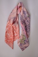
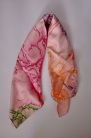
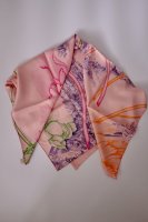
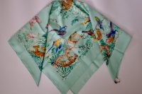
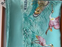
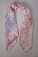
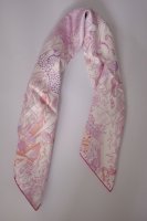
I nabbed a few scarves off the European site before the holidays to beat the price increase. I've only just picked them up yesterday since I was away during the break. In the meantime, I'd had a chance to try on a few colorways of Peonies while out of town, and was convinced that I'd be sending back the one I ordered. Much as I loved the idea of it, the colorways I was trying on let the mystical cityscape fade into the background, leaving the peony petals looking a bit too literal for my tastes. I LOVE peonies, and think flower petals look fantastic with some people's style, but garland-of-petals just doesn't work with what I'm wearing these days.
So I was shocked and very pleased to find that colorway 04 of Pivoines reads very differently on me than the others have! The dreamy and mysterious fantasy city is rendered in a purpley blue and jumps off the pale peachy-rose background. The flower parts are actually neon, which gives them a wonderful eccentricity that's as far from photo-real as can be, but the neon is tempered by the softness of the background. If you've been trying on Pivoines and having the same reaction I have to it, I definitely recommend giving this color a go.
View attachment 4295011 View attachment 4295012 View attachment 4295013
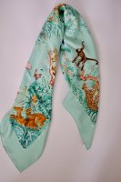
Next surprise for me: Equateur in the washed silk, which I was sure I would be keeping. I've always loved this pattern, although I've never owned a scarf in it. I have the Tatouage heels and Apple watch band, and have been eyeing the wallpaper as well. Pattern I love + a colorway that looks like the lovechild of eau de nil and menthe seemed like an obvious win for me, but... turns out I don't love how it ties. Tying it just doesn't change it much; no matter what I do, it's a ring of animals, albeit enchanting ones. In a bias fold, I don't think they show quite enough for impact. I do like how they look draped loosely over the shoulders in a triangle, but I don't wear scarves that way very often. This one is probably going back, although the colorway is hard to give up. However, for those whose style better suits the way this ties, the colors and the feel of the silk are dreamy.
The pic in the box is truest to the real color on my screen.
View attachment 4295018 View attachment 4295019
View attachment 4295020
Finally, Animapolis. I found this scarf charming flat, but didn't even try it on when I saw it during the holidays; I have a fraught history with super-detailed tiny-scale patterns. Kluska's modeling shot and story persuaded me I needed to give it a go anyway, and I was delighted with how well this semi-finesse colorway works for me. I don't love that it's the same "palette" as the Pivoines-- seriously, these regimented palettes, UGH HERMES-- but the pattern has charmed me enough that I'm going to try to put that out of my head. It'll stop me from getting any more designs in this color set, however, no matter how cool they may turn out to be.
View attachment 4295016 View attachment 4295017
One thing I really like about Animapolis is that it creates different looks when folded on its alternate biases. When I tried the Equateur, a TPF friend with me commented that Dallet probably didn't really think about how the design would look tied in different ways, which I think is a solid conjecture. Animapolis is the opposite; it's MEANT to be worn and it transforms according to each knot. Not everyone wants or needs that from a scarf, but it's definitely a selling point for me.
Thank you for this; these are the cws I have been interested in seeing properly.

Your taste is exquisite!! The second one is the only one I’m eyeing for myself but the color always you’ve selected in each are TDF. Too bad you’re returning the second scarf but I’d love to see modeling pictures of the ones you keep! Really stunning.

I nabbed a few scarves off the European site before the holidays to beat the price increase. I've only just picked them up yesterday since I was away during the break. In the meantime, I'd had a chance to try on a few colorways of Peonies while out of town, and was convinced that I'd be sending back the one I ordered. Much as I loved the idea of it, the colorways I was trying on let the mystical cityscape fade into the background, leaving the peony petals looking a bit too literal for my tastes. I LOVE peonies, and think flower petals look fantastic with some people's style, but garland-of-petals just doesn't work with what I'm wearing these days.
So I was shocked and very pleased to find that colorway 04 of Pivoines reads very differently on me than the others have! The dreamy and mysterious fantasy city is rendered in a purpley blue and jumps off the pale peachy-rose background. The flower parts are actually neon, which gives them a wonderful eccentricity that's as far from photo-real as can be, but the neon is tempered by the softness of the background. If you've been trying on Pivoines and having the same reaction I have to it, I definitely recommend giving this color a go.
View attachment 4295011 View attachment 4295012 View attachment 4295013
Next surprise for me: Equateur in the washed silk, which I was sure I would be keeping. I've always loved this pattern, although I've never owned a scarf in it. I have the Tatouage heels and Apple watch band, and have been eyeing the wallpaper as well. Pattern I love + a colorway that looks like the lovechild of eau de nil and menthe seemed like an obvious win for me, but... turns out I don't love how it ties. Tying it just doesn't change it much; no matter what I do, it's a ring of animals, albeit enchanting ones. In a bias fold, I don't think they show quite enough for impact. I do like how they look draped loosely over the shoulders in a triangle, but I don't wear scarves that way very often. This one is probably going back, although the colorway is hard to give up. However, for those whose style better suits the way this ties, the colors and the feel of the silk are dreamy.
The pic in the box is truest to the real color on my screen.
View attachment 4295018 View attachment 4295019
View attachment 4295020
Finally, Animapolis. I found this scarf charming flat, but didn't even try it on when I saw it during the holidays; I have a fraught history with super-detailed tiny-scale patterns. Kluska's modeling shot and story persuaded me I needed to give it a go anyway, and I was delighted with how well this semi-finesse colorway works for me. I don't love that it's the same "palette" as the Pivoines-- seriously, these regimented palettes, UGH HERMES-- but the pattern has charmed me enough that I'm going to try to put that out of my head. It'll stop me from getting any more designs in this color set, however, no matter how cool they may turn out to be.
View attachment 4295016 View attachment 4295017
One thing I really like about Animapolis is that it creates different looks when folded on its alternate biases. When I tried the Equateur, a TPF friend with me commented that Dallet probably didn't really think about how the design would look tied in different ways, which I think is a solid conjecture. Animapolis is the opposite; it's MEANT to be worn and it transforms according to each knot. Not everyone wants or needs that from a scarf, but it's definitely a selling point for me.
I love how thorough your review was! Thanks for sharing your thoughts and various tying photos. I’ve been collecting scarves for awhile and my one comment about the two of the same palette is go for what you love. Blue dominates my collection, but because I love it, I always wear them. For Equateur, I love the turquoise colorway personally. It does feel animal forward though because this colorway doesn’t have the contrast of the forest. Maybe look at another colorway that blends the animals a bit more? OR tie it like a necklace if you really love the colorway and want to try to make it work.
