These threads are archived as part of our reference library, therefore please only post scarves on this thread from the season in the title. If you are not sure, please do a search or ask in the ID this scarf thread before you post. 

TPF may earn a commission from merchant affiliate
links, including eBay, Amazon, and others

What is the H name for the minty-turquoise green? Thanks.Hmmm, great question, Moma. I see the color families pretty clearly in some of the other Equateurs, but am not sure what this falls under.
This color would be great on you too, so it would be lovely if it surfaced elsewhere....
Really pretty and the color look so much better on you.I like Dallet so much that I could not resist...
I do not mind the wide border, I like very much old designs.
View attachment 4295054
View attachment 4295055
Really pretty and the color look so much better on you.
I love the way that looks around your neck! I never would have thought it would be that beautiful IRL. I hadn't even considered it in that color way until just now. The vivid blues and purples and light greyish white color. Stunning.
Love the whites, you pic makes it look much greater than the official ones...
I like Dallet so much that I could not resist...
I do not mind the wide border, I like very much old designs.
View attachment 4295054
View attachment 4295055
What is the H name for the minty-turquoise green? Thanks.

So lovely on you!I like Dallet so much that I could not resist...
I do not mind the wide border, I like very much old designs.
View attachment 4295054
View attachment 4295055
Wow! Thanks for all the beautiful pix and analysis!I nabbed a few scarves off the European site before the holidays to beat the price increase. I've only just picked them up yesterday since I was away during the break. In the meantime, I'd had a chance to try on a few colorways of Peonies while out of town, and was convinced that I'd be sending back the one I ordered. Much as I loved the idea of it, the colorways I was trying on let the mystical cityscape fade into the background, leaving the peony petals looking a bit too literal for my tastes. I LOVE peonies, and think flower petals look fantastic with some people's style, but garland-of-petals just doesn't work with what I'm wearing these days.
So I was shocked and very pleased to find that colorway 04 of Pivoines reads very differently on me than the others have! The dreamy and mysterious fantasy city is rendered in a purpley blue and jumps off the pale peachy-rose background. The flower parts are actually neon, which gives them a wonderful eccentricity that's as far from photo-real as can be, but the neon is tempered by the softness of the background. If you've been trying on Pivoines and having the same reaction I have to it, I definitely recommend giving this color a go.
View attachment 4295011 View attachment 4295012 View attachment 4295013
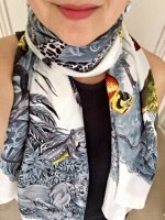
Next surprise for me: Equateur in the washed silk, which I was sure I would be keeping. I've always loved this pattern, although I've never owned a scarf in it. I have the Tatouage heels and Apple watch band, and have been eyeing the wallpaper as well. Pattern I love + a colorway that looks like the lovechild of eau de nil and menthe seemed like an obvious win for me, but... turns out I don't love how it ties. Tying it just doesn't change it much; no matter what I do, it's a ring of animals, albeit enchanting ones. In a bias fold, I don't think they show quite enough for impact. I do like how they look draped loosely over the shoulders in a triangle, but I don't wear scarves that way very often. This one is probably going back, although the colorway is hard to give up. However, for those whose style better suits the way this ties, the colors and the feel of the silk are dreamy.
The pic in the box is truest to the real color on my screen.
View attachment 4295018 View attachment 4295019
View attachment 4295020
Finally, Animapolis. I found this scarf charming flat, but didn't even try it on when I saw it during the holidays; I have a fraught history with super-detailed tiny-scale patterns. Kluska's modeling shot and story persuaded me I needed to give it a go anyway, and I was delighted with how well this semi-finesse colorway works for me. I don't love that it's the same "palette" as the Pivoines-- seriously, these regimented palettes, UGH HERMES-- but the pattern has charmed me enough that I'm going to try to put that out of my head. It'll stop me from getting any more designs in this color set, however, no matter how cool they may turn out to be.
View attachment 4295016 View attachment 4295017
One thing I really like about Animapolis is that it creates different looks when folded on its alternate biases. When I tried the Equateur, a TPF friend with me commented that Dallet probably didn't really think about how the design would look tied in different ways, which I think is a solid conjecture. Animapolis is the opposite; it's MEANT to be worn and it transforms according to each knot. Not everyone wants or needs that from a scarf, but it's definitely a selling point for me.
I have a question for you @lanit . Are all scarves in 90 cm eventually released in the 140 cm size, or are only some of them released in a larger size? How can a person find out which scarves might make it to the 140 size in the future? I am absolutely crazy over one of the new designs - Kawa Ora - which has yet to arrive on any website, and the only thing that could possibly make that one "better" in my opinion would be if it were released in a larger shawl size.All very beautiful choices to share @calexandre, though you may not keep all. I’ve already the white summer silk Equateuer, but was excited about a washed silk version. Now not so sure but hopefully will not duplicate what I have already. And agree with you re Peony silk. I am waiting to try these in person, but wondering if I can wait until a larger format is issued since I don’t wear 90s as much anymore. I also agree about the scale and busyness of Animopolis. I already have a couple of Ugo Gattoni silks and happy with those designs and colorations. Just a comparison for you of Equateur summer silk frim over several years ago for reference.,.did not want to be off topic, but hope it is of help in coloration discussion of the new issues.
View attachment 4295122
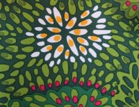
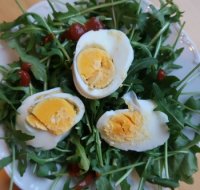
@xincinsin, I prepared myself a snack to honor your post (even added hot sauce to imitate the red dots). But I was impatient so the slices of egg fell apart...Love the greens. And the "eggs" look interesting. A scarf for a hardboiled scarf addict...


I know! So many pics I have to go back sometimes to double-check too.How kind of you to point that out. [emoji6] Being so busy here sometimes I forget what I have already seen!

@xincinsin, I prepared myself a snack to honor your post (even added hot sauce to imitate the red dots). But I was impatient so the slices of egg fell apart...
View attachment 4295138 View attachment 4295139
Dear Mrs. Shirley, if you see this, I hope you forgive me and get a great laugh out of it!
Nah, rather eggscellentExcellent!

I believe this would fall under the Miami color family?Hmmm, great question, Moma. I see the color families pretty clearly in some of the other Equateurs, but am not sure what this falls under.
This color would be great on you too, so it would be lovely if it surfaced elsewhere....
It is hard to know which scarves may be reissued in a different format in a future season. Not all 90s are eventually rereleased in 140 or other format.I have a question for you @lanit . Are all scarves in 90 cm eventually released in the 140 cm size, or are only some of them released in a larger size? How can a person find out which scarves might make it to the 140 size in the future? I am absolutely crazy over one of the new designs - Kawa Ora - which has yet to arrive on any website, and the only thing that could possibly make that one "better" in my opinion would be if it were released in a larger shawl size.
