Thanks Julide!!Jahna, I am excited to hear this news! Please share when your designs are ready for purchase
You are using an out of date browser. It may not display this or other websites correctly.
You should upgrade or use an alternative browser.
You should upgrade or use an alternative browser.
Scarves Hermès scarf colors
- Thread starter Jahna
- Start date
TPF may earn a commission from merchant affiliate
links, including eBay, Amazon, and others
More options
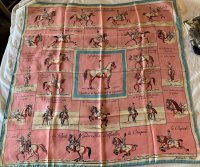
Who Replied?I bought this 1938 scarf, Saumur, just to look at the color saturation of the reverse. Any of you with A Cheval sur mon Carre enjoys this scarf image within the overall design. How fun to share with y’all!

Off to the right in the first photo is my fun “bonus gift” scarf: a non-H 1980s reissue of The Angler’s Companion, which Hermes produced in 1937 from a 17th c. Book by Sir Isaak Walton. Since the image wasn’t an Hermes original, others issued it prolifically but maybe not as often as publishers reissued the classic volume. Seller said Fontan’s III pictures a reissue because one of the text bubbles uses “Mich” instead of July, which was on the Hermes version.


Off to the right in the first photo is my fun “bonus gift” scarf: a non-H 1980s reissue of The Angler’s Companion, which Hermes produced in 1937 from a 17th c. Book by Sir Isaak Walton. Since the image wasn’t an Hermes original, others issued it prolifically but maybe not as often as publishers reissued the classic volume.
 Seller said Fontan’s III pictures a reissue because one of the text bubbles uses “Mich” instead of July, which was on the Hermes version.
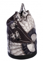
No idea when and if that bag was made, it looks like BRAZIL II due to the size of the feather dingle balls - depends on bag size really - it looks large in the photo without dimensions lol , it could be BRAZIL II found this on TRR, I asked in the SOTD thread and some thought it may have been made into a scarf. Would anyone know what year or the CW information if it was made into a scarf? This CW has my name all over it!!TIA!!

I dont have any record of it coming in either design in the neutral cw but they could have made a custom cw for the bag ???
I am not really much help on scarf bags, I once bought one for a friend , centuries ago
I just want to dive into that drawer and never come out! All lovelyThe ‘Dark Neutral’ drawer:
View attachment 4550621
Richer colors, but warm and cozy, equally marvelous.
Circus with its grays and a few tigers
View attachment 4550615
Les Fusils - Browns and grays. This scarf has some damage, but it’s so soft and lovely.
View attachment 4550614
And another from the men’s side - Clan Equestre
View attachment 4550616
Great styling on all... and the Grrrr almost glows! So impacting!From far left : Grrrrrr 100
top column :
1. Faubourg rainbow twilly (marine/blanc)
2.Quadriceps fil 70 ( noir/blanc)
Grand manege bandana love 70 ( rouge/rose/noir)
bottom column:
1.Grand manege detail 90( marine/ blanc)
2.Le Grand Prix du Faubourg 90 (blanc/noir/ gris)+Grand manege detail 90( marine/ blanc)
Have a good night everyone.

You’re killing me! Your Ecosse is a Grail for me... as much as I treasure mine, yours is tops! And, this Kachinas is most certainly a neutral!A few more from the dark neutral drawer:
Fleurs d’Ecosse - lovely taupey gray
View attachment 4551091
L’Arbre de vie - perfect with almost everything and it has a fabby turquoise hem!
View attachment 4551092
Belle Chasse
View attachment 4551090
Today I’m wearing Kachinas - not technically neutral but it goes with so much!
View attachment 4551093
What a gorgeous, happy color combo!Sorry for the decidedly UN neutral nature of my SOTD...it's a recent buy from another dear TPF member!
View attachment 4551232
No apologies needed. I am so very sorry to hear this! It is quite a difficult and challenging situation. I hope that you both have better days ahead and that your DH will find some improvement and reliefI also wanted to post an apology for my lack of comments upon all the beautiful pictures on here. I DO look at them, and they are soothing my soul through some awful times! My husband has also been my caregiver since we met. Now ONE disc above the 4 lumbar vertebrae that were fused last November has crumbled and gotten MUCH worse over the past several months. Sometimes he can't get up off the couch for up to 4 days in a row. So I become his caregiver! Not quite impossible, just exceedingly difficult. Three trips to ER for excrutiating pain over the past 6 weeks. I have finally arranged for in home health care for him! So the crushing burden eases.
That's my story and I'm sticking to it! Apologies to Mods for swerving so far off topic.
Ok... one more reminder that I need this design.... Stunning!last scarf of the week ( oh boy, I need more neutral scarf
)
Panoplie équestre
This is so beautiful!
Beautiful!Blue Saturday with CdC silk shawl)
Positively stunning!
An absolute treasure! I would just stand in front of the mirror and stare at it all day longWhine Warning Alert: Plagued by first-world problems today.Whine, whine, whine.
Too hot for silk twill, too hot for moussie stole (all that winding leads to more whining).
Want light colors, light weight, but ya gotta have charm....
thus, SOTD debut 1938’s Saumur with well-hidden mother of pearl ancre scarf ring from Maitai. The light-weight silk, and pink & blue just felt so fresh and right. And the color saturation avoids that annoying twisting and fluffing to avoid blah reverses.
View attachment 4551950
Ooooh gorgeous!Khaki is not my preferred cw for neutrals, but it is indeed versatile. CLF exceptionelle worn with the embroidery shown and hidden. When hidden, the dull khaki is the perfect backdrop for a large double-twist silver scarf ring.
View attachment 4551966
@Jbizzybeetle's remark about hiding both border and centre made me experiment with my Moliere which has red in the centre and border. Worn here in a fancy fold which one of my dear SAs taught me, then first attempt to minimize the red which left only one corner peeping out, and finally a second attempt which has all the red tucked out of sight, leaving only the neutral portions showing.
View attachment 4551968
Just amazing!Oh no. My photobucket link is not working. Trying again!
So, so gorgeous! The Onde de Chic is magnificent!Last day of neutrals, with my moussies.
View attachment 4552011
Luna Park
View attachment 4552013
Soleil
View attachment 4552012
Onde de Chic
View attachment 4552010
I’m sorry that I’ve been MIA for the past few days but I’ve been quite busy taking care of a lot of tedious and time-consuming stuff... It’s actually past-midnight, but I wanted to share some of my favorite neutrals
Robe du Soir

L’Instruction du Roy
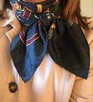
One of my fav silks of all time: Sichuan
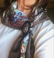
A Walk in the Park
Etude pour une Parure du Gala
Le Songe de la Licorne

Le Jardin a Sintra

Chaque Rencontre est Unique

Robe du Soir

L’Instruction du Roy

One of my fav silks of all time: Sichuan

A Walk in the Park

Etude pour une Parure du Gala

Le Songe de la Licorne

Le Jardin a Sintra

Chaque Rencontre est Unique

There's a short thread about this bag model.I found this on TRR, I asked in the SOTD thread and some thought it may have been made into a scarf. Would anyone know what year or the CW information if it was made into a scarf? This CW has my name all over it!!TIA!!

https://forum.purseblog.com/threads/hermes-sac-soie-cool.813757/
I recall H made a full size and a mini version. (Because I was so tempted to get one...
 )
)There's a short thread about this bag model.
https://forum.purseblog.com/threads/hermes-sac-soie-cool.813757/
I recall H made a full size and a mini version. (Because I was so tempted to get one...)
Thanks! It is tempting....

On color saturation, and contrast hems and oldies,
First a note on screening, When screening and squeegeeing (sp?) ... H sometimes does more passes for a given color , ie reapplies the ink multiple times (or equivalently it lingers longer to spray the color for digital printing)
Anyway back to my oldie, my SULFURES ca 1980, it has a solid pink field rather than a field + border. Well, it is an oldie .. and typically they sometimes show imperfections... They did not do enough passes on the pink background, and the reverse is just SLIGHTLY less pink. When they rolled the hem forward they show the reverse side of the silk at the hem. Well, it almost looks like a contrast hem, the hem is ever so slightly paler than the field
To summarize if you have a wide border or solid field scarf, and dont intend a contrast hem, eg you have to saturate the border /field color so that it soaks through and the hem then appears the same color as the field/border
The converse is true too
If you intend a contrast hem, you need more passes the print the hem, so that the hem shows up nice an bright since you see the reverse of the silk
Finally, consider a finesse-y kid of pen and ink design - a colored hem needs to get multiple passes to look right, but the inner part of the design can be inked less, you may deliberately want a faded old look to the lines for the main design - they may be deliberately wavy and broken eg Pagni - his signature style is imperfect lines
And a final note, on modern scarves where the design does not soak through, it is good to have a contrast hem. There is only the smallest area to be soaked with ink (the bit that will be flipped over), you dont have to use buckets of ink to print the field, so that the hem is the same colorOn color saturation, and contrast hems and oldies,
First a note on screening, When screening and squeegeeing (sp?) ... H sometimes does more passes for a given color , ie reapplies the ink multiple times (or equivalently it lingers longer to spray the color for digital printing)
Anyway back to my oldie, my SULFURES ca 1980, it has a solid pink field rather than a field + border. Well, it is an oldie .. and typically they sometimes show imperfections... They did not do enough passes on the pink background, and the reverse is just SLIGHTLY less pink. When they rolled the hem forward they show the reverse side of the silk at the hem. Well, it almost looks like a contrast hem, the hem is ever so slightly paler than the field
To summarize if you have a wide border or solid field scarf, and dont intend a contrast hem, eg you have to saturate the border /field color so that it soaks through and the hem then appears the same color as the field/border
The converse is true too
If you intend a contrast hem, you need more passes the print the hem, so that the hem shows up nice an bright since you see the reverse of the silk
Finally, consider a finesse-y kid of pen and ink design - a colored hem needs to get multiple passes to look right, but the inner part of the design can be inked less, you may deliberately want a faded old look to the lines for the main design - they may be deliberately wavy and broken eg Pagni - his signature style is imperfect lines
So, yes, the modern proliferation of contrast hems is likely tied to the overall use of less ink
Very interesting! So, in many cases, the practice of even a thin border makes easier the proper look of the hem? Rhetorical.On color saturation, and contrast hems and oldies,
First a note on screening, When screening and squeegeeing (sp?) ... H sometimes does more passes for a given color , ie reapplies the ink multiple times (or equivalently it lingers longer to spray the color for digital printing)
Anyway back to my oldie, my SULFURES ca 1980, it has a solid pink field rather than a field + border. Well, it is an oldie .. and typically they sometimes show imperfections... They did not do enough passes on the pink background, and the reverse is just SLIGHTLY less pink. When they rolled the hem forward they show the reverse side of the silk at the hem. Well, it almost looks like a contrast hem, the hem is ever so slightly paler than the field
To summarize if you have a wide border or solid field scarf, and dont intend a contrast hem, eg you have to saturate the border /field color so that it soaks through and the hem then appears the same color as the field/border
The converse is true too
If you intend a contrast hem, you need more passes the print the hem, so that the hem shows up nice an bright since you see the reverse of the silk
Finally, consider a finesse-y kid of pen and ink design - a colored hem needs to get multiple passes to look right, but the inner part of the design can be inked less, you may deliberately want a faded old look to the lines for the main design - they may be deliberately wavy and broken eg Pagni - his signature style is imperfect lines
Amazing, cost-driven and technology-driven design. And we thought it was just because it popped!And a final note, on modern scarves where the design does not soak through, it is good to have a contrast hem. There is only the smallest area to be soaked with ink (the bit that will be flipped over), you dont have to use buckets of ink to print the field, so that the hem is the same color
So, yes, the modern proliferation of contrast hems is likely tied to the overall use of less ink

Yup
And the hem came first, I think, they turned the hem forward as far back as the 1950s - by that time Hermes was commissioning the scarves not buying out of a catalog as in the 1930s, 1940s
Must pull one of my old Guccis - they are not saturated colors, but then the hems are backwards - the printing is less saturated / more delicate / it does not pop
It all goes to how they turn the hemAmazing, cost-driven and technology-driven design. And we thought it was just because it popped!
And the hem came first, I think, they turned the hem forward as far back as the 1950s - by that time Hermes was commissioning the scarves not buying out of a catalog as in the 1930s, 1940s
Must pull one of my old Guccis - they are not saturated colors, but then the hems are backwards - the printing is less saturated / more delicate / it does not pop
Fascinating about the hems! I always thought it was just a design device.
On another note, I was ironing my (blue) Ingrid last night and noticed that a lot of the colors on the white did not have holding lines. The absence of the trap lines makes the colors look even brighter. Now I’ve got to go back and look at other scarves with a white ground. Even more in love with “Ingrid”!
On another note, I was ironing my (blue) Ingrid last night and noticed that a lot of the colors on the white did not have holding lines. The absence of the trap lines makes the colors look even brighter. Now I’ve got to go back and look at other scarves with a white ground. Even more in love with “Ingrid”!
I have always wondered about the color differences - Gucci vs Hermes - ca late 1960s - early 1980s - the Accornero daysYup
It all goes to how they turn the hem
And the hem came first, I think, they turned the hem forward as far back as the 1950s - by that time Hermes was commissioning the scarves not buying out of a catalog as in the 1930s, 1940s
Must pull one of my old Guccis - they are not saturated colors, but then the hems are backwards - the printing is less saturated / more delicate / it does not pop
Lest we forget, H had a scarf slump in the 1970s that did not resolve til the early 1980s when Accornero (Gucci designer) died and Jean Louis Dumas took over at H
I dont know the sale figures for those years of G vs H scarves, and there is so much H mythology that clouds things, but one should NOT leap to the conclusion that H dominated the scarf market ca 1960 - 1980, and that all the other houses were hot to copy H, it may well have been the other way round during the slump. In some sense, JLD brought Gucci-style designs (lots of non-granny style flowers, and fauna, no horses) to H in the 1980s versus the old H stuff (ancien regime, vieux jeu, horsy)
Last edited:
Register on TPF! This sidebar then disappears and there are less ads!

