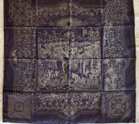
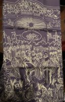
I found this interesting article in the Houston Chronicle online about the incredible scarf dyeing process. According to this, it takes 400-600 hours just to prepare the design for screening: https://www.chron.com/life/article/The-Hermes-scarf-process-3919853.php
I was fascinated to learn that they dye the scarves smallest color areas to largest and darkest to lightest. I would have guessed entirely opposite.
I was fascinated to learn that they dye the scarves smallest color areas to largest and darkest to lightest. I would have guessed entirely opposite.