You are using an out of date browser. It may not display this or other websites correctly.
You should upgrade or use an alternative browser.
You should upgrade or use an alternative browser.
Scarves Hermès scarf colors
- Thread starter Jahna
- Start date
TPF may earn a commission from merchant affiliate
links, including eBay, Amazon, and others
More options
Who Replied?A closeup of my PLUMES, both by Linares, two issues about 20 years apart with the same detailing on the feathers. Surely different screens but they tried to emulate the early issue EXACTLY. So reissues did not originally have less detail or colors - if they redid PLUMES now they might reduce the colorsI got to thinking about A Shirley designs, in the last 10 or so years she has done several styles of designs
Was thinking of the differences between AS feathers and those of Linares, and AS fur and those of Linares and Dallet - major differences .
- Uber detailed womens designs eg Canadian WIld, Under Waves, English garden those are all about girly, colors and details - the cute little bunny in the corner. They are not about texture. They are something of a replacement for the Henry designs since CH seems to be no more. There are 3 or 4 of these designs.
- She has done several zoom/detail scarves for the mens collections - ARGHH, AWOO - dino, wolf, bear. Those are about scales, feathers, fur, birch trees. Very textured in part because the mens palette is so limited - black, gray blue, blue gray, brown, gray brown etc. Those are not girly or about color. There are 3 or 4 of these...
- Hybrid scarves for womens collection - JAGUAR, ZEBRA, TYGER- some prominent fur and feathers, but also a lot of flowers. These have texture, and girly colored flowers
- I would put ESPRIT in its own category - a zoom design with only the tiniest lip service to fur and feathers so not girly, colorful or textured a priori.
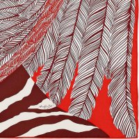
And a snippet of ZEBRA PEGASUS - the fur is not textured - it is two tone chiaroscuro, each feather is two tone - a totally diff vibe from PLUMES
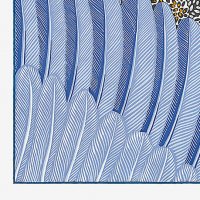
So, Shirley does her own style fur and feathers in ESPRIT, the blue one are arguably more complicated than those in ZP but no where near the detail of Linares feathers
Attachments
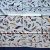

AS photos from h.comA closeup of my PLUMES, both by Linares, two issues about 20 years apart with the same detailing on the feathers. Surely different screens but they tried to emulate the early issue EXACTLY. So reissues did not originally have less detail or colors - if they redid PLUMES now they might reduce the colors
And a snippet of ZEBRA PEGASUS - the fur is not textured - it is two tone chiaroscuro, each feather is two tone - a totally diff vibe from PLUMES
So, Shirley does her own style fur and feathers in ESPRIT, the blue one are arguably more complicated than those in ZP but no where near the detail of Linares feathers
with the designs, it's like the difference between 'photographic' renditions, ie trying to replicate exactly what a feather or whatever looks like, making the subsequent design appear realistic (sometimes with this genre of art you have to look twice before realising it is a painting and not a photo as the detail is so high), or an artists interpretation of an animal or object which can be very simple. There are less fine detail 'real life' examples within recent collections aren't there, the new Index Palmarum is a good example, less photographic, more 19th century botanical collector's drawing.
@marietouchet et al, AW19’s reissue of Un Jardin sur le Toit sparked recollection of the discussion of laser printing vs. screened silk and the saturation thereof. Here’s front and back of CW13.
Attachments
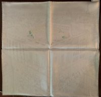
For comparison, not a great photo, but of the early one with more ink on reverse@marietouchet et al, AW19’s reissue of Un Jardin sur le Toit sparked recollection of the discussion of laser printing vs. screened silk and the saturation thereof. Here’s front and back of CW13.
Yours is mostly printed in grey not navy ? Navy would show better in the reverse
This could be due to the older one having a different procedure for screening ie more passes of each color ( each of which used to be done multiple times ) but that is a stretch
In any case, the new and old versions were printed considerably different
Ps not my photo, unfortunately copied without noting the source, mea culpa
Attachments
Last edited:
For comparison, not a great photo, but of the early one with more ink on reverse
Yours is mostly printed in grey not navy ? Navy would show better in the reverse
This could be due to the older one having a different procedure for screening ie more passes of each color ( each of which used to be done multiple times ) but that is a stretch
In any case, the new and old versions were printed considerably different
Ps not my photo, unfortunately copied without noting the source, mea culpa
Thank you for the input. I love the detail of these discussions!
Yes, the new CW notes gris/multicolor. Blanc is probably the first color, but I’ve put it away to deal with returning after vacation.
Yup blanc / gris/ multi per websiteThank you for the input. I love the detail of these discussions!
Yes, the new CW notes gris/multicolor. Blanc is probably the first color, but I’ve put it away to deal with returning after vacation.
More on colors on the reverse ..Yup blanc / gris/ multi per website
I was thinking that Jardin sur le toit is kind of a finesse design, pen and ink design - not a color blob design, and it does seem that the finesse designs from 2019aw are more prone to blank reverses
Quite a few designs are colored eg patisserie, but also have finesse Cws. There is a b&w cw of patisserie , black field, white ink cw 22 noir / creme
There is one on eBay now, look at the photo of the laminated tag - hint : if you want to see the reverse side of a scarf, look in the photo of the laminated tag - well the white lines show but barely, the reverse is mostly black, not sure I like the look
Must go look at my older finesse scarves, curious about the reverses
Ps looked at my two, and they don’t show much on the reverse, the blank reverse is a side effect of the finesse design. Mine are so old that they were incontrovertibly screened
Last edited:
More on colors on the reverse ..
I was thinking that Jardin sur le toit is kind of a finesse design, pen and ink design - not a color blob design, and it does seem that the finesse designs from 2019aw are more prone to blank reverses
Quite a few designs are colored eg patisserie, but also have finesse Cws. There is a b&w cw of patisserie , black field, white ink cw 22 noir / creme
There is one on eBay now, look at the photo of the laminated tag - hint : if you want to see the reverse side of a scarf, look in the photo of the laminated tag - well the white lines show but barely, the reverse is mostly black, not sure I like the look
Must go look at my older finesse scarves, curious about the reverses
Ps looked at my two, and they don’t show much on the reverse, the blank reverse is a side effect of the finesse design. Mine are so old that they were incontrovertibly screened
Very interesting! I definitely see the logic here although I’ve seen the finesse designs only on computer screens, never IRL.
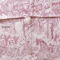
Front and back of the noir/blanc Jardin sur le Toit for reference.


Wow ! that is totally different from the B&W Patisserie on ebayFront and back of the noir/blanc Jardin sur le Toit for reference.
View attachment 4507653
View attachment 4507654
One of my finesse scarves from 23 years ago. Most true finesse were first done full color, then the finesse screen was stripped out for a reissue , of sorts, with only lines . Two color scarves - field color and line color. GRAND CORTEGE was doen full color then as a two color finesse.Very interesting! I definitely see the logic here although I’ve seen the finesse designs only on computer screens, never IRL.
Finesse these days can mean a lot of stuff, but mostly a pen & ink style drawing, less than 5 colors. I think the eyeliners were called Finesse on some of the web sites (?)
Finesse was never my thing, so, mine is atypical - of course ! I love atypical scarves. But this design is great. Mine was done only in finesse, CAVALCADE DE MAI, never in full color.
Clearly the lines are what could have been the finesse screen from a full color printing, like the lead in stained glass. But the finesse lines should be very crisp whereas in TOIT, I think , correct me if I am wrong, the lines are a bit blurry, trying to give the illusion of a pencil drawing.
Sorry no photo of reverse, but you can see the lines on the other side, fainter than on the front.
Attachments
Last edited:
Front and back of the noir/blanc Jardin sur le Toit for reference.
View attachment 4507653
View attachment 4507654
Wouldn’t this make sense if the only color applied is the black?
So intense, thus the reverse color is as strong as the front?
What a beautiful design! Thank you for sharing this scarf. I may need to find one for myselfOne of my finesse scarves from 23 years ago. Most true finesse were first done full color, then the finesse screen was stripped out for a reissue , of sorts, with only lines . Two color scarves - field color and line color. GRAND CORTEGE was doen full color then as a two color finesse.
Finesse these days can mean a lot of stuff, but mostly a pen & ink style drawing, less than 5 colors. I think the eyeliners were called Finesse on some of the web sites (?)
Finesse was never my thing, so, mine is atypical - of course ! I love atypical scarves. But this design is great. Mine was done only in finesse, CAVALCADE DE MAI, never in full color.
Clearly the lines are what could have been the finesse screen from a full color printing, like the lead in stained glass. But the finesse lines should be very crisp whereas in TOIT, I think , correct me if I am wrong, the lines are a bit blurry, trying to give the illusion of a pencil drawing.
Sorry no photo of reverse, but you can see the lines on the other side, fainter than on the front.

Register on TPF! This sidebar then disappears and there are less ads!