So, in my geeky tally, they made 1 white RdS, and 3 that are off white - 4 "white" cws is a lot but 3 are not whiteMoire "white" RdS - from h.com
These are the mod shots of 3 other whitish cws - not including your pure white one - mod shots were chopsen deliberately because the model wears white - the white clothes make the scarves all look off white, they look to be naturel or gris chiné but some would call them white
You are using an out of date browser. It may not display this or other websites correctly.
You should upgrade or use an alternative browser.
You should upgrade or use an alternative browser.
Scarves Hermès scarf colors
- Thread starter Jahna
- Start date
TPF may earn a commission from merchant affiliate
links, including eBay, Amazon, and others
More options
Who Replied?
Glad to help! The RdS was indeed closest to white IRL, but the Oiseaux was very close to my eye. The Belles was also close, but just a hair off in person. Like winter white.Wonderful palette of whites, great info, they all look white at first glance
The Belles looks to be Ecru - at least to me, I dont remember the color names per H, but its ecru-ness may just be an optical illusion due to the browns
The RdS is indeed white per H - and the blues make it look winter white indeed - H243174S 10 Bleu Ciel Gris Bleute Blanc, if you want an outfit to look whiter, wear blue accents ..
The Oiseaux is 242983S02 Vieux Rose Ivoire Vert so, an off white per H
But the PdS is H243071S-06 Gris Chine Bleu Gris, a broken grey , though the snippet looks kinda white in the photo
I love the fun of looking - inn a geeky fashion at all the micro details - no one has to agree with my perception of color - to me, you have 4 very different white scarves - love em
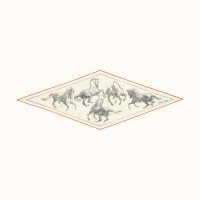
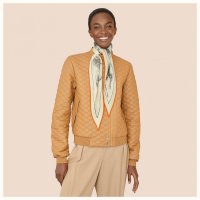
Another white ? The name of this is Blanc Anthracite Orange - so H is claiming it is white, not off-white , not naturel or whatever
Certainly looks beige to me on the model but the beige coat makes it look more beige
Look at the losange on the white background of the web site , it looks beige there too ...
https://www.hermes.com/us/en/product/pirouette-au-galop-losange-medium-model-H472850Sv01/
from H.com
I have always been uber picky about white versus off whites - it used to be a major fashion faux pas to mix white & beige, not so much any more
Attachments
So interesting. The blank reverse is the reason I did not get a Pivoines scarf after all. When I tried on the Cite Cav recently, the SA had already made a bias fold, so I didn't notice this flaw.Gorgeous peach Melba colors ... tdf
But wow the reverse is blank , some 10 years ago that would have been considered a major flaw , times change
And is the digital printing associated with less saturation ie color on the reverse, maybe but not necessarily
Yes you can adjust the flow on a digital printer to get shading effects without using another color
But you can do the same on screening but reducing/ increasing the number of times a screen is used. They do the same screen up to 8 times and the minimum is two, I think
Must go pull a digital one of mine and scrutinize , mine would be an H Cinetique , eons ago, so, maybe not typical of recent work and newer machines, I cling to my oldies and am proud of it lol
I love reading these thoughtful and philosophical posts from you and from others. Some people just say "that's pretty - I'll wear it." LOL. You really understand how color and scale and theme interact, and how they work for you personally. I would like to spend more time thinking about this for myself!This replyis to @textilegirl question about the similarity of colors in EArly America Scarf posted on Scarf of the Day thread.
EA was a very early scarf purchase for me on the Bay actually. I had never seen the colorway before but I loved the graphic look of the borders. It reads more graphic to me with a nice balance of white space so it always looks great with other patterns which this photo Is a good example of how I can mix it with simple graphic tees and tops. Samourais is more silver and ardoise greys with pops of yellow, and I chose it because the metallic grays balanced with the pop of lemon yellow was very yin yang. I think the EA yellow is called absinthe lr anise if I recall correctly. The yellow on the Samourais is jaune. They are not neceassarily interchangeable in my mind because EA feels casual to me where Samourai is like a power silk and a bit more serious in tone even though I can wear either with a tee and jeans. Adding more to my love of these two colors is my recent Ballade de Heian. I kept thinking that I already have EA and Samourai, but still love this colorway and subject matter is so different from the other two. i think I’ve reached my limit of yellow and silver/grey though LOL because I also have a 70 Manufacture de Boucleries and On a Summer Day 140 silk in yellow and grey!!! ACK.
I do think H repeats color schemes though they tweak the color palettes depending upon the seasonal colors that are being offered at that time. I have learned I can wear certain H colors more easily in shawls than twills, but also larger scale graphics rather than finely detailed designs.
View attachment 4482892 View attachment 4482903
View attachment 4482891
View attachment 4482909 View attachment 4482911
Do others want to chime in about this?
Yes. And the colors on the Pegase Paysage 90 wash are stunning IRL, especially the tangerine CW. I love the matte surface also.Yes, absolutely.
I agree. Also, we had this discussion elsewhere, but at least for the current season Kachinas the colors are not muted as they may otherwise seem on the wash silks. In fact, I have one colorway where the accent colors seem to pop even more than they do on silk. This may also be due to the texture.
Yes. I find the first one in particular really fascinating!all credit Hermès.com
As for the scarves, wow, what colors! Three of my favorites:


So interesting. The blank reverse is the reason I did not get a Pivoines scarf after all. When I tried on the Cite Cav recently, the SA had already made a bias fold, so I didn't notice this flaw.
which CW for Cite Cav?
curious if any out yet other than red/white and pink/orange. TIA!
The blue/pink CW - denim? My favorite color family of the season! This was at Madison NYC a few weeks ago.which CW for Cite Cav?
curious if any out yet other than red/white and pink/orange. TIA!
On the blank reverse ... something I noticed yesterday ... those who are interested will do the research and I dont want to seriously poopooh authentic scarves for sale just because I noticed something that struck me, so no linksSo interesting. The blank reverse is the reason I did not get a Pivoines scarf after all. When I tried on the Cite Cav recently, the SA had already made a bias fold, so I didn't notice this flaw.
On Ebay, 2 Reve de Gloria - original issue light blue - recent reissue pink
The basic design is airbrushed (looking) swirls
The reverses of both scarves can be seen in the photos
The recent issue - pink - has a "white" reverse - clearly digitally printed - the front and back of the scarf are in a single shot - catches your eye kind of difference
The blue one - original screened issue - the reverse is almost the same color as the front
VERY striking difference between the issues
The blue/pink CW - denim? My favorite color family of the season! This was at Madison NYC a few weeks ago.
Gr8! I’ll take a look at photo of it.
Were there any other la Cite Cavaliere there at the time?
I haven’t annoyed my SS there in a week, so must be time.


A great example, I think, of how the « art » influences the apparent color of the ground. I, too, would love to see the 3 cws together irl.Good demo of white
Go to H.com and look for the CABANES CSGM - there are 3 Blancs with lt blue, dk blue, sepia - to me, the fields look different - all 3 look to be off white (to me) not snow white - The lt blue is the whitest
It would be interesting to have all 3 side by side and upside down to see if the same field color is really used
When did they start printing digitally, and is that noted anywhere?On the blank reverse ... something I noticed yesterday ... those who are interested will do the research and I dont want to seriously poopooh authentic scarves for sale just because I noticed something that struck me, so no links
On Ebay, 2 Reve de Gloria - original issue light blue - recent reissue pink
The basic design is airbrushed (looking) swirls
The reverses of both scarves can be seen in the photos
The recent issue - pink - has a "white" reverse - clearly digitally printed - the front and back of the scarf are in a single shot - catches your eye kind of difference
The blue one - original screened issue - the reverse is almost the same color as the front
VERY striking difference between the issues
I have NEVER seen an official H publication explicitly mentioning digital printing ... There have been ambiguous recent press releases/interviews talking of the latest innovative scarf making techniques without saying what they areWhen did they start printing digitally, and is that noted anywhere?
But, there have been rumblings for 10 - 15 years of inkjet/digital printing and some fabrics smack of it (eg recent ones with blank reverses). My 2004-ish H Cinetique is the earliest that I know of. The one where the colors on the reverse are different than on the front, and where the printing went to the edge ca 2004 - super unusual at THAT time.
It is kind of like manufacturing location... scarves now bear labels saying made in Italy, Scotland, Bangladesh, India, Nepal etc - they are not all made in France but H never highlights the other locations - it is as if Lyon were still the only silk manufacturing location. Lyon as the only manufacturing location is a myth they allow to endure.
Register on TPF! This sidebar then disappears and there are less ads!