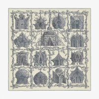
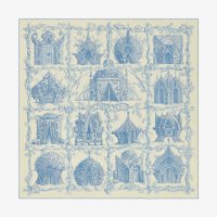
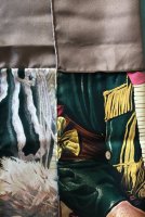
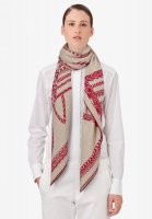
Sorry for the confusion, I was referring to how a small portion of the unprinted fabric looks ex a 1 - 2 in sq, the grey sample - seen from backside of fabric is not a uniform gray at all , sorry I have no good closeups photos of "white" CS. H uses a lot of shades of white (ecru, blanc cassé etc) but all may receive the moniker "blanc" on the tagreally?!!!? wow. so in AW19, how do we account for the apparent “background” differences between these two JdL CSGMs? the second seems more white.
"White" is a color most easily distorted by lighting and photography.
The first photo - the beigy JdL - was taken at home - different lights, not the blue fluorescents in the store
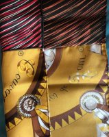
The second photo was done in a store and dimly lit but the blue ink gives a whiter overall impression - and to really nitpick (forgive me please) there is red behind the scarf, yes, the background for the photo matters (holding up to light versus on a solid background) - today's CS is sheerer (not as thick) so background colors show through - as in the photo of the blue one