Thanks MT. Those sneaky devils! And the reverse is blank? Zut alors ! The scarves that I design, if they are not silk-screened, I back them with plain or patterned silk.I have NEVER seen an official H publication explicitly mentioning digital printing ... There have been ambiguous recent press releases/interviews talking of the latest innovative scarf making techniques without saying what they are
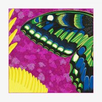
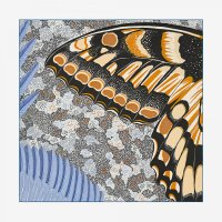
But, there have been rumblings for 10 - 15 years of inkjet/digital printing and some fabrics smack of it (eg recent ones with blank reverses). My 2004-ish H Cinetique is the earliest that I know of. The one where the colors on the reverse are different than on the front, and where the printing went to the edge ca 2004 - super unusual at THAT time.
It is kind of like manufacturing location... scarves now bear labels saying made in Italy, Scotland, Bangladesh, India, Nepal etc - they are not all made in France but H never highlights the other locations - it is as if Lyon were still the only silk manufacturing location. Lyon as the only manufacturing location is a myth they allow to endure.
I guess that should make the older scarves more valuable.
I wondered how they could put out so many more scarves, some with seemingly endless colors.