Scarves Hermès scarf colors

TPF may earn a commission from merchant affiliate
links, including eBay, Amazon, and others

@Jbizzybeetle
Thanks for asking this question.

I think I would like to get a little more specific. I do not have a Hermes store in my state so the only way I can see scarfs and shawls is when traveling or by ordering from H.com. I have noticed particularly with the color Fushia that on my current season twillys it is a bright hot pink but when I ordered the same pattern in CSGM it became a very dark purple. The photo on H.com portrays them as both looking hot pink like my twillys. Is this normal? I honestly thought maybe I was sent the incorrect shawl, but it has happened to me before with other colorways. The 100% silk ones are pretty accurate in color but the CSGM, I never know how the colors are going to translate.

I think it depends on the scarf. I feel like the colors for the blue Cashmere Acte III and the pink Jungle Love rainbow twilly are fairly accurate. But I’m not sure if you are aware that Hermès modifies their photos slightly to alter color appearances just a bit, so the colors IRL will be similar but not exact.
 
@tbbbjb
To Lanit & all re: your comment “”Some Colors easier to wear on shawls than silks” — my question: do shawl materials affect differences from silks IRL color presentation?

Yes, absolutely.

IMO csgm shawls are slightly more muted due to saturation into the woven fabric, whereas silkscreening on twill retains brighter colors on the surface?

I agree. Also, we had this discussion elsewhere, but at least for the current season Kachinas the colors are not muted as they may otherwise seem on the wash silks. In fact, I have one colorway where the accent colors seem to pop even more than they do on silk. This may also be due to the texture.
 
  • Like
Reactions: momasaurus
I think it depends on the scarf. I feel like the colors for the blue Cashmere Acte III and the pink Jungle Love rainbow twilly are fairly accurate. But I’m not sure if you are aware that Hermès modifies their photos slightly to alter color appearances just a bit, so the colors IRL will be similar but not exact.
Yes, I am aware that Hermes does that but I had the twillys purchased and in front of me and purchased the CSGM with the same name and the Fushia color in that in person was a true purple nowhere near the hot pink that the twillys had. I do not know if it is ok to post which one it is that is why I am being vague about that. But, I have had this exact problem come up more then once. Could someone please advise me as to which Hermes color I should be looking for if I am seeking hot pink as the primary color on a blended fabric (Cashmere and Silk blend) shawl? I have not encountered this problem when I purchase 100% silk shawls or scarves.

@BBC I know from your posts here and on the VCA forum that you love pink so you may be the perfect lady to help me with this. Thank you in advance if you can offer any assistance.
 
  • Like
Reactions: BBC
Yes, I am aware that Hermes does that but I had the twillys purchased and in front of me and purchased the CSGM with the same name and the Fushia color in that in person was a true purple nowhere near the hot pink that the twillys had. I do not know if it is ok to post which one it is that is why I am being vague about that. But, I have had this exact problem come up more then once. Could someone please advise me as to which Hermes color I should be looking for if I am seeking hot pink as the primary color on a blended fabric (Cashmere and Silk blend) shawl? I have not encountered this problem when I purchase 100% silk shawls or scarves.

@BBC I know from your posts here and on the VCA forum that you love pink so you may be the perfect lady to help me with this. Thank you in advance if you can offer any assistance.

Absolutely happy to help!

Yes, people should be aware that Hermès uses color names inconsistently. One Hermès fuchsia is not always the same as another Hermès fuchsia!!!
 
Wow! A lot of posts here during my vacances!

I feel really stupid asking this, but how does anyone know which scarves are silk-screened and which are laser-printed? Somehow I was still under the impression that they were still all screened. Yuk! I hate to admit I don't know this.

Help anyone?
 
  • Like
Reactions: Julide and BBC
And, speaking of color, looking at S/S and the men's collection S/S 2020, color has gone, uh, crazy? Almost overwhelming, but I find some of the combos to be really interesting:
all credit Hermès.com
Screen%20Shot%202019-07-06%20at%206.34.05%20PM_zpsftiptxe6.png
Screen%20Shot%202019-07-06%20at%206.29.44%20PM_zps5xwapfe8.png
Screen%20Shot%202019-07-06%20at%206.33.32%20PM_zpsio2vfofm.png
Screen%20Shot%202019-07-06%20at%206.31.24%20PM_zpschl9apsx.png
 
  • Like
Reactions: BBC
This replyis to @textilegirl question about the similarity of colors in EArly America Scarf posted on Scarf of the Day thread.


EA was a very early scarf purchase for me on the Bay actually. I had never seen the colorway before but I loved the graphic look of the borders. It reads more graphic to me with a nice balance of white space so it always looks great with other patterns which this photo Is a good example of how I can mix it with simple graphic tees and tops. Samourais is more silver and ardoise greys with pops of yellow, and I chose it because the metallic grays balanced with the pop of lemon yellow was very yin yang. I think the EA yellow is called absinthe lr anise if I recall correctly. The yellow on the Samourais is jaune. They are not neceassarily interchangeable in my mind because EA feels casual to me where Samourai is like a power silk and a bit more serious in tone even though I can wear either with a tee and jeans. Adding more to my love of these two colors is my recent Ballade de Heian. I kept thinking that I already have EA and Samourai, but still love this colorway and subject matter is so different from the other two. i think I’ve reached my limit of yellow and silver/grey though LOL because I also have a 70 Manufacture de Boucleries and On a Summer Day 140 silk in yellow and grey!!! ACK.

I do think H repeats color schemes though they tweak the color palettes depending upon the seasonal colors that are being offered at that time. I have learned I can wear certain H colors more easily in shawls than twills, but also larger scale graphics rather than finely detailed designs.

View attachment 4482892 View attachment 4482903
View attachment 4482891
View attachment 4482909 View attachment 4482911

Do others want to chime in about this?
Great analysis and examples L., thank you! I really like this color combo, and lament that I didn't add the silver grey Samourais to my pile of greys when it was initially released. It's fun to see how much the design influences the feel of the colors -- an obvious point to be sure but easier when several examples are at hand. :flowers:
 
  • Like
Reactions: QueenieQ and Julide
@tbbbjb
To Lanit & all re: your comment “”Some Colors easier to wear on shawls than silks” — my question: do shawl materials affect differences from silks IRL color presentation?
I have the same MP cw in gav, 90cm and moussie. I think size also modifies our impression of the colour. The brown/orange border on the MP gav looks brighter than the one on the 90cm. Possibly like when choosing wall paint, the colour in the small sample looks more intense, and the intensity is diluted when spread over a large expanse. The brown/orange appears very vermilion in the moussie.
 
Great analysis and examples L., thank you! I really like this color combo, and lament that I didn't add the silver grey Samourais to my pile of greys when it was initially released. It's fun to see how much the design influences the feel of the colors -- an obvious point to be sure but easier when several examples are at hand. :flowers:
Your pile of grays?!?! :faint:Sounds heavenly!:flowers:
 
@Jbizzybeetle
Thanks for asking this question.

I think I would like to get a little more specific. I do not have a Hermes store in my state so the only way I can see scarfs and shawls is when traveling or by ordering from H.com. I have noticed particularly with the color Fushia that on my current season twillys it is a bright hot pink but when I ordered the same pattern in CSGM it became a very dark purple. The photo on H.com portrays them as both looking hot pink like my twillys. Is this normal? I honestly thought maybe I was sent the incorrect shawl, but it has happened to me before with other colorways. The 100% silk ones are pretty accurate in color but the CSGM, I never know how the colors are going to translate.

I have the same problem. The colours on H.com and the listed names are never reliable. It drives me nuts! Thank goodness for that pictures on tPF!:flowers:
 
@Jbizzybeetle
Thanks for asking this question.

I think I would like to get a little more specific. I do not have a Hermes store in my state so the only way I can see scarfs and shawls is when traveling or by ordering from H.com. I have noticed particularly with the color Fushia that on my current season twillys it is a bright hot pink but when I ordered the same pattern in CSGM it became a very dark purple. The photo on H.com portrays them as both looking hot pink like my twillys. Is this normal? I honestly thought maybe I was sent the incorrect shawl, but it has happened to me before with other colorways. The 100% silk ones are pretty accurate in color but the CSGM, I never know how the colors are going to translate.
CS absorbs ink different than silk so you never know, it is an animal hair while silk is not
Also, the weave is more prominent on CS fabric sticks up more , the surface is more 3D
Actually they may use slightly different inks on CS than on pure silk , sure, they probably color match for the same orange on Pegase Paysage in either fabric, but heck was just chatting with a GF about the perils of color matching (on house paint)
@tbbbjb
Thx, MT—very helpful input on variations! :drinks:
 
@tbbbjb
Thx, MT—very helpful input on variations! :drinks:
PS you have noticed that there is no real white in the CS palette anymore, maybe there used to be
The unprinted CS fabric is composed of bleached silk (can be quite white) and bleached CS - a greige - the unprinted fabric blends are a thus blotchy oatmeal/grey - "naturel" (beige) or "gris chiné'" (grey) ie greiges not whites
Totally different printing on a blotchy fabric than on one of uniform white color ie pure silk , although twill / summer twill/ jacquard all print differently despite being 100 percent silk

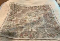
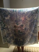
really?!!!? wow. so in AW19, how do we account for the apparent “background” differences between these two JdL CSGMs? the second seems more white.
 

Attachments

  • 20B7D551-AC08-4950-8A87-8DE5357CAE32.jpeg
    20B7D551-AC08-4950-8A87-8DE5357CAE32.jpeg
    278.1 KB · Views: 97
  • DEFD0CC8-059E-4EDD-A858-08CED523CF88.jpeg
    DEFD0CC8-059E-4EDD-A858-08CED523CF88.jpeg
    222.6 KB · Views: 94
Top