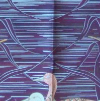
Beautiful colors!View attachment 4481489 Quick question on CW02 la cite cavaliere aw19– so little saturation due to intricate details in design?
Note reverse showing in this tie.
You are using an out of date browser. It may not display this or other websites correctly.
You should upgrade or use an alternative browser.
You should upgrade or use an alternative browser.
Scarves Hermès scarf colors
- Thread starter Jahna
- Start date
TPF may earn a commission from merchant affiliate
links, including eBay, Amazon, and others
More options
Who Replied?
I believe the saturation is because of the laser printing. Less ink so less reverse saturation, but it makes more intricate designs!View attachment 4481489 Quick question on CW02 la cite cavaliere aw19– so little saturation due to intricate details in design?
Note reverse showing in this tie.

I believe the saturation is because of the laser printing. Less ink so less reverse saturation, but it makes more intricate designs!
H University comes thru again!
so all are laser-printed now?
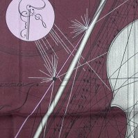
Is this silver matte what @marietouchet is referring to? In daylight I can see these greys as metallic gey silver?Yes, I noticed this on my new Mountain Zebra 90.


Lanit is this also on the Hermès copyright?Is this silver matte what @marietouchet is referring to? In daylight I can see these greys as metallic gey silver?
View attachment 4482076 View attachment 4482075
Hard to tell from photo, is the copyright in silver ? I have not seen the silver as a major part of design, just for the copyright or a tiny bit of design ( a contrasting line or two, something subtle) , the cp is done in a different ink so that it shows upIs this silver matte what @marietouchet is referring to? In daylight I can see these greys as metallic gey silver?
View attachment 4482076 View attachment 4482075
I really don’t think the zebra is silver, and there is too much grey on him for use of the silver ink
Gorgeous peach Melba colors ... tdfView attachment 4481489 Quick question on CW02 la cite cavaliere aw19– so little saturation due to intricate details in design?
Note reverse showing in this tie.
But wow the reverse is blank , some 10 years ago that would have been considered a major flaw , times change
And is the digital printing associated with less saturation ie color on the reverse, maybe but not necessarily
Yes you can adjust the flow on a digital printer to get shading effects without using another color
But you can do the same on screening but reducing/ increasing the number of times a screen is used. They do the same screen up to 8 times and the minimum is two, I think
Must go pull a digital one of mine and scrutinize , mine would be an H Cinetique , eons ago, so, maybe not typical of recent work and newer machines, I cling to my oldies and am proud of it lol
Silver ink examples
1980s MARE AUX CANARDS - the "white" lines are silver, broad, and uneven, not super well done but very unusual and very SHINY
2006 MUSIQUE DES SPHERES - the "white" lines that look like fireworks are thin, very even. The grey body of the viola is grey - not silver. You have to look up close to see the lines are silver, they are much less prominent than those on the MaC
I dont think they have ever used silver except in thin lines, there are no silver color blocks IMHO
I am drawing a blank on a recent one with silver CP - try looking on recent ones by Pierre Marie , a GF got one and was so happy at the silver ink but PM is not my thing so I promptly forgot
Attachments
Thanks MT, the copyright is in black so no, i suppose it is grey ink after all.Hard to tell from photo, is the copyright in silver ? I have not seen the silver as a major part of design, just for the copyright or a tiny bit of design ( a contrasting line or two, something subtle) , the cp is done in a different ink so that it shows up
I really don’t think the zebra is silver, and there is too much grey on him for use of the silver ink

Gorgeous peach Melba colors ... tdf
But wow the reverse is blank , some 10 years ago that would have been considered a major flaw , times change
And is the digital printing associated with less saturation ie color on the reverse, maybe but not necessarily
Yes you can adjust the flow on a digital printer to get shading effects without using another color
But you can do the same on screening but reducing/ increasing the number of times a screen is used. They do the same screen up to 8 times and the minimum is two, I think
Must go pull a digital one of mine and scrutinize , mine would be an H Cinetique , eons ago, so, maybe not typical of recent work and newer machines, I cling to my oldies and am proud of it lol
thank you, MT, for further explanation. Really makes me appreciate my older ones, too. The reverse of Equateur and Les Trois Mousquetaires are awash with color.
Some cws of Collection Imperial had silver and gold printing.Silver ink examples
1980s MARE AUX CANARDS - the "white" lines are silver, broad, and uneven, not super well done but very unusual and very SHINY
2006 MUSIQUE DES SPHERES - the "white" lines that look like fireworks are thin, very even. The grey body of the viola is grey - not silver. You have to look up close to see the lines are silver, they are much less prominent than those on the MaC
I dont think they have ever used silver except in thin lines, there are no silver color blocks IMHO
I am drawing a blank on a recent one with silver CP - try looking on recent ones by Pierre Marie , a GF got one and was so happy at the silver ink but PM is not my thing so I promptly forgot
This replyis to @textilegirl question about the similarity of colors in EArly America Scarf posted on Scarf of the Day thread.
EA was a very early scarf purchase for me on the Bay actually. I had never seen the colorway before but I loved the graphic look of the borders. It reads more graphic to me with a nice balance of white space so it always looks great with other patterns which this photo Is a good example of how I can mix it with simple graphic tees and tops. Samourais is more silver and ardoise greys with pops of yellow, and I chose it because the metallic grays balanced with the pop of lemon yellow was very yin yang. I think the EA yellow is called absinthe lr anise if I recall correctly. The yellow on the Samourais is jaune. They are not neceassarily interchangeable in my mind because EA feels casual to me where Samourai is like a power silk and a bit more serious in tone even though I can wear either with a tee and jeans. Adding more to my love of these two colors is my recent Ballade de Heian. I kept thinking that I already have EA and Samourai, but still love this colorway and subject matter is so different from the other two. i think I’ve reached my limit of yellow and silver/grey though LOL because I also have a 70 Manufacture de Boucleries and On a Summer Day 140 silk in yellow and grey!!! ACK.
I do think H repeats color schemes though they tweak the color palettes depending upon the seasonal colors that are being offered at that time. I have learned I can wear certain H colors more easily in shawls than twills, but also larger scale graphics rather than finely detailed designs.


Do others want to chime in about this?
Ah, love this one too L., but I wonder how you compare it to that other yellow/grey stunner, Samourai. I have an hypothesis that H sometimes repeats color combinations over the years (to be sure, less literally than the new color themes of the last few seasons) and find myself thinking 'now where have I seen that combo before?' (Ebay often serves as a sort of flash card system for me.) Unfortunately, I usually can't remember, LOL! In this case, I've had your EA on my radar since I first saw it ages ago and I think you are twins with @Croisette7. It seems brighter to me than Samourai, the yellow border perhaps? Do you find that you can reach for them reasonably interchangeably?
Hi dear, I will post my reply on the Color thread to avoid OT here!

EA was a very early scarf purchase for me on the Bay actually. I had never seen the colorway before but I loved the graphic look of the borders. It reads more graphic to me with a nice balance of white space so it always looks great with other patterns which this photo Is a good example of how I can mix it with simple graphic tees and tops. Samourais is more silver and ardoise greys with pops of yellow, and I chose it because the metallic grays balanced with the pop of lemon yellow was very yin yang. I think the EA yellow is called absinthe lr anise if I recall correctly. The yellow on the Samourais is jaune. They are not neceassarily interchangeable in my mind because EA feels casual to me where Samourai is like a power silk and a bit more serious in tone even though I can wear either with a tee and jeans. Adding more to my love of these two colors is my recent Ballade de Heian. I kept thinking that I already have EA and Samourai, but still love this colorway and subject matter is so different from the other two. i think I’ve reached my limit of yellow and silver/grey though LOL because I also have a 70 Manufacture de Boucleries and On a Summer Day 140 silk in yellow and grey!!! ACK.
I do think H repeats color schemes though they tweak the color palettes depending upon the seasonal colors that are being offered at that time. I have learned I can wear certain H colors more easily in shawls than twills, but also larger scale graphics rather than finely detailed designs.
Do others want to chime in about this?
This replyis to @textilegirl I have learned I can wear certain H colors more easily in shawls than twills, but also larger scale graphics rather than finely detailed designs.
View attachment 4482892 View attachment 4482903
View attachment 4482891
View attachment 4482909 View attachment 4482911
Do others want to chime in about this?
@tbbbjb
To Lanit & all re: your comment “”Some Colors easier to wear on shawls than silks” — my question: do shawl materials affect differences from silks IRL color presentation?
IMO csgm shawls are slightly more muted due to saturation into the woven fabric, whereas silkscreening on twill retains brighter colors on the surface?@tbbbjb
To Lanit & all re: your comment “”Some Colors easier to wear on shawls than silks” — my question: do shawl materials affect differences from silks IRL color presentation?
@JbizzybeetleIMO csgm shawls are slightly more muted due to saturation into the woven fabric, whereas silkscreening on twill retains brighter colors on the surface?
Thanks for asking this question.
I think I would like to get a little more specific. I do not have a Hermes store in my state so the only way I can see scarfs and shawls is when traveling or by ordering from H.com. I have noticed particularly with the color Fushia that on my current season twillys it is a bright hot pink but when I ordered the same pattern in CSGM it became a very dark purple. The photo on H.com portrays them as both looking hot pink like my twillys. Is this normal? I honestly thought maybe I was sent the incorrect shawl, but it has happened to me before with other colorways. The 100% silk ones are pretty accurate in color but the CSGM, I never know how the colors are going to translate.
Register on TPF! This sidebar then disappears and there are less ads!