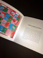
Did anyone else get ZEE BOOKLET ? not the stories, the color booklet, it had been MIA for a while
Interesting thing - bound with a bolduc on top - the ribbon prevents opening it up to copy , ergo, I have no pix to share, sorry
It is better because for each scarf shown there is a large pic of it worn and a close-up of a portion of the flat scarf - more detail is better, I like BUT...
The selection of scarves shown is odd. The old booklets used to try to show at least one of each design - at least in a pile of rumpled silk - now, there is no attempt to survey the collection in its entirety (or close). I cannot determine the overarching color themes (Purplish, veggie etc) of the collection from the few photos of the selected scarves. Ex, they feature the white/black/yellow Janos Ber - that could go with anything.
Spent time trying to think - what is the unifying theme behind the scarves shown ? It lacks the best designs (PdS in CSGM), the fav formats - mousse & CSGM, I dont think there was a single 140cm in there? hard to tell since the booklet is hard to read without cracking the spine.
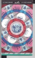
My inner marketing persona decided this is the booklet of what they WANT to sell you - simple stuff - LOWER PRICE point items, fewer screens - 4 pages devoted to ties (as in business suit ties for women), lots of losanges, Jaguar made it barely . The cover is Jeu des Omnibus remix - 5 colors in a finesse rendition
All in all they have decided to downplay the best stuff
Again no one has to agree with me
Interesting thing - bound with a bolduc on top - the ribbon prevents opening it up to copy , ergo, I have no pix to share, sorry
It is better because for each scarf shown there is a large pic of it worn and a close-up of a portion of the flat scarf - more detail is better, I like BUT...
The selection of scarves shown is odd. The old booklets used to try to show at least one of each design - at least in a pile of rumpled silk - now, there is no attempt to survey the collection in its entirety (or close). I cannot determine the overarching color themes (Purplish, veggie etc) of the collection from the few photos of the selected scarves. Ex, they feature the white/black/yellow Janos Ber - that could go with anything.
Spent time trying to think - what is the unifying theme behind the scarves shown ? It lacks the best designs (PdS in CSGM), the fav formats - mousse & CSGM, I dont think there was a single 140cm in there? hard to tell since the booklet is hard to read without cracking the spine.
My inner marketing persona decided this is the booklet of what they WANT to sell you - simple stuff - LOWER PRICE point items, fewer screens - 4 pages devoted to ties (as in business suit ties for women), lots of losanges, Jaguar made it barely . The cover is Jeu des Omnibus remix - 5 colors in a finesse rendition
All in all they have decided to downplay the best stuff
Again no one has to agree with me


 All I can guess is that my eye is drawn to the contrast between the shiny front side and the matte back side. I'd almost prefer the reverse to be stark white than to have the ghost of the pattern without it fully coming through; somehow that would look more deliberate and seamless to me than this middle-ground saturation level. But what I'd REALLY love is for the back to be almost indistinguishable from the front, like it is on this ELenK, which I'm putting in here just to give an illustration for any new collectors dropping in who might be puzzled over what I'm fretting over with the gorgeous Robe scarf.