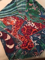
Scarves The Hermès Spring Summer 2018 Scarves

TPF may earn a commission from merchant affiliate
links, including eBay, Amazon, and others

I am thinking of Robe de soir in cw 3, the hot pink version as a head scarf for the summer, and also because I don't have a pink scarf yet.. your thoughts?

I loved it from pics and then tried it, didn't work on me. The mid-shades of blues is the most beautiful of the design for me but I've already bought 2 predominantly blue silk 90s this season.
 
After having lots of fun browsing the new collection in the boutique this Saturday, I ended up leaving with a 90cm Robe de Soir. The next morning, I found I couldn't stop thinking about the Samourais shawl in cw06, and marched back in to collect one of those too. I love how @Langsam described it as "moonlit glow." What made this colorway irresistible to me is the way that the cherry blossoms are rendered-- they remind me of seeing cherry blossoms at twilight along the river in Tokyo.

I find this colorway frustrating to photograph; in my pictures it looks flat and somewhat dull. It's neither in real life! Other TPFers have done it much more justice, but I add a couple photos anyway just because I love to see as many different tying possibilities as I can when I'm using this thread to plot purchases :cool:

View attachment 3989482 View attachment 3989487


The Robe du Soir 90cm ties so beautifully, and I love this coloration with its mixture of blues, slate grey, taupe, pops of white, and a caramel hem. However, it might not be a keeper for me. @frou frou mentioned upthread that some scarves from recent years aren't saturated on the back, and this is one of them. I find the "blank" back irritating; it means I have to fuss with my scarf more than I'd like to prevent the luminous front side from being abruptly interrupted by its matte white reverse. I know from experience that the way I tie my scarves means I won't pick up scarves that aren't saturated on the reverse. Exhibits A and B in the form of two colorways of the Samourais 90cm are sitting in my closet as evidence, having never made it out of their boxes because of their unsaturated reverses. So I had better be stern with myself and not accumulate a third such scarf just to have it gather dust!

But it's a gorgeous colorway and someone who ties differently will loooooove it. :smile:

View attachment 3989483 View attachment 3989486 View attachment 3989485 View attachment 3989484

Congratulations, very beautiful and looks very Japanese and in delicate and respectful sense.

I'm another irritated by the lack of saturation on some of the reverses of H scarves but I have to say RdS is exquisite on you and this cw is one of the best of the season. Congratulations on this too if you decide to keep.
 
After having lots of fun browsing the new collection in the boutique this Saturday, I ended up leaving with a 90cm Robe de Soir. The next morning, I found I couldn't stop thinking about the Samourais shawl in cw06, and marched back in to collect one of those too. I love how @Langsam described it as "moonlit glow." What made this colorway irresistible to me is the way that the cherry blossoms are rendered-- they remind me of seeing cherry blossoms at twilight along the river in Tokyo.

I find this colorway frustrating to photograph; in my pictures it looks flat and somewhat dull. It's neither in real life! Other TPFers have done it much more justice, but I add a couple photos anyway just because I love to see as many different tying possibilities as I can when I'm using this thread to plot purchases :cool:

View attachment 3989482 View attachment 3989487


The Robe du Soir 90cm ties so beautifully, and I love this coloration with its mixture of blues, slate grey, taupe, pops of white, and a caramel hem. However, it might not be a keeper for me. @frou frou mentioned upthread that some scarves from recent years aren't saturated on the back, and this is one of them. I find the "blank" back irritating; it means I have to fuss with my scarf more than I'd like to prevent the luminous front side from being abruptly interrupted by its matte white reverse. I know from experience that the way I tie my scarves means I won't pick up scarves that aren't saturated on the reverse. Exhibits A and B in the form of two colorways of the Samourais 90cm are sitting in my closet as evidence, having never made it out of their boxes because of their unsaturated reverses. So I had better be stern with myself and not accumulate a third such scarf just to have it gather dust!

But it's a gorgeous colorway and someone who ties differently will loooooove it. :smile:

View attachment 3989483 View attachment 3989486 View attachment 3989485 View attachment 3989484
Do you know the CW for that RdS scarf?
I am sort of obsessed with it now.....
 
  • Like
Reactions: BBC and calexandre
Ladies, thanks for all your sweet compliments and likes on my new blues. You've all encouraged me to think very hard indeed before I give up on Robe du Soir!

Do you know the CW for that RdS scarf?
I am sort of obsessed with it now.....

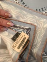
Of course, here's the hang tag! I should have posted it in my original message. Do let me know how you get on with it.... :flowers:

IMG_7138.JPG

Congratulations on your 06!! We are in a great family of fellow scarfies who have this beauty! I am sad about the Robe scarf not having a saturated back. This looks amazing on you, but that would be nerve wracking to try to keep the scarf from flipping over to the back. Seems like you would only be able to wear it a couple of ways. (Cowboy/ascot type knots or a traditional diagonal fold tied with tails in front.) These beauties are too expensive to be limited on ways to wear them. (I went back to your gorgeous pics! The ways you tied this look so pretty. Since the front is a lighter colorway, is it noticeable that the back isn't saturated? Not trying to enable you but it really is pretty.......)

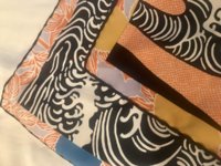
Ladybaga, thanks for your kind and encouraging comments! Honestly I've been puzzled myself as to why I find the pale back so noticeable when, as you rightly note, the front is pale (especially in one corner) as well. :huh: All I can guess is that my eye is drawn to the contrast between the shiny front side and the matte back side. I'd almost prefer the reverse to be stark white than to have the ghost of the pattern without it fully coming through; somehow that would look more deliberate and seamless to me than this middle-ground saturation level. But what I'd REALLY love is for the back to be almost indistinguishable from the front, like it is on this ELenK, which I'm putting in here just to give an illustration for any new collectors dropping in who might be puzzled over what I'm fretting over with the gorgeous Robe scarf. :smile:
IMG_8968.JPG
 
Ladies, thanks for all your sweet compliments and likes on my new blues. You've all encouraged me to think very hard indeed before I give up on Robe du Soir!


Of course, here's the hang tag! I should have posted it in my original message. Do let me know how you get on with it.... :flowers:

View attachment 3990593


Ladybaga, thanks for your kind and encouraging comments! Honestly I've been puzzled myself as to why I find the pale back so noticeable when, as you rightly note, the front is pale (especially in one corner) as well. :huh: All I can guess is that my eye is drawn to the contrast between the shiny front side and the matte back side. I'd almost prefer the reverse to be stark white than to have the ghost of the pattern without it fully coming through; somehow that would look more deliberate and seamless to me than this middle-ground saturation level. But what I'd REALLY love is for the back to be almost indistinguishable from the front, like it is on this ELenK, which I'm putting in here just to give an illustration for any new collectors dropping in who might be puzzled over what I'm fretting over with the gorgeous Robe scarf. :smile:
View attachment 3990594
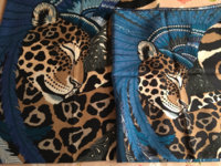
Hmm....I had to go pull out my Jaguar Quetzal to look at the back after all the lack of saturation discussion on your RdS. The JQ back looks pretty much like the front. I was thinking that maybe it was a new printing technique and the new ones would have it...but that doesn't seem to be the case. I wonder what's up with that? Back shown with front corners flipped up. IMG_1426.JPG
 
Hmm....I had to go pull out my Jaguar Quetzal to look at the back after all the lack of saturation discussion on your RdS. The JQ back looks pretty much like the front. I was thinking that maybe it was a new printing technique and the new ones would have it...but that doesn't seem to be the case. I wonder what's up with that? Back shown with front corners flipped up. View attachment 3990744

It’s in beta mode. :P
 
Top