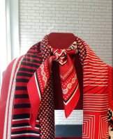
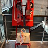
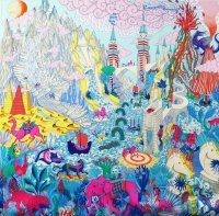
Scarves ........The Hermès Fall/Winter 2019 Scarves...........

TPF may earn a commission from merchant affiliate
links, including eBay, Amazon, and others

Yes! A wider variety of designs would be awesome! And I find it difficult to understand why there is a need for colour families when laser printing is employed...I thought they introduced laser printing to cut down on the use of colours, but since they use less now, why have colour families? :shrugs:

Hm I thought laser printing is a more precise way to print more complex and detailed modern designs.

I am still not sure how I feel about the color families myself. I can see how it's supposed to fit a more holistic design vision for Hermes etc, but even if I like a color family, I am not likely to purchase more than one scarf because I feel they are too similar otherwise. I haven't been buying as many scarves per collection, although I do thoroughly enjoy the ones I do buy.
 
My sentiments exactly , it’s very dull.
I love graphic scarves and admire the more fun busy ones like Animopalis, but it’s not much work for the H laser print machine!
Thinking of those older more painterly designs with lots of shading and fine detail, I did find them harder to wear ; they were more ladylike and I’m more into androgyny. But they should still be available.
What we need from H is more variety of design types , colour palettes and less mashups and riffs on B de G
( And I’m a diehard B de G fan , but ......)

I do wonder if they might do more 'old school' designs at some point. I think we are just in the graphic phase, but they do mix it up eventually.

I can certainly do without all the BdGs though... I own exactly one vintage scarf in that design and never really wear it.
 
  • Like
Reactions: eliwon
@Angelian: thank you for your posts and pictures! I appreciate it!

I am clearly in the minority as so far none of these scarf designs and colour ways are screaming at me to buy. The women’s scarves a bit meh to me. But early days of course and I await to see what more treasures will appear.
From long experience I can predict that not being enthused about the upcoming season's collection means you will go gaga over the one after that. This is an iron law of nature.
 
Hahaha I don’t care about the H police. These pics are all out in the open. What else is the point of holding press days?! Please post pics if you’ve seen more than what I have been able to find! :flowers:
I googled H Press Day and have to say with scarves being shown at an angle so it's hard to see the complete (or at least most of) design, the Press day pix can be a real tease. Thank you for your pictures Angelian, yours were pix a person could make buying plans with.
 
The perfect setting or decor for wearing the desserts scarf (which I will buy in every color) is the cake pictures of artist Wayne Thiebald --example below. I wandered into an exhibition room of his at a major museum and thought I'd died and gone to heaven.
images
 
Hm I thought laser printing is a more precise way to print more complex and detailed modern designs.

I am still not sure how I feel about the color families myself. I can see how it's supposed to fit a more holistic design vision for Hermes etc, but even if I like a color family, I am not likely to purchase more than one scarf because I feel they are too similar otherwise. I haven't been buying as many scarves per collection, although I do thoroughly enjoy the ones I do buy.


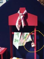
I'm sure it was. I remember a thread speaking of laser printing being the reason that the back of the scarf has greater contrast from the front. It made me think that they use less ink so are there by saving money. Perhaps a wrong conclusion to take?:shrugs:Either way the colour family; you are right I have no interest in two designs with the exact same colours, a happy accident happening years in between? Maybe, but not the same season. So far, I still miss the shading imagine animalpolis with more colour details....:D
 
My sentiments exactly , it’s very dull.
I love graphic scarves and admire the more fun busy ones like Animopalis, but it’s not much work for the H laser print machine!
Thinking of those older more painterly designs with lots of shading and fine detail, I did find them harder to wear ; they were more ladylike and I’m more into androgyny. But they should still be available.
What we need from H is more variety of design types , colour palettes and less mashups and riffs on B de G
( And I’m a diehard B de G fan , but ......)
I absolutely hate the printing now. There is no depth.
How funny, I don't find the shading and detail of earlier designs "ladylike," just more artistic, but I agree - more variety would be great! This new Cité map design is right up my alley. I thought I would love the new Amoureux de Paris from S/S but the printing really turned me off.
 
Top