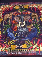
This is SO feminine, classic, and pretty! Just lovely.I have one small contribution, Poste et Cavalerie Detail Cw09Waiting for the punk horse and the pegase ..
View attachment 4960742View attachment 4960743
You are using an out of date browser. It may not display this or other websites correctly.
You should upgrade or use an alternative browser.
You should upgrade or use an alternative browser.
Scarves Spring/summer 2021 scarves
- Thread starter hermeshound
- Start date
TPF may earn a commission from merchant affiliate
links, including eBay, Amazon, and others
More options
Who Replied?

Great choice! Love how the purple leaves look like flames (to me, anyway).FedEx just dropped off my La Marche du Zambeze wash scarf 90 in noir/vert/orange. CW18. I'm wearing it now, and I'm keeping it. It is softer than most new scarves, and has the feel that I love from so many of my vintage scarves.
View attachment 4960835View attachment 4960836View attachment 4960837View attachment 4960839View attachment 4960840
On the other end of the brightness spectrum, here are more shots of my MdZ wash scarf. The wash texture is indeed scrumptious! So wearable, this has hardly left my neck since it showed up. The rose pale color is hard to capture in a photo, it definitely appears lilac-leaning pink IRL, not creme or gray. The first photo is the most color-accurate. Studying the scarf further, the "dip-dye-like" effect seems to originate from the base fabric itself. I think the entire fabric of the scarf is rose pale (including hem), then the rest of the design was printed on top of that, so every color is suffused with the rose pale, making for a very soft and low-contrast effect. For sure not as low contrast as a true dip dye, but you can tell that the scarf is not a bunch of colors separately printed on a white/plain silk. Thoughts? The first picture is most color-accurate in my opinion.


Love this on you missm. I wouldn't have considered this without your post. Going on the list to try.I have one small contribution, Poste et Cavalerie Detail Cw09
View attachment 4960742View attachment 4960743
Stunning, langsam!On the other end of the brightness spectrum, here are more shots of my MdZ wash scarf. The wash texture is indeed scrumptious! So wearable, this has hardly left my neck since it showed up. The rose pale color is hard to capture in a photo, it definitely appears lilac-leaning pink IRL, not creme or gray. The first photo is the most color-accurate. Studying the scarf further, the "dip-dye-like" effect seems to originate from the base fabric itself. I think the entire fabric of the scarf is rose pale (including hem), then the rest of the design was printed on top of that, so every color is suffused with the rose pale, making for a very soft and low-contrast effect. For sure not as low contrast as a true dip dye, but you can tell that the scarf is not a bunch of colors separately printed on a white/plain silk. Thoughts? The first picture is most color-accurate in my opinion.
View attachment 4961046
View attachment 4961047View attachment 4961049View attachment 4961050
Thank you! The Zambese wash is lovely too! Been thinking about that oneThis is SO feminine, classic, and pretty! Just lovely.
thank you! It is prettier than I thought it would beLove this on you missm. I wouldn't have considered this without your post. Going on the list to try.

@Langsam - I like the deep penetration of the colors along the border of MdZ, the browns in your colorway and the greens in mine. The black crosshatch is only on the front. It makes for very handsome tips, which nearly always show in my preferred knots.
I also like the petite fabric care tag. It is much smaller than the one on my new Ex-Libris Atlantis 70, which I promptly cut off.


I also like the petite fabric care tag. It is much smaller than the one on my new Ex-Libris Atlantis 70, which I promptly cut off.
Agree, and hooray for the smaller tag!@Langsam - I like the deep penetration of the colors along the border of MdZ, the browns in your colorway and the greens in mine. The black crosshatch is only on the front. It makes for very handsome tips, which nearly always show in my preferred knots.
I also like the petite fabric care tag. It is much smaller than the one on my new Ex-Libris Atlantis 70, which I promptly cut off.
View attachment 4961087View attachment 4961091
Mainly bright fuchsia. Some of the flowers are red with orange.This is the cw I want to try. I tried on the light blue, which is gorgeous, but I do NOT need another light blue scarf. Is the accent color red, or bright pink?
Attachments
Thank you for the inspiration, Langsam! MdZ is so beautiful on you that i placed order for the same CW, as i saw it.On the other end of the brightness spectrum, here are more shots of my MdZ wash scarf. The wash texture is indeed scrumptious! So wearable, this has hardly left my neck since it showed up. The rose pale color is hard to capture in a photo, it definitely appears lilac-leaning pink IRL, not creme or gray. The first photo is the most color-accurate. Studying the scarf further, the "dip-dye-like" effect seems to originate from the base fabric itself. I think the entire fabric of the scarf is rose pale (including hem), then the rest of the design was printed on top of that, so every color is suffused with the rose pale, making for a very soft and low-contrast effect. For sure not as low contrast as a true dip dye, but you can tell that the scarf is not a bunch of colors separately printed on a white/plain silk. Thoughts? The first picture is most color-accurate in my opinion.
So tempting!!! Thanks for all the info and these great pix. I love the idea of an entirely rose-pale base. Won't that do wonders for the complexion?On the other end of the brightness spectrum, here are more shots of my MdZ wash scarf. The wash texture is indeed scrumptious! So wearable, this has hardly left my neck since it showed up. The rose pale color is hard to capture in a photo, it definitely appears lilac-leaning pink IRL, not creme or gray. The first photo is the most color-accurate. Studying the scarf further, the "dip-dye-like" effect seems to originate from the base fabric itself. I think the entire fabric of the scarf is rose pale (including hem), then the rest of the design was printed on top of that, so every color is suffused with the rose pale, making for a very soft and low-contrast effect. For sure not as low contrast as a true dip dye, but you can tell that the scarf is not a bunch of colors separately printed on a white/plain silk. Thoughts? The first picture is most color-accurate in my opinion.
View attachment 4961046
View attachment 4961047View attachment 4961049View attachment 4961050
What? They are messing around with the fabric tags again? Good luck to future authenticators.@Langsam - I like the deep penetration of the colors along the border of MdZ, the browns in your colorway and the greens in mine. The black crosshatch is only on the front. It makes for very handsome tips, which nearly always show in my preferred knots.
I also like the petite fabric care tag. It is much smaller than the one on my new Ex-Libris Atlantis 70, which I promptly cut off.
View attachment 4961087View attachment 4961091
Am I crazy, or does it seem like this CW of Zambeze (bleu ciel / bleu jean / rose) has fewer different colors than the others? Do they do that? 
Moma you’re not! This one is more monochromatic to me but for the pops of pink. This is the one I asked my SA to order in and now I’m rethinking whether I should instead go for the navy blue with fuschia pink hem to have more of a contrast on this design. I’ll post pics when it arrives, no idea when that will be sadly. The website always seems so much faster.Am I crazy, or does it seem like this CW of Zambeze (bleu ciel / bleu jean / rose) has fewer different colors than the others? Do they do that? View attachment 4961525
Register on TPF! This sidebar then disappears and there are less ads!