My actual SOTD is one I have no problems with!! Tohu Bohu. View attachment 3890978
Sure, I would have no problem with this color way too


TPF may earn a commission from merchant affiliate
links, including eBay, Amazon, and others
My actual SOTD is one I have no problems with!! Tohu Bohu. View attachment 3890978


Another Brides Fleuries ... the first scarf I have let go from my small collection. Love the design, but the bright (almost optic) white is just too stark a contrast with my skin tone and with my wardrobe which is soft blues and grays. Lesson learned - just being beautiful isn't enough, it needs to also go with me and my closet
Another for the "What Was I Thinking?" theme...
Suite et Poursuite 70 design by Cyrille Diatkine [2015]
View attachment 3890924
View attachment 3890925
Wow, talk about TOO BRIGHT... I grabbed this one off the Bay the first time I saw the pattern because 1) 70s were being discontinued, 2) I hadn't seen any other colorways, and 3) I sort of liked the idea of cassis and orange for the holidays (I got it in December, and the circles reminded me of Christmas balls and the green of holly). I don't own anything in cassis, but it does go with fuchsia and other red-purples, which were on my mind at the time. I don't wear it often, but it's a vintage silk 70 and the two-point tie in the second pic keeps it close to my neck, where I see it as a little festive highlight -- I think a larger scarf presence could be too much like a statement of some kind. (I do wear twillys and gavroches more than I used to, so maybe that's why it's getting a second chance as a smaller-looking scarf with this knot.) I still like the pattern, and I thought the CSGM was TDF in white and blue. I may get another color someday.
This is a great topic. I learn so much when everybody gets into the details about what does and does not work for them and why. I am not ready to rehome my errors yet, so advice is welcome, but if all you have is sympathy, I'll take that too.
This one I still hope I can reclaim: Au de la cinq mers, in gold, black, and what I hoped was a wine color but is oranger than I thought. The pics in this current ebay listing get the colors about right, though you can't see that there are some highlights that are traffic-cone orange, yiikes:


I wanted a regal scarf, and it is regal. But I didn't know yet that a black border gets lost in my black wardrobe (thanks again for that insight, ElainePG) and that I prefer a pattern that goes all the way to the hem.
I thought either the gold wouldn't be too bad on me or -- ha ha -- that I could diminish or hide it (there's your "WTH was I thinking???" Hide it with what? A false beard?). But the beauty of this one is in the wonderful detail, and if I scrunch it up to hide the gold, then it's just a black border with some mustardy bits and what's the point?
I do get compliments on the details when I wear it in a draped bias fold that shows off the ships and fish and fabrics, but it's hard to make myself wear it when I have so many others that look better on me.
I made a mistake when I bought (from a lovely reseller... it definitely was NOT her fault!) this colorway of Giverny. The black border is wider than I'd like, and disappears against my black outfits, so I generally tie it as shown below. But then that puts all this yellow against my face, which only works if I wear a ton of makeup. As you can see in the photo, I try to minimize the yellow by wearing a contrasting necklace, but I don't think it does too much.
So the scarf ends up sitting unloved in the drawer, poor thing, and I really ought to re-home it; perhaps now that I've confessed my sins here, I'll do just that!
View attachment 3890983 View attachment 3890984
Wearing Cliquetis today, possible rescue from the re-homing pile:
View attachment 3890995
I really like the color of this but I hate that great big gold thing in one corner - I’m sure it has an official name but it makes me think of a sporran and my very dear Jamie Fraser is nowhere in sight so it doesn’t do much for me. [emoji56][emoji6]
Just a quick visit in answer to @eagle1002us - I am still around! I have not posted for a while because I haven’t bought any new H scarves for ages and also my small collection has really had enough airing. There really are limits to posting the same scarves over and over again.
I am also seriously ill now and getting worse. I only manage to leave the house once a week if I am lucky and mostly stay in bed. I do post on my blog and Instagram regularly, though. My present obsession is with growing out my dyed hair and embracing the grey now that I am 61. It has been cut short and I am documenting the changes .
Here is my “not really sure” scarf: Au Coeur de la Vie. I bought this colourway as I loved the colours of the plants and animals. But the bright yellow border is almost a neon shade! I also don’t care for the very centre. If I manage to tie it right, then it looks OK, especially with navy on a Summer’s day. This is an old archive photo so it is a bit blurry...
View attachment 3891055
Here is a photo from Spring this year...
View attachment 3891060
I love, love Pani La Shar Pawnee and went thru a period of orange scarves. Once that period was over (ohh, about a few years ago) I realized that this cw just does not go with anything I usually wear (except white tee). I have since got more Pani in different cw, but just cannot let go of this one.....maybe I will frame him
This mod shot is from the last time I wore him.
BIG Thank you for all your likings to my previous posting.
Here is my "what was I thinking" - A Cheval sur mon Carre". I went for it during those times when pink was my favorite color .. maybe still ?? The pink border, those pink horseshoes ...BUT this scarf stays mainly in the box.
Now I am seriously thinking if I should re-home it.View attachment 3891129


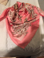
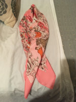
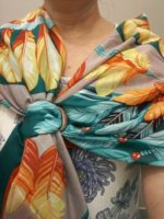
Well here’s mine. I love the design and it has sentimental value due to its Opera Garner theme. But...
The pink feels too sweet and the hits of brown, orange and red don’t cut the sweetness.
It never ties nicely, you can never see the pretty bits enough.
I now have the pink Pegase which is more sophisticated so I reach for it when I want pink.
Looks better on the bed than it does on me.
Does she stay or does she go? Perhaps try harder. Can’t remember last time I wore it:
View attachment 3891154
View attachment 3891155
View attachment 3891156
 ). Wear with taupe???
This!!!! Thank you!I can see why black borders don't often work, I felt the same about a recent try-on at H.
It's a beautiful scarf and someone will love it. I don't think scarves should have to be so much hard work and you have so many wonderful silks.

Try your Mors ring to show the fun parts so it's folded like on your bed. I like the color (surprise surprise!). Wear with taupe???
Like this:
View attachment 3891165
Wow. Love these pairings, especially the middle picture. This is really a fun week.This SO funny!!! I got a great giggle out of your description, Belphoebe--- This has to be a clear example of that which is one person's fail is another's grail! I LOVE THIS SCARF! I have the exact same color way and am so enamored by the design and the details, and the color as well. I don't usually wear it black on black, but more often with camel and rust. It's a great fall scarf for me. I'm not one for yellow, but wearing it with camel tones down the brightness.View attachment 3891091
View attachment 3891090
View attachment 3891092
View attachment 3891093
Well, how pink is it really? In this picture, only the hem. (I actually love this picture....)BIG Thank you for all your likings to my previous posting.
Here is my "what was I thinking" - A Cheval sur mon Carre". I went for it during those times when pink was my favorite color .. maybe still ?? The pink border, those pink horseshoes ...BUT this scarf stays mainly in the box.
Now I am seriously thinking if I should re-home it.View attachment 3891129
Do you wear the brown/tan shade in the scarf? That might work. I like it on the black dress, maybe without pink cardigan.Well here’s mine. I love the design and it has sentimental value due to its Opera Garner theme. But...
The pink feels too sweet and the hits of brown, orange and red don’t cut the sweetness.
It never ties nicely, you can never see the pretty bits enough.
I now have the pink Pegase which is more sophisticated so I reach for it when I want pink.
Looks better on the bed than it does on me.
Does she stay or does she go? Perhaps try harder. Can’t remember last time I wore it:
View attachment 3891154
View attachment 3891155
View attachment 3891156
The scarf is darn pretty the way you've tied it. And it's darn pretty on you. Just my opinion.I made a mistake when I bought (from a lovely reseller... it definitely was NOT her fault!) this colorway of Giverny. The black border is wider than I'd like, and disappears against my black outfits, so I generally tie it as shown below. But then that puts all this yellow against my face, which only works if I wear a ton of makeup. As you can see in the photo, I try to minimize the yellow by wearing a contrasting necklace, but I don't think it does too much.
So the scarf ends up sitting unloved in the drawer, poor thing, and I really ought to re-home it; perhaps now that I've confessed my sins here, I'll do just that!
View attachment 3890983 View attachment 3890984
Do you wear the brown/tan shade in the scarf? That might work. I like it on the black dress, maybe without pink cardigan.
I'm disappointed that it doesn't tie well. I have scarf mail coming (this design), but it's been stuck for THREE WEEKS at JFK, so I am not amused. (customs? It comes from Japan, but I have bought plenty of stuff from Japanese sellers.)
I like it with your shirt. I like the shirt a lot, too. i have multiple b&w shirts myself. The deep red and gold stands up to the shirt but doesn't fight it. Cookie, you got yourself an outfit!Wearing Cliquetis today, possible rescue from the re-homing pile:
View attachment 3890995
I really like the color of this but I hate that great big gold thing in one corner - I’m sure it has an official name but it makes me think of a sporran and my very dear Jamie Fraser is nowhere in sight so it doesn’t do much for me. [emoji56][emoji6]

Beautiful and I would love to have it bc it's a warmer pink, which works w my coloring. I've always, always loved your scarves and your styling but I can see why you don't grab this one. Most of your scarves seem to be cooler in tone (like the cardi in your photo) which is gorgeous w your coloring! I wish I could wear those cool, crisp colors but they make me look sallow.Well here’s mine. I love the design and it has sentimental value due to its Opera Garner theme. But...
The pink feels too sweet and the hits of brown, orange and red don’t cut the sweetness.
It never ties nicely, you can never see the pretty bits enough.
I now have the pink Pegase which is more sophisticated so I reach for it when I want pink.
Looks better on the bed than it does on me.
Does she stay or does she go? Perhaps try harder. Can’t remember last time I wore it:
View attachment 3891154
View attachment 3891155
View attachment 3891156


Beautiful and I would love to have it bc it's a warmer pink, which works w my coloring. I've always, always loved your scarves and your styling but I can see why you don't grab this one. Most of your scarves seem to be cooler in tone (like the cardi in your photo) which is gorgeous w your coloring! I wish I could wear those cool, crisp colors but they make me look sallow.


