I whole heartedly agree, as I'm eating my second bowl of BBQ potato chips.Never say after this bag I’m done, we all know it’s like potato chips we always want more…..

I whole heartedly agree, as I'm eating my second bowl of BBQ potato chips.Never say after this bag I’m done, we all know it’s like potato chips we always want more…..


Same!What a fun thread!
When I first saw Evelyne, I thought, what an awkward looking bag. Then I ended up with 2, and is one of my favorite bags I've ever owned.
The throws - so overated. I now also have (the Ithaque and the Vibration), and fight with hubby who gets to use it
 I also thought the Evelyne looked kind of odd at first and the perforated H didn't help either. Yet now I am going to buy it for my mum as it's literally her style for casual bags!
Oh please, can I see a photo of the throws?What a fun thread!
When I first saw Evelyne, I thought, what an awkward looking bag. Then I ended up with 2, and is one of my favorite bags I've ever owned.
The throws - so overated. I now also have (the Ithaque and the Vibration), and fight with hubby who gets to use it

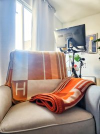
Hi! It took me a while to get these photos! The lighting is just terrible, and I suck at stagingOh please, can I see a photo of the throws?


This looks so cozy.Hi! It took me a while to get these photos! The lighting is just terrible, and I suck at staging
These are the links to the throws (so you can see the design):
Ithaque
Vibration
i would say the Ithaque doesnt look as saturated as in the photos, though it is a darker/saturated orange. The vibration orange is lighter IRL than on the website. They're both GORGEOUS, my photos don't so justice.
View attachment 5742524
