VCA ~ Van Cleef Arpels Discussion thread!

TPF may earn a commission from merchant affiliate
links, including eBay, Amazon, and others

@Storm Spirit
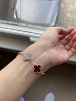
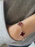
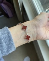
Here is a pic of how light the red gets in natural sunlight. The more natural light it gets directly on it the lighter it looks. but on me it will lean more toward intense red due to my more olive skin tone. Yeah. I don’t see “glow”. It’s more dramatic red.
The chance of it looking glowy is much higher on your skin tone. I would take some pictures from a distance in different rooms with different lighting and see if how you perceive the color changes.

7C6D2011-0FCB-4333-98B9-B0CD3A6A6D43.jpeg

CA1A9EFC-5029-423D-9E21-2FB742EA491F.jpeg

A7BC762F-877B-4911-A694-85A746DECA3E.jpeg
 
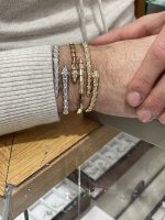
I'd love to see your WG 5 motif pave stacked with the WG Clover as I was recently thinking what else to wear with a WG Clover.
My WG Clover is coming soon. It's "on the truck", or I should say "on the plane, coming to America."

I was planning on wearing the WG Clover by itself as I don't like to jingle on my wrist. Hence I never stack bangles. Stacking bracelets are okay as they don't jingle (e.g. when wearing VCA, I do wear two WG MOP 5 motifs which I like that look as it gives it a more presence).

The WG Clover is on the thin side, and it's not quite a bold bangle look. I had been thinking of how to create a bolder look and thought if I should get a second WG Clover. Then I thought.. ugh... the jingle, I can't do it.

I typically don't like to stack bangles with bracelets as the aesthetic seems off to me as it's not quite a coordinated match (I'm a matchy matchy gal).

However, your 5 motif pave and WG Clover together sounds beautiful, and it's all in the same "WG/diamond" matchy theme.
I'd love to see a modshot if you're not shy.

I'll try to post a picture when I can, but am often pretty late doing so. I think it took me like six months to post a photo on another thread. If you don't like the jingle I can't recommend the combo, although after quite a while wearing a bangle stack it looks very fresh and clean to me, I think it is noisier or at least as noisy as a bangle combo. I love the look but each time I wear it -- pretty often these days! -- I am surprised at first by the noise. It is definitely noticeable so if you can't do jingle that may be a deal breaker. I do wear on my non-dominant wrist so there is a bit less movement and noise, but there is some
 
  • Like
Reactions: BigAkoya
Ladies, I think I have a bit of a dilemma and could really use some help! So yesterday, hubby & I went in store to pick up the carnelian bracelet my SA found. I had a good look at it in store under various lighting and it looked great! Hubby says it's the nicest shade of red he's seen, and he has seen many more bracelets than I have on his various trips. It's a very rich, vibrant shade of red while being translucent which I really like - I prefer translucent, glowy stones over opaque ones that don't let much light through (sort of reminds me of bricks for lack of a better description :lol:).

Here comes the "but"... I took it home and it looked darker than it was in store, but this was quite late at night, so I looked at it again this morning. Here's the bracelet laid out on the travel pouch:
gU6dzLD.jpg


Here you can see how much the colour differs between when it's on the travel pouch and when there's nothing blocking the light:
cE62fma.jpg


This is what it looks like on my wrist:
O7cJG5j.jpg


It's a bit darker than I would have liked and doesn't really look "red" enough. I don't know if my expectations for carnelian were unrealistic, or if I have chosen the wrong shade because on paper, this is the nicest I've seen - the colour is very saturated and vibrant, the motifs are consistent and it's very translucent (apparently it's difficult to find carnelian that's both saturated, vibrant and translucent as most are more opaque), but on my arm, it's not very red. Does it just not suit me? Or maybe the translucency doesn't work with my skin undertone?

I'm very puzzled as I liked how it looked in store, and spent a long time looking at it under different lighting - bright lights, in a dark corner, etc - but I don't know... with my MOP and guilloche bracelets, it was an instant :love: :love: :love:. I'm not really getting that same feeling with this when I'm looking at it at home on my wrist, and I can't figure out why. My SA is super super nice and said if I'm not sure, just message her and bring it back, but I feel like such a pain in the ass and I also don't like returning things unless faulty.

I think in an ideal world, I'd like the carnelian on my wrist to look more like the bright red in the second photo, but is that even possible? Should I maybe look for a more opaque shade? Ahhh :panic: :panic:
Another thought… not to make you go nuts…

But… maybe skip carnelian?
With your skin coloring and that pop you are looking for in a bracelet, I think you might love blue agate.

Just a thought as it seems carnelian is not quite giving you that ear to ear grin.
 
I'll try to post a picture when I can, but am often pretty late doing so. I think it took me like six months to post a photo on another thread. If you don't like the jingle I can't recommend the combo, although after quite a while wearing a bangle stack it looks very fresh and clean to me, I think it is noisier or at least as noisy as a bangle combo. I love the look but each time I wear it -- pretty often these days! -- I am surprised at first by the noise. It is definitely noticeable so if you can't do jingle that may be a deal breaker. I do wear on my non-dominant wrist so there is a bit less movement and noise, but there is some
Ok. Thanks. And skip the photo, no worries. I’ll ask my SA. Thank you!
 
Sounds like best plan. Her pictures are Tempting me too as I go back and forth on clover vs serpenti in wg. I am more leaning towards clover since I think it has more longevity for me but pushed this decision to next year.
It looks so good doesn’t it. My jeweler has three serpentines and they are spectacular. That is a tough choice

2A785E16-6B2D-4677-BB51-B904BFE2F235.jpeg
 
@Storm Spirit
Here is a pic of how light the red gets in natural sunlight. The more natural light it gets directly on it the lighter it looks. but on me it will lean more toward intense red due to my more olive skin tone. Yeah. I don’t see “glow”. It’s more dramatic red.
The chance of it looking glowy is much higher on your skin tone. I would take some pictures from a distance in different rooms with different lighting and see if how you perceive the color changes.

View attachment 5329806

View attachment 5329807

View attachment 5329808
Absolutely love how this stone works in WG
 
  • Love
Reactions: EpiFanatic
I actually vote for get them all! The WG onyx pave would look great with a WG clover. I pair a pave 5 motif with a clover and was super gratified in my choice when I saw the amazing picture on another thread of the always fabulous eternallove4bag with the same pairing :blush:
The VCA list always expands. I will try them on together and going to look at her posts now
 
  • Haha
Reactions: lynne_ross
Hi! I think I wrote a long post about this, but I'll summarize my thoughts here.

For me, the shade is a bit dark. It's has too much brown in it and worn against your skin increases that dark red brown, which is why you feel it does not pop. When you look at it at night, it will be even darker. That's the nature of deep red carnelian; it will get darker against your skin.

A red stone in perfect light on a light surface will always look darker indoors against skin. The translucency of carnelian increases that effect.

I prefer a more lighter orangey-red which the orange (ie. a drop of yellow) is what makes it pop more, especially a night.
For me, red stones are very dark indoors and at nighttime; hence, I prefer a lighter, orangey shade of red.

I think if you don't love it at first sight, you may want to consider another shade. I've purchase deep red stones before (e.g. Burma ruby), and it looked beautiful during the bright daylight and under bright store lights. Indoors and at night, it had zero pop and receded. I was very disappointed and never loved that ring. I wore the ring because I spent so much money on it, but every time I wore it, I would try to convince myself it's a beautiful stone because it was "so expensive" and not because it was "so bright and glowy." In the end, I got rid of that ring as it gave me an ear to ear frown.

Stone color is 100% personal preference, and don't try and convince yourself based on our opinions.
Think hard if can love this dark shade. At the end of the day, you need to stare at that bracelet and think "wow, it pops and I love it." If you are hesitating on this bracelet, return it.

If you are wiping it clean in the hopes it will get brighter or having to put your wrist under a light/lamp to make it pop... it's a big no for me. I did all that with my ruby, and those are not natural acts. You need to be able to stare at your bracelet while watching TV and think "wow, my bracelet pops, I sure do love it."

If you truly love this dark red, then this is the one and keep. It's all preference and only you can decide.
My number one advice is use our opinion as input, but use your gut feel to make your decision.
My ruby was supposed the perfect shade of pigeon-blood red which is the industry reference for a ruby. The is what heavily influenced me to purchase it. However, I have realized I don't like that dark pigeon-blood red shade; it's too dark for me.

Listen to your gut above all else. There is no right or wrong with colored stones; it is 100% preference.
Just my two cents. Hope this helps.

Yes :love: I remember your orangey red advice a few weeks ago and I'd stopped looking for the super rich, deep burgundy that I thought I wanted. This particular shade of carnelian, I love everywhere - in photos, videos, in store... until it's on my wrist at home under indoor lighting. It looks great in the bathroom where the light is much brighter and whiter, but under yellowish indoor lighting, it's probably not quite what I had in mind.

You absolutely hit the nail on the head with "having to put your wrist under a light/lamp to make it pop" - under strong lighting, I love it, and I also love the colour when it's held up to the light. Under normal lighting though, I don't feel as drawn to it as guilloche/MOP. I also purchased a coco crush ring yesterday and in comparison, this hasn't given the same "yay!!" feeling but I thought it might grow on me.

With orangey reds, I don't seem to like them quite so much on the tray as my eye is automatically drawn towards the rich reds (like this one) but on my arm, the rich reds just appear a little too dark. Everyone I've shown photos to so far loves the shade but I don't feel it suits me for some reason. I'm still very much on the fence as if I were to return this, I don't know if/when I'll find another one I like.

And slightly off topic, I don't suppose you have any photos of your ruby ring before you sold it? I love rubies too and would love to see photos!
 
Ladies, I think I have a bit of a dilemma and could really use some help! So yesterday, hubby & I went in store to pick up the carnelian bracelet my SA found. I had a good look at it in store under various lighting and it looked great! Hubby says it's the nicest shade of red he's seen, and he has seen many more bracelets than I have on his various trips. It's a very rich, vibrant shade of red while being translucent which I really like - I prefer translucent, glowy stones over opaque ones that don't let much light through (sort of reminds me of bricks for lack of a better description :lol:).

Here comes the "but"... I took it home and it looked darker than it was in store, but this was quite late at night, so I looked at it again this morning. Here's the bracelet laid out on the travel pouch:
gU6dzLD.jpg


Here you can see how much the colour differs between when it's on the travel pouch and when there's nothing blocking the light:
cE62fma.jpg


This is what it looks like on my wrist:
O7cJG5j.jpg


It's a bit darker than I would have liked and doesn't really look "red" enough. I don't know if my expectations for carnelian were unrealistic, or if I have chosen the wrong shade because on paper, this is the nicest I've seen - the colour is very saturated and vibrant, the motifs are consistent and it's very translucent (apparently it's difficult to find carnelian that's both saturated, vibrant and translucent as most are more opaque), but on my arm, it's not very red. Does it just not suit me? Or maybe the translucency doesn't work with my skin undertone?

I'm very puzzled as I liked how it looked in store, and spent a long time looking at it under different lighting - bright lights, in a dark corner, etc - but I don't know... with my MOP and guilloche bracelets, it was an instant :love: :love: :love:. I'm not really getting that same feeling with this when I'm looking at it at home on my wrist, and I can't figure out why. My SA is super super nice and said if I'm not sure, just message her and bring it back, but I feel like such a pain in the ass and I also don't like returning things unless faulty.

I think in an ideal world, I'd like the carnelian on my wrist to look more like the bright red in the second photo, but is that even possible? Should I maybe look for a more opaque shade? Ahhh :panic: :panic:
I think Carnelian is a very difficult stone as it's a changeling. I had the 20-motif Alhambra--it was a gorgeous fire engine red, but unless worn on a pristine white shirt it took on a brownish cast. I wanted to love it but didn't and I rarely wore it.
I know you want to love this, but you don't. If you don't love it now, you're not going to love it anymore later. In fact, you may well not only dislike it, but be aggravated to boot knowing you had the chance to return it but didn't.
I say move-on. There's always something else from VCA to buy--perhaps in-store right now or if not, right around the corner. It's better to buy something you love rather than something you want to love, something you're talking yourself into, something that doesn't meet your expectations, or something you love based on an image in your mind based on promotional photos, that isn't a match in real life.
 
Last edited by a moderator:
I love the shade too. The motifs are beautifully matched and I think it looks beautiful on you. As everyone has said, it looks darker on your skin simply because it's a translucent stone. I love the drama of the opaque red once against skin, but you're the one wearing it and you have to love it. Can you ask them to look for a bracelet with even lighter red? Also, in that video, I think the lighting was directly on the bracelet so that helped make the carnelian look lighter. I think the YTer has skin tone that is very similar to yours so I am guessing in indoor lighting and no special camera lighting, it will look just like yours. Let us know what you decide.

That's also another reason why I'm very on the fence - I've seen bracelets with different shade motifs (would drive me crazy) and this one is pretty much perfectly matched, which I love. I love the colour everywhere, except when it's on my wrist under most normal lighting. From a distance it looks very dark, and maybe this particular shade just doesn't suit my skintone. I have a couple of days to think it over, as the next time I'll be able to go in store is Sunday. Right now I feel it's such a pity to return it, as it's a beautiful shade, but at the same time if I don't love it, I most probably won't wear it much, which would be a waste.
 
@Storm Spirit
Here is a pic of how light the red gets in natural sunlight. The more natural light it gets directly on it the lighter it looks. but on me it will lean more toward intense red due to my more olive skin tone. Yeah. I don’t see “glow”. It’s more dramatic red.
The chance of it looking glowy is much higher on your skin tone. I would take some pictures from a distance in different rooms with different lighting and see if how you perceive the color changes.

View attachment 5329806

View attachment 5329807

View attachment 5329808

I love this red on you!! It's beautiful and very striking from a distance, and the white gold is perfect too! Is yours more opaque or translucent?
 
  • Like
Reactions: EpiFanatic
Another thought… not to make you go nuts…

But… maybe skip carnelian?
With your skin coloring and that pop you are looking for in a bracelet, I think you might love blue agate.

Just a thought as it seems carnelian is not quite giving you that ear to ear grin.

Blue agate is next on my list :lol: It's currently OOS but my SA knows I'm looking for one (as bright blue as possible). I actually purchased a few BA bracelets from the online boutique last year but they were all too dark for my liking, so I won't be purchasing coloured stones online anymore as it's too much of a lucky dip.

I seem to love carnelian on everyone else except me! Red is one of my favourite colours so I'm very, very puzzled...
 
Top