Anfang, thank you!
 Chestnutty
, yes, our SAs are really good at what they do, aren't they!
 papertiger
 and
kitty S, isn't that the beauty of Hermes scarves...they make us smile and happy! I'm also smiling reading your sweet words.
 sac-a-main
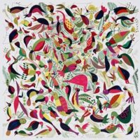
, thank you dear! As you mentioned, it's back ground (I figured b/g = back ground), looks more white in photo. You are keen!

Background color in 15 is actually like pale pink IRL, like petal of cherry blossom.
I believe rose nacre has also been used in tohubohu too, but compared to tofubofu being more pastel combination, this has more contrast in colors that might make it hard to capture the pinkness in back ground.
Same goes to other cw.
I saw 16 and 18 too, and I totally agree to Chestnutty's comment on 16 about ecru color.
18 (photo below) was very bright and fun coloring.
Am I too chatty about this design...?

 Took some quick pics, it's getting dark here and it's rainy so the colors are a bit warmer than IRL but you should be able to see it. Sorry for so many shots, I don't know how you usually wear your scarves?
 I would follow you down the street in that combo, Mindy is 100 % correct
  .
. where is it from, H or Pucci or...?
