Scarves .......... The Spring 2013 scarves ..........

TPF may earn a commission from merchant affiliate
links, including eBay, Amazon, and others

Sorry if this has already been mentioned but there are lots of gavroches on the france H site at the moment, Pique and les parisiennes are there (oh my, wish i lived in europe)!!

ooh thanks footloose for the alert! Pique is adorable in the gavroche! I can see now that they cut out a good bit of the design for the smaller version, and they are just as charming as the ones TT was posting!

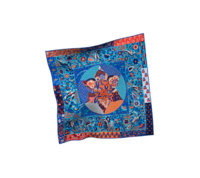
Christine Henry is my fave scarf artist and I have been feeling a bit hesitant about this design---in the GM it looks like a "country quilt" or something and I am not into quilts....but parts of it I love. I've been thinking it will be essential to see the CWs and how it folds....am curious about the 90s.

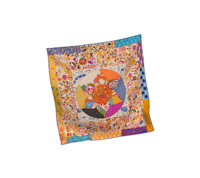
How fab is this CW? I hope they make it in the 140 size!

omg I was thinking the exact same thing!! And, I am all about the bright, contrasting CWs, too!
 
I could be wrong, but I think these scarves are for display only - a few months ago, the FSH window had beautiful neutral colorations of most of last season's scarves (lovely sepias and greys), but they were not available for sale at all. I remember reading either on TPF or on a blog that many people were asking the SAs about the window scarves!
140 silk twill of ExLibris en Kimonos sure would be lovely though!

I was wondering if this was too good to be true. Because I NEED Ex Libris enK in a 140 silk twill! (tresors not so bad, either!). Can someone in Paris pop over and ask them?? :p:graucho:
 
Mindi B said:
YES! I was trying to figure out why this design spoke to me (I'm no chess-player) and it definitely does have that mid-century modern feel. My parents had curtains in the '50s with just this sort of geometric shape-and-line print. It also reminds me a little of a Paul Klee painting. Great observation, Monceau!

Thank you for elucidating! I felt the same way, too!
 
Another Design for the new S/S 2013 Cashmere GM ~ Ceintures et Lien in CW 13 noir/orange/gris

Thank you for letting me share :smile1:

attachment.php


attachment.php
Oh my, this is glorious - classic and festive at the same time, very regal!
The list grows...:graucho:
Thank you for sharing, tinkerbell69:smile1:
 
HfromT said:
...I wholeheartedly concur, Juda! I've been collecting H scarves for about 25 years now, and this the first time that I don't want a single 90 cm silk from a collection (in fact, I truly only want the GM Echec au Roi in the blanc/rouge/gris cw). I also think the theme is odd this year, and I'm not sure how it meshes with some of the designs at all!

I find that usually there is at least one "winner" design every season...I have yet to I find that for SS13...
 
I am with those who see little of interest in the new 90 cms. I like several GMs, but the twills aren't exciting me this season. Nor are the new bags we've seen so far. The "sportif" thing does nothing for me. I personally hope the new direction H seems to be taking is not pursued, but it would be good for my wallet if it were, so I suppose that's an upside! :p


I agree with you, Mindi.
My new bag this year will be an SO B35 ~ have not seen anything from the new collection that makes me scream, "I need this NOW!".
That being said, hopefully there will be a few GMs that I can't live without.
 
Agreed! I also decided on the 140 after seeing the 90 version of Echec au Roi. The design seemed less busy & in better proportion on a 140.

I love the colors of the chess pieces & with the contemporary feel of this piece, I went with basic colors of green, yellow, blues with some black/grays on a white background :)

Here is my GM in CW 09, Blanc/Jaune Vif/Bleu.

Wow - lovely, particularly when modeled!
 
I'm yet to see ANYTHING worth coming home with me except Echec... The ultimate H for me is a 90 carre, and so far - nada. Though, of course, we haven't seen much, have we?
I was waiting for Tous les Bateaux du Monde, but couldn't help but comparing it to Jonques et Sampanes. And though the corners are richer in details, the latter was more 3D, less flat.
TouslesBateauxduMonde242723S05_zpsfcbc9cba.jpg
JonquesetSampans1_zpsa92e351e.jpg


I'm waiting for BdG with flowers, though. I am not a big fan of H classics, but couldn't stay away from mini BdG and BdG en finesse.:D
 
Masik said:
I'm yet to see ANYTHING worth coming home with me except Echec... The ultimate H for me is a 90 carre, and so far - nada. Though, of course, we haven't seen much, have we?
I was waiting for Tous les Bateaux du Monde, but couldn't help but comparing it to Jonques et Sampanes. And though the corners are richer in details, the latter was more 3D, less flat.


I'm waiting for BdG with flowers, though. I am not a big fan of H classics, but couldn't stay away from mini BdG and BdG en finesse.:D

Junques et Sampans + Voiles de Lumiere = Tous les Bateaux du Monde.
 
I'm yet to see ANYTHING worth coming home with me except Echec... The ultimate H for me is a 90 carre, and so far - nada. Though, of course, we haven't seen much, have we?
I was waiting for Tous les Bateaux du Monde, but couldn't help but comparing it to Jonques et Sampanes. And though the corners are richer in details, the latter was more 3D, less flat.
TouslesBateauxduMonde242723S05_zpsfcbc9cba.jpg
JonquesetSampans1_zpsa92e351e.jpg


I'm waiting for BdG with flowers, though. I am not a big fan of H classics, but couldn't stay away from mini BdG and BdG en finesse.:D


I'm trying to keep an open mind, even tho I love Jonques and have 3 cws, The thing that bother me the most about Bateaux is the dichotomy of the every detailed border vs the more flat looking sails. It might be different in person. Like I said, I'm trying to keep an open mind. The border of Jonques is very pretty in its own right.
 
I'm trying to keep an open mind, even tho I love Jonques and have 3 cws, The thing that bother me the most about Bateaux is the dichotomy of the every detailed border vs the more flat looking sails. It might be different in person. Like I said, I'm trying to keep an open mind. The border of Jonques is very pretty in its own right.
ITA, there is something incongruous in the marriage of the field and the border.
The border feels like a 19th century botanical etching, while the field has an almost commercial illustration feel to it. On the other hand, H scarves can do some amazing visual feats when tied, so this one may surprise.
 
jamberry and tinkerbell69, love your selections of Echec Au Roi and Ceintures et liens respectively! Thanks for the lovely pictures! Congrats!!!!!

Now for experts here, I'm looking into the 45cm Gavroche Pique Fleuri...and discovered something strange again with the color numbers!

Here is TankerToad's gavroche which she posted as colourway 09 Bleu Jean/Beige Dore/Orange
attachment.php


But Hermes France website posted this colourway as 04!!!
http://france.hermes.com/femme/peti...figurable-product-892733s-38732.html?nuance=2
attachment.php


Here is a comparison picture of TankerToad's 09 vs. Hermes website 04 on lower left corner.... they are the same colour but TT's tag shows 09 and Hermes website shows 04 for the same colour!!
attachment.php


(FYI, in Hermes website, 09 is a navy blue colour as shown below..totally different from TT's 09 above)
attachment.php


Is the C'est La Fete colour mix up happening again on this Pique Fleuri Gavroche??? Hope not! If any experts know here, please shed us some light. I really love this colour for the gavroche. Thanks thanks!
 

Attachments

  • Pique Fleuri Gavroche 892733S09.jpg
    Pique Fleuri Gavroche 892733S09.jpg
    96.8 KB · Views: 2,492
  • Pique Fleuri Gavroche 892733S04.jpg
    Pique Fleuri Gavroche 892733S04.jpg
    87.6 KB · Views: 2,529
  • IMG_0252.jpg
    IMG_0252.jpg
    47.2 KB · Views: 2,481
  • Pique Fleuri 04 vs. 09 which is correct.jpg
    Pique Fleuri 04 vs. 09 which is correct.jpg
    109.8 KB · Views: 1,565
I'm trying to keep an open mind, even tho I love Jonques and have 3 cws, The thing that bother me the most about Bateaux is the dichotomy of the every detailed border vs the more flat looking sails. It might be different in person. Like I said, I'm trying to keep an open mind. The border of Jonques is very pretty in its own right.

Very valid point, Seton. Especially for us addicts :D. BUT for the $$$$ H is charging I want to be in love with a design, not try to talk myself into it, kwim?
 
Oooh carlinha! Thanks for posting the pictures of the GM colourways of Echec Au Roi with the colour descriptions! I am sooo dead! I love 5 colourways after seeing these pix! (03, 04, 07, 12, and 13) Money tree where are you??!!!

mia and others who are interested, these are the pics i have been able to gather for the CWs... hope this helps!

03 marine/orange/ciel
echecauroi02_zpseb233eb9.jpg


04 Vert Amande/Fuchsia/Orange (GM for sure)
echecauroi04_zps9ebfe4cd.jpg


06 orange/mauve/marron
echecauroi09_zpsceadd6ca.jpg


07 Blanc/Gris/Rouge (GM for sure)
(photo courtesy of a TPF-er do not remember who?)
echecblack_zps75e6aa7f.jpg


09 blanc/jaune vif/bleu
echecauroi27_zps737e518e.jpg


13 blanc/argile clair/rose poudre (GM for sure)
(photo courtesy of chincac)
echechpink_zps3491578b.jpg
 
Top