Scarves .......... The Spring 2013 scarves ..........

TPF may earn a commission from merchant affiliate
links, including eBay, Amazon, and others

For a while H have been shamelessly courting the very young, perhaps now they trying to not scare the men by announcing scarves for the sporty.

Wow! That is exactly how I have felt....I'm a long time buyer, too. Yesterday, I was looking at the old scarf booklets.....nothing today compares to the designs of yesteryear -- I know, I know, I sound like an old lady, but that's ok. The designs were classier, solid, with interesting stories. It felt like the scarves had purpose beyond adornment. They had history.

That said, today's scarves have much more vivid colorways...a few of the blues, purples and pinks are just mesmerizing. Is it me or is the fabric is a bit different, too? I love the feel of the vintage silks.

Thanks, PT, for saying this!

I pretty much agree. these days H is getting a lot of mileage out of clocks but it seemed that the weather-vanes, perfume bottles, botanical, african masks, ships, fish, ethnic designs and seashell HS of yesteryear went beyond the contemporary mish-mash of patterns--they were about something. I like the concept of pattern mixing but sometimes it begins to get really busy. Potential exception: Zaba's nesting Russian dolls/toy box was a fairly recent attempt to combine specific items with pattern mixing; this print was interesting if busy.
 
I pretty much agree. these days H is getting a lot of mileage out of clocks but it seemed that the weather-vanes, perfume bottles, botanical, african masks, ships, fish, ethnic designs and seashell HS of yesteryear went beyond the contemporary mish-mash of patterns--they were about something. I like the concept of pattern mixing but sometimes it begins to get really busy. Potential exception: Zaba's nesting Russian dolls/toy box was a fairly recent attempt to combine specific items with pattern mixing; this print was interesting if busy.

Well said! :drinkup:
Sure, there are plenty of beauties out there now,,,,it's just different from my early days. I find the scarves from the early days are the ones I get the most compliments on....odd how that stuff works!
 
I pretty much agree. these days H is getting a lot of mileage out of clocks but it seemed that the weather-vanes, perfume bottles, botanical, african masks, ships, fish, ethnic designs and seashell HS of yesteryear went beyond the contemporary mish-mash of patterns--they were about something. I like the concept of pattern mixing but sometimes it begins to get really busy. Potential exception: Zaba's nesting Russian dolls/toy box was a fairly recent attempt to combine specific items with pattern mixing; this print was interesting if busy.


...absolutely!! I truly miss reading about the story behind the older scarves (remember how they used to include the stories behind some of them on the web site...that's gone "goodbye" too!). My dear mother called the newer designs "migraine-inducing", and she was right. And I tend to have a bias towards anything with an equestrian theme...those are few and far between these days too. :nogood:
 
Wow! That is exactly how I have felt....I'm a long time buyer, too. Yesterday, I was looking at the old scarf booklets.....nothing today compares to the designs of yesteryear -- I know, I know, I sound like an old lady, but that's ok. The designs were classier, solid, with interesting stories. It felt like the scarves had purpose beyond adornment. They had history.

That said, today's scarves have much more vivid colorways...a few of the blues, purples and pinks are just mesmerizing. Is it me or is the fabric is a bit different, too? I love the feel of the vintage silks.

Thanks, PT, for saying this!

I can still find some patterns in the new editions that I like but I definitely think the silk has become thinner and softer and wrinkles more quickly. It is not just the starching of the older ones, the silk is thicker. My latest Galop Chromatique has a very thin, almost flimsy feel.
 
When I was in Paris last week the window at FSH had 140 silk twill versions of ExLibris en Kimonos and Tresors Retrouves. Any news on these and how much they cost?
I could be wrong, but I think these scarves are for display only - a few months ago, the FSH window had beautiful neutral colorations of most of last season's scarves (lovely sepias and greys), but they were not available for sale at all. I remember reading either on TPF or on a blog that many people were asking the SAs about the window scarves!
140 silk twill of ExLibris en Kimonos sure would be lovely though!
 
Thank you for this!

you're very welcome lovely!

Name: echec au roi


Ooops, flipping pages backward lol

hahahaha whoops sorry i meant the CW names and numbers :blushing:

I absolutely have to have cw 07 (blanc/gris/rouge) of Echec au Roi in a cashmere GM!:heart: Someone posted theirs earlier on in this thread, and it brought me to my knees! Interestingly, I prefer this design in a 140 vs. a 90. In my opinion, the scale of the design works better in a larger format, and you can more clearly make out the chess pieces. Carlinha...your cw is a stunner as well! Congrats on yours too Mia...both of you wear them so well.

thank you HfromT! i agree the 140 GM is the perfect format for echec! and i am in love with the CW07 too... this design may the death of me!

I tried going onto the H France website to get at least the cw #s for these, but they don't seem to match up with the info here. Odd!

i saw that BBC! i wonder if the CWs in france are different from US??

Just for your reference... Graff Hermes 140

01
03
04
05
06
08
10

thank you so much for this lvj! i have been DYING to see the graff colors!!

Agreed! I also decided on the 140 after seeing the 90 version of Echec au Roi. The design seemed less busy & in better proportion on a 140.

I love the colors of the chess pieces & with the contemporary feel of this piece, I went with basic colors of green, yellow, blues with some black/grays on a white background :)

Here is my GM in CW 09, Blanc/Jaune Vif/Bleu.

this is another of my CW faves... i think i may need this too jamberry! looks fabulous on you!
 
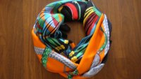
Another Design for the new S/S 2013 Cashmere GM ~ Ceintures et Lien in CW 13 noir/orange/gris

Thank you for letting me share :smile1:

attachment.php


attachment.php
 

Attachments

  • DSC07519.JPG
    DSC07519.JPG
    287.7 KB · Views: 1,672
  • DSC07531.JPG
    DSC07531.JPG
    130.6 KB · Views: 1,517
Scarfies, I am struggling this season to find a 90 carre that I realllyyyyyy like.

They either look better in GM (Echec au Roi, Tous les bateaux ..., Pique Fleuri...) or I simply don't like the design at all.

For me this is the worst season for scarves in a very long time.
Some of the previous seasons were not that wow but I always managed to find few dessins that work for me.
I miss the days when I used to buy the entire (almost) carre collection in several cws.
Am I the only one feeling this way?

although i am VERY NEW to the scarf world, i agree with you juda in that the designs look better to me in the GM shawls

This looks fabulous on you, jamberry!:loveeyes:
I usually can't do blanc (although naturel works for me - go figure!) but they way you have it tied does not put much blanc around the face, so this might work for me.
I love the feel of this, too. Very mid-century modern, but contemporary at the same time.

very well put monceau!

Thanks for the intel, carlinha, and congrats on your new GM - looks beautiful on you!

I feel your pain too, juda. I think the theme for the year is not what most of H are drawn to H for, nor willing to pay their prices for - the Swing reissue makes me gag, and I don't want a bright green cartoonish scarf from H!
I have limited funds, and typically pick 1 90 cm per collection. Because I haven't been collecting for so long, I'm drawn towards Le Songe de la Licorne as my pick for the year, but honestly if I owned La Danse du Cheval Marwari and another Annie Faivre or 2, I probably wouldn't be - and there is the issue of finding an acceptable CW. I usually love Pierre Marie, but Les Trophees really doesn't appeal to me because of the theme. Ors Bleus is surprisingly pretty though.
Sorry for the rambling :smile1:

you are welcome sophieg! the theme for H this year seems very odd to me also, not necessarily my cup of tea

How fab is this CW? I hope they make it in the 140 size!

this is stunning julian!

When I was in Paris last week the window at FSH had 140 silk twill versions of ExLibris en Kimonos and Tresors Retrouves. Any news on these and how much they cost?

:faint: oh no....

I am with those who see little of interest in the new 90 cms. I like several GMs, but the twills aren't exciting me this season. Nor are the new bags we've seen so far. The "sportif" thing does nothing for me. I personally hope the new direction H seems to be taking is not pursued, but it would be good for my wallet if it were, so I suppose that's an upside! :p

i agree with you mindi!
 
...absolutely!! I truly miss reading about the story behind the older scarves (remember how they used to include the stories behind some of them on the web site...that's gone "goodbye" too!). My dear mother called the newer designs "migraine-inducing", and she was right. And I tend to have a bias towards anything with an equestrian theme...those are few and far between these days too. :nogood:

i always wondered where those stories come from... does H not do them anymore? i LOVE reading about the design! this is too sad....

Another Design for the new S/S 2013 Cashmere GM ~ Ceintures et Lien in CW 13 noir/orange/gris

Thank you for letting me share :smile1:

attachment.php


attachment.php

OMG i never looked twice at this design but in this CW! I LOVE :drool: congrats tinkerbell!
 
jamberry said:
Agreed! I also decided on the 140 after seeing the 90 version of Echec au Roi. The design seemed less busy & in better proportion on a 140.

I love the colors of the chess pieces & with the contemporary feel of this piece, I went with basic colors of green, yellow, blues with some black/grays on a white background :)

Here is my GM in CW 09, Blanc/Jaune Vif/Bleu.

Beautiful!
 
Scarfies, I am struggling this season to find a 90 carre that I realllyyyyyy like.

They either look better in GM (Echec au Roi, Tous les bateaux ..., Pique Fleuri...) or I simply don't like the design at all.

For me this is the worst season for scarves in a very long time.
Some of the previous seasons were not that wow but I always managed to find few dessins that work for me.
I miss the days when I used to buy the entire (almost) carre collection in several cws.
Am I the only one feeling this way?

You're definitely not the only one, I think I will miss 90s this season. :shucks:
Planning only on the Equateur reissues.
 
Monceau said:
This looks fabulous on you, jamberry!:loveeyes:
I usually can't do blanc (although naturel works for me - go figure!) but they way you have it tied does not put much blanc around the face, so this might work for me.
I love the feel of this, too. Very mid-century modern, but contemporary at the same time.

I always enjoy your interpretation of items. You are always very sharp and spot on. Your intelligence shines through:-)
 
Top