We are twins on cw2! Love this. I wasn’t sure about this one or the blue/pink, but it’s got a lot of great colors in it and I think it fills a hole in my scarf wardrobe.Hi G & T, colourways 1 and 2 as requested. Taken on a rainy dark British day, west facing bedroom with incandescent bulbs lit, so this will affect the hue slightly. But you’ll get the idea. I’m really glad that I purchased both, they are so pretty.
You are using an out of date browser. It may not display this or other websites correctly.
You should upgrade or use an alternative browser.
You should upgrade or use an alternative browser.
Scarves ........The Hermès Fall/Winter 2019 Scarves...........
- Thread starter Angelian
- Start date
TPF may earn a commission from merchant affiliate
links, including eBay, Amazon, and others
More options
Who Replied?This is so pretty.View attachment 4504054 Sorry but it’s just too hot here to spend much time trying on my new scarves so I just took one quick pic of this scarf. Hope this helps View attachment 4504037 View attachment 4504038
It's from Europe but jbizzybeetle is in the US and should be getting hers this week.Love this design and colorway. Is this from US or Europe?
Hello. I know the mountain zebra is getting a lot of coverage here, but I hope you don't mind me sharing these comparison photos of 08 (with the pink zebra), 07 (fuschia/aqua), and 01 (the "original"):
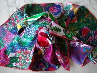
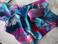
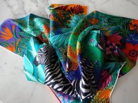
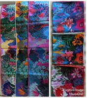

They are all so heart-breakingly beautiful, but I (shockingly) don't know if I want to keep any of them. Maybe it's the print scale and density? Maybe it's the sweetness of the design? Or maybe it's my generally inability to choose between them that is making me throw up my hands? I don't know.
Thoughts?
Great comparison pictures. They are all beautiful. To make a decision about which one to keep or none, it may be helpful to think about what you have in your wardrobe to go with each CW and whether you already have other scarves in those colors.Hello. I know the mountain zebra is getting a lot of coverage here, but I hope you don't mind me sharing these comparison photos of 08 (with the pink zebra), 07 (fuschia/aqua), and 01 (the "original"):
View attachment 4504455
View attachment 4504456 View attachment 4504457 View attachment 4504458 View attachment 4504459
They are all so heart-breakingly beautiful, but I (shockingly) don't know if I want to keep any of them. Maybe it's the print scale and density? Maybe it's the sweetness of the design? Or maybe it's my generally inability to choose between them that is making me throw up my hands? I don't know.
Thoughts?
Great comparison pictures. They are all beautiful. To make a decision about which one to keep or none, it may be helpful to think about what you have in your wardrobe to go with each CW and whether you already have other scarves in those colors.
Absolutely agree with this as am/was having same dilemma about CW 1.
I decided to keep without regret. It goes well with my non-summer wardrobe. It is beautiful, and therefore it will present itself when the outfit is right...
Between the three, 08 looks best on you in my opinion.Hello. I know the mountain zebra is getting a lot of coverage here, but I hope you don't mind me sharing these comparison photos of 08 (with the pink zebra), 07 (fuschia/aqua), and 01 (the "original"):
View attachment 4504455
View attachment 4504456 View attachment 4504457 View attachment 4504458 View attachment 4504459
They are all so heart-breakingly beautiful, but I (shockingly) don't know if I want to keep any of them. Maybe it's the print scale and density? Maybe it's the sweetness of the design? Or maybe it's my generally inability to choose between them that is making me throw up my hands? I don't know.
Thoughts?

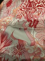
I love etoupe too and, maybe you agree with me, to me it reads a warm neutral. The close up below might be more helpful if it was taken in natural light, but what I think it shows well is how the cool pale pink is offset by the warm grey. To my eye, this contrast of warm and cool is what allows the creators to produce a scarf of great depth and interest, despite the limited palette.Gorgeous! You've made me take a second look at this red color way! Would you describe the darker neutral as true gray or more of a taupe-gray? Etoupe is my favorite bag color, and sadly, I've realized that more of my scarves have gray than tan shades. Thanks for any additional comments on this!
I have to say that before I compared these two colourways, I hadn’t realized quite how grey this scarf is. It’s not by any means dull, it’s just modest.
Hello. I know the mountain zebra is getting a lot of coverage here, but I hope you don't mind me sharing these comparison photos of 08 (with the pink zebra), 07 (fuschia/aqua), and 01 (the "original"):
View attachment 4504455
View attachment 4504456 View attachment 4504457 View attachment 4504458 View attachment 4504459
They are all so heart-breakingly beautiful, but I (shockingly) don't know if I want to keep any of them. Maybe it's the print scale and density? Maybe it's the sweetness of the design? Or maybe it's my generally inability to choose between them that is making me throw up my hands? I don't know.
Thoughts?
They are beautiful...how do you feel in one or more?
Just me: I’ve learned not every beautiful scarf works for me emotionally. If I don’t feel like a million dollars in a $415 scarf, back it goes.
I really love my Cosmographia in Rose / Rouge / Blanc. It’s my first red scarf and also the first scarf whose tag I removed. I posted before about the coral tones in this scarf and now I am posting some comparison shots with the Cosmographia Blanc / Vert / Corail. Apologies for looking scruffy - it’s full on Eskandar sweater weather here in the Southern Hemisphere!View attachment 4504151View attachment 4504161View attachment 4504163View attachment 4504166View attachment 4504167View attachment 4504168
your tie/styling really show off this scarf!
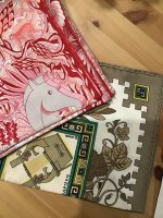
Back again! Your question intrigued me so I found something to help understand the the Cosmographia grey. This scarf is a very old Musique des Dieux (my first ever H) and the grey is super warm, almost bronze. Using this comparison you can see that although the grey in the red Cosmographia might be warm, it’s definitely not a taupe.Gorgeous! You've made me take a second look at this red color way! Would you describe the darker neutral as true gray or more of a taupe-gray? Etoupe is my favorite bag color, and sadly, I've realized that more of my scarves have gray than tan shades. Thanks for any additional comments on this!
Last edited:
Thank you!your tie/styling really show off this scarf!
@FugitiveRouge - While you may not have solved your dilemma, you've solved mine! I need that blue/pink MZ after all. Who knew?Hello. I know the mountain zebra is getting a lot of coverage here, but I hope you don't mind me sharing these comparison photos of 08 (with the pink zebra), 07 (fuschia/aqua), and 01 (the "original"):
View attachment 4504455
View attachment 4504456 View attachment 4504457 View attachment 4504458 View attachment 4504459
They are all so heart-breakingly beautiful, but I (shockingly) don't know if I want to keep any of them. Maybe it's the print scale and density? Maybe it's the sweetness of the design? Or maybe it's my generally inability to choose between them that is making me throw up my hands? I don't know.
Thoughts?
But, back to you. You may not have found the color way that most resonates with you. Perhaps the Cobalt/Curry/Ciel color way (cw 08) will work best. That one, for some reason, does make me feel like $1,000,000, to use the expression of @Jbizzybeetle at tPF. Perhaps it is all of the glorious "gold" in it contrasted against the rich, deep, vibrant blues? I had not expected to fall so hard for that one. That said, return them all if you don't "love" any of them. If you will not wear them (or frame them) they serve no purpose for you.
Register on TPF! This sidebar then disappears and there are less ads!
