Oooh, put me on that "like" list also! Love the hem.A@abq2atl
I don't do yellow and brown, so those 2 don't appeal to me.
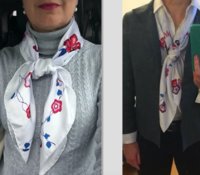
Mors et gourmettes remix.
Here is my least- loved scarf. I bought It early on, encouraged by DH and SA. Although DH now says it is his least favorite scarf of mine also. I think I may have worn it once.
For me, the colors just feel too bright. I can easily imagine this scarf on some of the other ladies here.
@Joannadyne and maybe @Cordeliere
After I bought this, I later bought the same design in the ciel/ blue CW, and have worn that one a lot!
View attachment 3890555 View attachment 3890556
You are using an out of date browser. It may not display this or other websites correctly.
You should upgrade or use an alternative browser.
You should upgrade or use an alternative browser.
Scarves Scarf Of The Day - Which Hermès scarf are you wearing today?
- Thread starter ABQ2ATL
- Start date
TPF may earn a commission from merchant affiliate
links, including eBay, Amazon, and others
- Status
- Not open for further replies.
More options
Who Replied?I love this theme!!
It will be fun/interesting to see if one person's "fail" is somebody else's "grail"..........
It will be fun/interesting to see if one person's "fail" is somebody else's "grail"..........

Another Brides Fleuries ... the first scarf I have let go from my small collection. Love the design, but the bright (almost optic) white is just too stark a contrast with my skin tone and with my wardrobe which is soft blues and grays. Lesson learned - just being beautiful isn't enough, it needs to also go with me and my closet ")
Attachments
Another Brides Fleuries ... the first scarf I have let go from my small collection. Love the design, but the bright (almost optic) white is just too stark a contrast with my skin tone and with my wardrobe which is soft blues and grays. Lesson learned - just being beautiful isn't enough, it needs to also go with me and my closet
Brides Fleuries is an interesting scarf -- I love the "faux-embroideries" but agree that the optic white is hard to carry off. I thought hard about the one like yours with the pale parme (lavender/gray) pattern in the center, which seemed to suit the flowerlets best. In the end, I passed on it, but may reconsider someday as I'm gradually warming to white scarves. Thanks for sharing!
Last edited:
Another for the "What Was I Thinking?" theme...
Suite et Poursuite 70 design by Cyrille Diatkine [2015]


Wow, talk about TOO BRIGHT... I grabbed this one off the Bay the first time I saw the pattern because 1) 70s were being discontinued, 2) I hadn't seen any other colorways, and 3) I sort of liked the idea of cassis and orange for the holidays (I got it in December, and the circles reminded me of Christmas balls and the green of holly). I don't own anything in cassis, but it does go with fuchsia and other red-purples, which were on my mind at the time. I don't wear it often, but it's a vintage silk 70 and the two-point tie in the second pic keeps it close to my neck, where I see it as a little festive highlight -- I think a larger scarf presence could be too much like a statement of some kind. (I do wear twillys and gavroches more than I used to, so maybe that's why it's getting a second chance as a smaller-looking scarf with this knot.) I still like the pattern, and I thought the CSGM was TDF in white and blue. I may get another color someday.
Suite et Poursuite 70 design by Cyrille Diatkine [2015]
Wow, talk about TOO BRIGHT... I grabbed this one off the Bay the first time I saw the pattern because 1) 70s were being discontinued, 2) I hadn't seen any other colorways, and 3) I sort of liked the idea of cassis and orange for the holidays (I got it in December, and the circles reminded me of Christmas balls and the green of holly). I don't own anything in cassis, but it does go with fuchsia and other red-purples, which were on my mind at the time. I don't wear it often, but it's a vintage silk 70 and the two-point tie in the second pic keeps it close to my neck, where I see it as a little festive highlight -- I think a larger scarf presence could be too much like a statement of some kind. (I do wear twillys and gavroches more than I used to, so maybe that's why it's getting a second chance as a smaller-looking scarf with this knot.) I still like the pattern, and I thought the CSGM was TDF in white and blue. I may get another color someday.
Last edited:
While we're on the subject of orange, which I do like when it's paired with the right colors:
Premieres Mains by Zoé Pauwels [1990 design with reissues]

I've talked about this scarf before, how I chose it for the center designs and ignored the orange, then tried every way I could to hide the border (despite the fact that the contrast hem is lavender!) It's a kind of a love-it-or-hate-it scarf, I find.
Then I found it in another color, and the blue border and peach hem goes much better with what I wear...but it's a little dull compared to the other one (probably the brown/beige center)

I'm pretty happy with the blue, but I kind of miss that lavender contrast hem -- again, the two-point knot to the rescue:

Maybe I'm not quite ready to give either of them up...
Premieres Mains by Zoé Pauwels [1990 design with reissues]
I've talked about this scarf before, how I chose it for the center designs and ignored the orange, then tried every way I could to hide the border (despite the fact that the contrast hem is lavender!) It's a kind of a love-it-or-hate-it scarf, I find.
Then I found it in another color, and the blue border and peach hem goes much better with what I wear...but it's a little dull compared to the other one (probably the brown/beige center)
I'm pretty happy with the blue, but I kind of miss that lavender contrast hem -- again, the two-point knot to the rescue:
Maybe I'm not quite ready to give either of them up...
Last edited:
I love the orange one!While we're on the subject of orange, which I do like when it's paired with the right colors:
Premieres Mains by Zoé Pauwels [1990 design with reissues]
View attachment 3890944
I've talked about this scarf before, how I chose it for the center designs and ignored the orange, then tried every way I could to hide the border (despite the fact that the contrast hem is lavender!) It's a kind of a love-it-or-hate-it scarf, I find.
Then I found it in another color, and the blue border and peach hem goes much better with what I wear...but it's a little dull compared to the other one (probably the brown/beige center)
View attachment 3890947
I'm pretty happy with the blue, but I kind of miss that lavender contrast hem -- again, the two-point knot to the rescue:
View attachment 3890955
Maybe I'm not quite ready to give either of them up...
Maybe if you tie the blue one in the same knot?
 Secretly, however, I must admit that the Hermesmatic thread shows hope and promise in scarf transformation.
Yes, this is the one with the pale lavender center. It is so pale and icy it's hard to see even IRL. If the lavender was more visible so that the white was more "accent" than "main event", it would have been more wearable for me.Brides Fleuries is an interesting scarf -- I love the "faux-embroideries" but agree that the optic white is hard to carry off. I thought hard about the one with the pale parme (lavender/gray) pattern in the center, which seemed to suit the flowerlets best. In the end, I passed on it, but may reconsider someday as I'm gradually warming to white scarves. Thanks for sharing!
Last edited:
While we're on the subject of orange, which I do like when it's paired with the right colors:
Premieres Mains by Zoé Pauwels [1990 design with reissues]
View attachment 3890944
I've talked about this scarf before, how I chose it for the center designs and ignored the orange, then tried every way I could to hide the border (despite the fact that the contrast hem is lavender!) It's a kind of a love-it-or-hate-it scarf, I find.
Then I found it in another color, and the blue border and peach hem goes much better with what I wear...but it's a little dull compared to the other one (probably the brown/beige center)
View attachment 3890947
I'm pretty happy with the blue, but I kind of miss that lavender contrast hem -- again, the two-point knot to the rescue:
View attachment 3890955
Maybe I'm not quite ready to give either of them up...
Yes, that is a LOT of border. The asymmetric knot hides it well.
My actual SOTD is one I have no problems with!! Tohu Bohu. 
This is a great topic. I learn so much when everybody gets into the details about what does and does not work for them and why. I am not ready to rehome my errors yet, so advice is welcome, but if all you have is sympathy, I'll take that too.
This one I still hope I can reclaim: Au de la cinq mers, in gold, black, and what I hoped was a wine color but is oranger than I thought. The pics in this current ebay listing get the colors about right, though you can't see that there are some highlights that are traffic-cone orange, yiikes:


I wanted a regal scarf, and it is regal. But I didn't know yet that a black border gets lost in my black wardrobe (thanks again for that insight, ElainePG) and that I prefer a pattern that goes all the way to the hem.
I thought either the gold wouldn't be too bad on me or -- ha ha -- that I could diminish or hide it (there's your "WTH was I thinking???" Hide it with what? A false beard?). But the beauty of this one is in the wonderful detail, and if I scrunch it up to hide the gold, then it's just a black border with some mustardy bits and what's the point?
I do get compliments on the details when I wear it in a draped bias fold that shows off the ships and fish and fabrics, but it's hard to make myself wear it when I have so many others that look better on me.
This one I still hope I can reclaim: Au de la cinq mers, in gold, black, and what I hoped was a wine color but is oranger than I thought. The pics in this current ebay listing get the colors about right, though you can't see that there are some highlights that are traffic-cone orange, yiikes:
I wanted a regal scarf, and it is regal. But I didn't know yet that a black border gets lost in my black wardrobe (thanks again for that insight, ElainePG) and that I prefer a pattern that goes all the way to the hem.
I thought either the gold wouldn't be too bad on me or -- ha ha -- that I could diminish or hide it (there's your "WTH was I thinking???" Hide it with what? A false beard?). But the beauty of this one is in the wonderful detail, and if I scrunch it up to hide the gold, then it's just a black border with some mustardy bits and what's the point?
I do get compliments on the details when I wear it in a draped bias fold that shows off the ships and fish and fabrics, but it's hard to make myself wear it when I have so many others that look better on me.
I made a mistake when I bought (from a lovely reseller... it definitely was NOT her fault!) this colorway of Giverny. The black border is wider than I'd like, and disappears against my black outfits, so I generally tie it as shown below. But then that puts all this yellow against my face, which only works if I wear a ton of makeup. As you can see in the photo, I try to minimize the yellow by wearing a contrasting necklace, but I don't think it does too much.
So the scarf ends up sitting unloved in the drawer, poor thing, and I really ought to re-home it; perhaps now that I've confessed my sins here, I'll do just that!


So the scarf ends up sitting unloved in the drawer, poor thing, and I really ought to re-home it; perhaps now that I've confessed my sins here, I'll do just that!
Last edited:

Fairytales was one of the first scarves I bought. Here I’m modeling it as a 20something in nyc. Loved the colors and the design but it didn’t fit my wardrobe at all. Only scarf I’ve let go!
Sympathy for your plight, @Belphoebe , and you made me laugh out loud with your comment about "hiding" the gold with a false beard. This wouldn't be a good scarf for me, either, for precisely the same reasons, yet I could see myself being tempted by it too.This is a great topic. I learn so much when everybody gets into the details about what does and does not work for them and why. I am not ready to rehome my errors yet, so advice is welcome, but if all you have is sympathy, I'll take that too.
This one I still hope I can reclaim: Au de la cinq mers, in gold, black, and what I hoped was a wine color but is oranger than I thought. The pics in this current ebay listing get the colors about right, though you can't see that there are some highlights that are traffic-cone orange, yiikes:
I wanted a regal scarf, and it is regal. But I didn't know yet that a black border gets lost in my black wardrobe (thanks again for that insight, ElainePG) and that I prefer a pattern that goes all the way to the hem.
I thought either the gold wouldn't be too bad on me or -- ha ha -- that I could diminish or hide it (there's your "WTH was I thinking???" Hide it with what? A false beard?). But the beauty of this one is in the wonderful detail, and if I scrunch it up to hide the gold, then it's just a black border with some mustardy bits and what's the point?
I do get compliments on the details when I wear it in a draped bias fold that shows off the ships and fish and fabrics, but it's hard to make myself wear it when I have so many others that look better on me.
It might be good in a very wide bias fold and then the ends tucked into the vee of an open suit jacket, if you ever wear scarves that way. All the lovely details would be up around your face, the borders would be hidden, and more gold than orange would show.
Or you could bite the bullet and re-home it.

- Status
- Not open for further replies.
Register on TPF! This sidebar then disappears and there are less ads!