You are using an out of date browser. It may not display this or other websites correctly.
You should upgrade or use an alternative browser.
You should upgrade or use an alternative browser.
Scarves Scarf of The Day 2023- Which Hermès scarf are you wearing today?
- Thread starter bunnycat
- Start date
TPF may earn a commission from merchant affiliate
links, including eBay, Amazon, and others
- Status
- Not open for further replies.
More options
Who Replied?Omg!A post and a little challenge today...
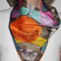
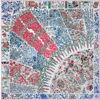
The wonderful Annie Faivre has made the most economical scarf (maths H of course as we then want all of them) and the most beautiful cover.
Can you help me find the 18 designs hidden in "Au fil du carré" ?
View attachment 5694186View attachment 5694187View attachment 5694188
1. Dômes célestes
2. Tapis volants
3. Cavaliers du Caucase
4. Ors nomades
5. Libre comme l'air
6. Art des steppes
7. Au fil de la soie
8. La danse du cheval Marwari
9. Rencontre océane
10. Tapis de selle
11. Légendes de l'arbre
12.... Etc
I'm drying!
Another cw...
View attachment 5694189
Now I want a Au Fil du Carre!
You won't be desapointed !Omg!
Now I want a Au Fil du Carre!
Taking off from @xincin's post this morning, I am posting two examples today. Two by Ledoux! The first, Carrick a Pompe, was issued in 1953 and so is on my list of birth year scarves. I was delighted that Hermes released a reissue last fall in the vintage 70 format. The original had already been reissued over the years in additional cws, but this one features a very cute border and a navy contrast hem.

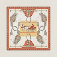
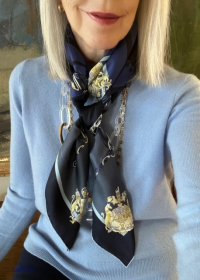
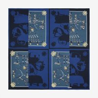
My second example is a 140 silk-- Harnais de Cour en Patch. This design had already been reissued in CSGM, bandana and in tattoo redesigns over the years. Here is the description of the recent (2020?) 140 from the website.
"Philippe Ledoux is part of Hermès history. His Harnais de Cour design is reinterpreted here. The single harness from the original is multiplied by four to form a patchwork of pairs facing off. The richly decorated pieces from Ledoux’s composition are rendered here with a stark two-tone motif that covers half of each section."
I like this design very much for the blend of the traditional look with the two-tone patches-- which remind me of the saturated colors of dip-dye scarves and also of the bi-color tattoo version (although that was a jacquard). This is my SOTD.


Dear Agrume, I send you my heartfelt sympathy for whatever you are going through at this time.Grateful for the distraction this forum provided in a very sad time for our family: scarves, kittens and dogs!
SOTD is the multi 2023 spring / summer scarf, not sure whether on theme with e.g. Brides de destin?
View attachment 5693511
 ❤️ Your grey/silver pairing is lovely.
It is beautiful! Fantastic purchase. Congratulations @greycity!SOTD is my newest CSGM and only purchase so far from the current season, Mon Premier Galop in Naturel / Bleu / Corail
I love the graphic print on this one and how well the pattern goes with the weave!
View attachment 5694201
Both are so pretty on you!Hello, Scarflandia. I am pretty sure any time a scarf has the word "remix" in the title it is likely to be a new take on a prior design! The very first Hermes scarf, “Jeu des Omnibus et Dames Blanches,” debuted in 1937, and was created from a woodblock engraving by Robert Dumas, a member of the extended Hermès family. Named after a popular parlor game, the scarf featured a group of women enjoying the sport at center, encircled by two concentric rings of horse-drawn buses. In 2007, Hermes issued a vintage 70 scarf of the same design to celebrate the 70th anniversary of the first carre. And then in 2017, Hermes issued Jeu Des Omnibus Remix by Gianpaolo Pagni. This design puts a new spin on the first scarf print with the addition of geometric lines and circles. Here are photos of the original (which I do not have), the 70 vintage anniversary issue and my cw of the Remix:
View attachment 5693566View attachment 5693573View attachment 5693585
And mod shots (of course!)
View attachment 5693569
View attachment 5693586
Thank you LKB ... I recently found a 2. basket in pristine condition.The green border Plumes is so lovely as is the new one but in such a different way! And I adore your cw of Ex Libris les Parisiennes @Croisette7. Beautiful color combo. And I too prefer the baskets on Les Pivoines
This is fantastic @ajaxbreaker-- I love both on you (and am posting Pagni today too-- following along in your path!
Thank you so much @momasaurus. An unexpected delight.
Such interesting analysis and two great formats of Dallet's iconic work (sisters on the MT Cut-- a fave of mine). I loved your close "reading" of the shawl for evidence of influence but wonder why it is going back? So interesting to me-- it is like landing in Oz from Kansas-- black and white to color...Thank you for a great post @ajaxbreaker!
As everyone has said, and I can only concur, orange is your color @Thelittlefoxes. To paraphrase the pop culture show "Orange is the New Scarf." (and the old scarf, too)
You look amazing in your Wild Singapore @Snausages-- go ahead and leave the classic to others (though I know you would rock that look too!)
Thank you for this information @Ashanti_Rose!
This is a terrific post and amazing that you have that Teuf-Teuf in such a fun color @Redbirdhermes. I think, like you, the side of Formule Chic that you are showing today has strong appeal for me...My DH loves classic cars and we are often to be found at fairs and shows featuring them. Now I need to wear an automobile scarf next time we go!
What fun and your muffler is beautiful @leechiyong -- such a surprising juxtaposition of the figure on the classic muffler. That's H for you! Always unexpected and delightful...
A lovely comparison and beautiful silks @Coco2606!
Oh ... you have the blue one ... so beautiful, Nomad!@Croisette7 I love the basket
too!!
View attachment 5693737View attachment 5693738View attachment 5693739
Thank you kindly, Stylehound!Dear Croisette,
Seeing your scarves is like being in a gallery of modern silk art! Smartly and beautifully presented!
Thank you Snausages ... honestly more to the vintage side.Table is adorable @xincinsin !
Fabulous examples @Croisette7 - curious if you have a preference for the old or new versions
Beautiful examples @ajaxbreaker !
You’ve tamed this swath of beauty @Thelittlefoxes - how did you do this?! Looks casual yet elegant
Love all these modern twists @Pirula - and love the jackets too!
TY @bunnycat and squeee with Pickles!
Ve never seen Teuf teuf - how cool to have this SE @Redbirdhermes ! And excellent points on the design elements
@leechiyong love your robots! Eager to see mod shots of your Farrier rectangle
H does feathers so beautifully @Coco2606
Sending virtual hugs @Agrume - you look great in the special scarf
Love the horses @LKBNOLA snd fabulous display of the Jeu evolution
TY @LKBNOLA but it’ll take a lot to get me away from dinosaurs and Kluskas
Love the brights @Teaforparrots and I’m envious of your blooming cactus - I’ve had mine for a year and it’s growing but not flowering. You must have a green thumb!
And looks great with the plaid @hermesguy
These pinks are wonderful @Nomad
TY @Stylehound !
Thank you Maedi!Great comparison. The Plumes has such beautiful shades of green.
Subtle colors. So nice !Taking off from @xincin's post this morning, I am posting two examples today. Two by Ledoux! The first, Carrick a Pompe, was issued in 1953 and so is on my list of birth year scarves. I was delighted that Hermes released a reissue last fall in the vintage 70 format. The original had already been reissued over the years in additional cws, but this one features a very cute border and a navy contrast hem.
View attachment 5694210View attachment 5694212
My second example is a 140 silk-- Harnais de Cour en Patch. This design had already been reissued in CSGM, bandana and in tattoo redesigns over the years. Here is the description of the recent (2020?) 140 from the website.
"Philippe Ledoux is part of Hermès history. His Harnais de Cour design is reinterpreted here. The single harness from the original is multiplied by four to form a patchwork of pairs facing off. The richly decorated pieces from Ledoux’s composition are rendered here with a stark two-tone motif that covers half of each section."
I like this design very much for the blend of the traditional look with the two-tone patches-- which remind me of the saturated colors of dip-dye scarves and also of the bi-color tattoo version (although that was a jacquard). This is my SOTD.
View attachment 5694215View attachment 5694216
Congratulations! It suits you so well greycity!SOTD is my newest CSGM and only purchase so far from the current season, Mon Premier Galop in Naturel / Bleu / Corail
I love the graphic print on this one and how well the pattern goes with the weave!
View attachment 5694201
Very stylish!Taking off from @xincin's post this morning, I am posting two examples today. Two by Ledoux! The first, Carrick a Pompe, was issued in 1953 and so is on my list of birth year scarves. I was delighted that Hermes released a reissue last fall in the vintage 70 format. The original had already been reissued over the years in additional cws, but this one features a very cute border and a navy contrast hem.
View attachment 5694210View attachment 5694212
My second example is a 140 silk-- Harnais de Cour en Patch. This design had already been reissued in CSGM, bandana and in tattoo redesigns over the years. Here is the description of the recent (2020?) 140 from the website.
"Philippe Ledoux is part of Hermès history. His Harnais de Cour design is reinterpreted here. The single harness from the original is multiplied by four to form a patchwork of pairs facing off. The richly decorated pieces from Ledoux’s composition are rendered here with a stark two-tone motif that covers half of each section."
I like this design very much for the blend of the traditional look with the two-tone patches-- which remind me of the saturated colors of dip-dye scarves and also of the bi-color tattoo version (although that was a jacquard). This is my SOTD.
View attachment 5694215View attachment 5694216
Agrume,Grateful for the distraction this forum provided in a very sad time for our family: scarves, kittens and dogs!
SOTD is the multi 2023 spring / summer scarf, not sure whether on theme with e.g. Brides de destin?
View attachment 5693511
Please accept my deep sympathies regarding this time in you and family’s life.
The CSGM is magnificent and bold.Jeu d‘Omnibus ... I regret I miss the 70 in my collex
gavroche
View attachment 5694226
CSGM
View attachment 5694228
View attachment 5694227
 Just gorgeous. Both colors. The little 70 shows up now and again-- I like the pink one too but I would love to see your new Les Pivoines with the basket! I am trying to find one-- it would be so pretty for spring! Your Omnibus gav is delightful @Croisette7!
Giverny was designed by Laurence Bourthoumieux in 1989 and features flowers from Monet's beautiful gardens surrounding the central image of the iconic Japanese bridge over his water lilies. The scarf is surrounded by a colored bamboo frame with a wide, solid-colored border and a matching hem. Here is a photo of my scarf along with a couple of photos I took when I visited the gardens in 2002.
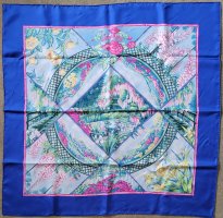


In their A/W 2017 collection Hermes released a different Giverny garden scarf called Fleurs de Giverny by Christine Henry. Here we have a new interpretation of the famous gardens where the floral design fills most of the scarf, which is surrounded by a border of flower vignettes and a contrasting hem. The perspective is no longer from ground level, but is an aerial view. In place of the usual circular scarf designs of the past, Henry's scarf is based on a quarter section of a circle. For illustration I selected the Hermes photo of CW15 which has many pink flowers, much like the actual garden photograph above which I took from a second story window of Monet’s home.
My scarf of the day is the original Giverny.


In their A/W 2017 collection Hermes released a different Giverny garden scarf called Fleurs de Giverny by Christine Henry. Here we have a new interpretation of the famous gardens where the floral design fills most of the scarf, which is surrounded by a border of flower vignettes and a contrasting hem. The perspective is no longer from ground level, but is an aerial view. In place of the usual circular scarf designs of the past, Henry's scarf is based on a quarter section of a circle. For illustration I selected the Hermes photo of CW15 which has many pink flowers, much like the actual garden photograph above which I took from a second story window of Monet’s home.

My scarf of the day is the original Giverny.

I covet that second CW of the CSGM... so simple yet so elegantJeu d‘Omnibus ... I regret I miss the 70 in my collex
gavroche
View attachment 5694226
CSGM
View attachment 5694228
View attachment 5694227
Beautifully paired and tied greycity!SOTD is my newest CSGM and only purchase so far from the current season, Mon Premier Galop in Naturel / Bleu / Corail
I love the graphic print on this one and how well the pattern goes with the weave!
View attachment 5694201
Fantastic example for this week LKB!Taking off from @xincin's post this morning, I am posting two examples today. Two by Ledoux! The first, Carrick a Pompe, was issued in 1953 and so is on my list of birth year scarves. I was delighted that Hermes released a reissue last fall in the vintage 70 format. The original had already been reissued over the years in additional cws, but this one features a very cute border and a navy contrast hem.
View attachment 5694210View attachment 5694212
My second example is a 140 silk-- Harnais de Cour en Patch. This design had already been reissued in CSGM, bandana and in tattoo redesigns over the years. Here is the description of the recent (2020?) 140 from the website.
"Philippe Ledoux is part of Hermès history. His Harnais de Cour design is reinterpreted here. The single harness from the original is multiplied by four to form a patchwork of pairs facing off. The richly decorated pieces from Ledoux’s composition are rendered here with a stark two-tone motif that covers half of each section."
I like this design very much for the blend of the traditional look with the two-tone patches-- which remind me of the saturated colors of dip-dye scarves and also of the bi-color tattoo version (although that was a jacquard). This is my SOTD.
View attachment 5694215View attachment 5694216
These are so delicious on you Croisette! I love the bold graphics and they worked well in the large format.Jeu d‘Omnibus ... I regret I miss the 70 in my collex
gavroche
View attachment 5694226
CSGM
View attachment 5694228
View attachment 5694227
Another beautiful then and now rbh!Giverny was designed by Laurence Bourthoumieux in 1989 and features flowers from Monet's beautiful gardens surrounding the central image of the iconic Japanese bridge over his water lilies. The scarf is surrounded by a colored bamboo frame with a wide, solid-colored border and a matching hem. Here is a photo of my scarf along with a couple of photos I took when I visited the gardens in 2002.
View attachment 5693617
View attachment 5693616
View attachment 5693615
In their A/W 2017 collection Hermes released a different Giverny garden scarf called Fleurs de Giverny by Christine Henry. Here we have a new interpretation of the famous gardens where the floral design fills most of the scarf, which is surrounded by a border of flower vignettes and a contrasting hem. The perspective is no longer from ground level, but is an aerial view. In place of the usual circular scarf designs of the past, Henry's scarf is based on a quarter section of a circle. For illustration I selected the Hermes photo of CW15 which has many pink flowers, much like the actual garden photograph above which I took from a second story window of Monet’s home.
View attachment 5693626
My scarf of the day is the original Giverny.
View attachment 5694255
- Status
- Not open for further replies.
Register on TPF! This sidebar then disappears and there are less ads!

