I think etoupe looks great with light, medium or dark denim but you have to be comfy. Also great with light gray, dark gray denim Or beige or olive cargos. both super distressed and frayed denim and pristine denim. It’s a drab neutral (I mean drab in a positive way lol) If you only wear etoupe with beige or white, that’s okay too, but very coastal grandma , hamptons aesthetic (whihc is not really my aesthetic). JMOBumping this because I bought a pair of Oasis sandals in etoupe a few days ago (they’re in epsom) and I’m not sure what to wear them with ♀️. I have oasis and Orans in black and gold but I loved the etoupe color at the store & wanted another neutral. But, I was trying them on with different outfits and I think they look weird with jeans (I love wearing jeans) but look great with white or beige. I need help or I’m exchanging them.
You are using an out of date browser. It may not display this or other websites correctly.
You should upgrade or use an alternative browser.
You should upgrade or use an alternative browser.
Please HELP Style my Hermes Bag / Scarf / Jewellery / RTW Thread for ALL
- Thread starter tlamdang08
- Start date
TPF may earn a commission from merchant affiliate
links, including eBay, Amazon, and others
More options
Who Replied?Thank you for putting it this way! No that’s not my aesthetic either, LOL. I tried them on with several things over the weekend and fell in love with them. HahaI think etoupe looks great with light, medium or dark denim but you have to be comfy. Also great with light gray, dark gray denim Or beige or olive cargos. both super distressed and frayed denim and pristine denim. It’s a drab neutral (I mean drab in a positive way lol) If you only wear etoupe with beige or white, that’s okay too, but very coastal grandma , hamptons aesthetic (whihc is not really my aesthetic). JMO
Thank you for helping!
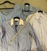
I recently pulled the trigger on a Kelly belt in Bleu Glacier with Palladium hardware from H.com as I really like blues - blue button up oxford shirts, dresses, etc. But now I have it, the belt reads so dull grey, almost green against anything blue. Not that I would pair it with these items necessarily, but struggling if this color is just too desaturated for me based on items in my wardrobe and the blues I actually like. Looking for some inspiration!
How does everyone else style their Bleu Glacier bags, shoes, or belts? I feel like I’m gravitating towards returning this belt. Doesn’t seem to have the undertone of anything in my wardrobe.

How does everyone else style their Bleu Glacier bags, shoes, or belts? I feel like I’m gravitating towards returning this belt. Doesn’t seem to have the undertone of anything in my wardrobe.

you show it with items with about 40% tonal saturationI recently pulled the trigger on a Kelly belt in Bleu Glacier with Palladium hardware from H.com as I really like blues - blue button up oxford shirts, dresses, etc. But now I have it, the belt reads so dull grey, almost green against anything blue. Not that I would pair it with these items necessarily, but struggling if this color is just too desaturated for me based on items in my wardrobe and the blues I actually like. Looking for some inspiration!
How does everyone else style their Bleu Glacier bags, shoes, or belts? I feel like I’m gravitating towards returning this belt. Doesn’t seem to have the undertone of anything in my wardrobe.
View attachment 5842776
they are all sapping the colour from each other
try it with a stronger tonal saturation - 70+%
and it might transform your response
Try it with other colours in your wardrobe and see if it works. I can see it working with whites.
If you wear a lot of blues and want a kelly belt to go with them, I’ll suggest returning and getting another in white or gold instead.
If you wear a lot of blues and want a kelly belt to go with them, I’ll suggest returning and getting another in white or gold instead.
I actually think it looks fine with your blues, if all colours match or of equal value, fashion-wise it looks a bit staged and old fashioned.
If you visualise a landscape (usually harmonious) you can perhaps see BG on an overcast Winter's day, a haze sky, a patch of soft white, the top of a thunderous dark mountainous smooth fjord with a patchwork of soft, bare-geen moss and greyed-out coloured vegetation, matt against shiny rock. Or the opposite (despite its name) faded dessert colours, bleached by the sun, beiges and stone, khakis light and dark, straw and hay, dust grey, grey-mauve shadows, sand yellows, the sky almost white.
If you visualise a landscape (usually harmonious) you can perhaps see BG on an overcast Winter's day, a haze sky, a patch of soft white, the top of a thunderous dark mountainous smooth fjord with a patchwork of soft, bare-geen moss and greyed-out coloured vegetation, matt against shiny rock. Or the opposite (despite its name) faded dessert colours, bleached by the sun, beiges and stone, khakis light and dark, straw and hay, dust grey, grey-mauve shadows, sand yellows, the sky almost white.
I actually think it looks fine with your blues, if all colours match or of equal value, fashion-wise it looks a bit staged and old fashioned.
If you visualise a landscape (usually harmonious) you can perhaps see BG on an overcast Winter's day, a haze sky, a patch of soft white, the top of a thunderous dark mountainous smooth fjord with a patchwork of soft, bare-geen moss and greyed-out coloured vegetation, matt against shiny rock. Or the opposite (despite its name) faded dessert colours, bleached by the sun, beiges and stone, khakis light and dark, straw and hay, dust grey, grey-mauve shadows, sand yellows, the sky almost white.
Wow!! I really like the idea of visualizing color like one from a painting a seeing what else in nature would pair with this color!
Would you mind explaining more of what this means? I seem to get into trouble with saturation all the time. Like how do the tones sap color from each other? Thanks for your insight!you show it with items with about 40% tonal saturation
they are all sapping the colour from each other
try it with a stronger tonal saturation - 70+%
and it might transform your response
in simple terms -Would you mind explaining more of what this means? I seem to get into trouble with saturation all the time. Like how do the tones sap color from each other? Thanks for your insight!
A
Get some paint of a strong bold colour - red, blue.
Get some white paint.
Acrylic would be easy to work with.
Mix it up using different proportions.
Equal proportions will give you 50% saturation
compare it with 75:25 or 25:75
very crudely that will give you and idea of the percentage saturation of any given colour.
B
look up something called the Colour Wheel;
this is a very crude idea about how some colours sap tone;
colours (of similar saturation) opposite each other will be harmonious and tend to reinforce or enrich each other
the closer colours are to each other, the less this effect is
and if they are in low saturation, the reinforcing effect will be lessened and could be negative
this is a crude attempt to explain the very sophisticated way colours interact
but you did ask
I actually think it looks fine with your blues, if all colours match or of equal value, fashion-wise it looks a bit staged and old fashioned.
Oh dear, I am definitely old fashioned then - I love matching my blues!

To stay on topic: I also struggle with wearing lighter shades/pastels, even in accessories, and often look washed out. Taking the saturation idea, I almost always need to mix dark/jewel/saturated items with a pale item - can never wear pale + pale. I would stick to bold colours against your belt; black/navy/grey or possibly chocolate/dark green/purple. However, this colour does seem to have an interesting undertone which means this might be more complex. So, maybe just go with what @papertiger said!

Oh dear, I am definitely old fashioned then - I love matching my blues!
To stay on topic: I also struggle with wearing lighter shades/pastels, even in accessories, and often look washed out. Taking the saturation idea, I almost always need to mix dark/jewel/saturated items with a pale item - can never wear pale + pale. I would stick to bold colours against your belt; black/navy/grey or possibly chocolate/dark green/purple. However, this colour does seem to have an interesting undertone which means this might be more complex. So, maybe just go with what @papertiger said!
I always think each one of us is attracted to a colour for reason (beyond fashion).
Your idea is great for you because it sounds like you would mix it in with your existing 'good' colours. That works too

Sometimes I look for Hermes scarf cws to help. Sometimes really unusual combos are mixed together and can bridge between two (or even three) seemingly disparate colours and look totally on point.
Haha I did ask! I’m familiar with some rudimentary color theory, but it’s definitely my weakness when it comes to coordinating or art. I love dressing tone on tone, but have recently run into issues with washing things out because everything’s just a little too close in color. This definitely helps. Thanks!in simple terms -
A
Get some paint of a strong bold colour - red, blue.
Get some white paint.
Acrylic would be easy to work with.
Mix it up using different proportions.
Equal proportions will give you 50% saturation
compare it with 75:25 or 25:75
very crudely that will give you and idea of the percentage saturation of any given colour.
B
look up something called the Colour Wheel;
this is a very crude idea about how some colours sap tone;
colours (of similar saturation) opposite each other will be harmonious and tend to reinforce or enrich each other
the closer colours are to each other, the less this effect is
and if they are in low saturation, the reinforcing effect will be lessened and could be negative
this is a crude attempt to explain the very sophisticated way colours interact
but you did ask
Oh dear, I am definitely old fashioned then - I love matching my blues!
To stay on topic: I also struggle with wearing lighter shades/pastels, even in accessories, and often look washed out. Taking the saturation idea, I almost always need to mix dark/jewel/saturated items with a pale item - can never wear pale + pale. I would stick to bold colours against your belt; black/navy/grey or possibly chocolate/dark green/purple. However, this colour does seem to have an interesting undertone which means this might be more complex. So, maybe just go with what @papertiger said!
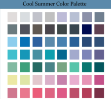
I normally look healthy with a lighter pink or a mint green (but with some brightness to it... vs super desaturated). No clue if I actually am a Cool Summer but some of the colors below are in my wardrobe generally.
I like the idea of black/navy/gray and using darker and more rich colors to pair with that light color.
Does anyone have a Bleu Glacier BAG or Shoes? Would love to see an entire outfit with a bigger object (a bag) in this color. Because if I can't figure it out as a belt, I would probably remove this color from my list of Hermes colors ongoing.

I think of it in terms of tonal value. Imagine a black and white photo of your choices. If it’s all medium gray. . .Haha I did ask! I’m familiar with some rudimentary color theory, but it’s definitely my weakness when it comes to coordinating or art. I love dressing tone on tone, but have recently run into issues with washing things out because everything’s just a little too close in color. This definitely helps. Thanks!
I like the belt you chose

I have recently bought a pair of Chypre and am tempted to get a pair of Izmir. While they look awesome themselves and in shows, I barely see them worn other than with t-shirts and shorts (for guys). I however, rarely wear shorts and thus struggling on how to wear them out.
Would you guys mind to share your views and/ or looks? I really need some inspiration
(Hope this thread is not overlapping with others)
Would you guys mind to share your views and/ or looks? I really need some inspiration

(Hope this thread is not overlapping with others)
Register on TPF! This sidebar then disappears and there are less ads!
