Belt and shoes and other classic matches are not really my style. So I do not match my belt or bag to shoes. I do sometimes coordinate a jacket with shoes or jacket with hat… which turns matching on it’s head

Sometimes I wear a belt for contrast (like a black belt on a light dress. And if my RTW is busy, then a neutral beige/taupe shoe.
Other times the belt seamlessly coordinates with the outfit, not the accessories. If you are simply starting out, it is easiest to limit your color palette. I have a straight up and down figure, so to create more of a waist, I tend to minimize the look of a belt against my clothes (so black, gray, navy beige)
View attachment 6023574View attachment 6023575View attachment 6023576
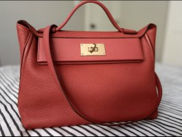
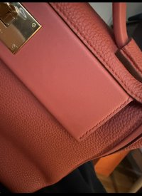
In the first pic, the pants have bittersweet brown leather trim on the pockets, so the belt (not shown is dark bittersweet brown). I mix browns, beige, black, and navy and use Hermes gold colored leather as a pop neutral (the sneakers are Fauve barenia which is Hermes gold)
In the middle pic, the belt matches the pants; the bag is gold colored (valextra) and the sandals are a contrast, albeit neutral. I’m mixing metals as well as neutrals. The silvery gray monili upper of the sandal is picked up by the toile sun hat, but it’s not necessary. If the sole of the shoe were warmer chestnut, the outfit would have a more matched look, but it would also look less casual, and more conservative. But this is a very basic, classic look: white shirt and khakis
last pic, I’m wearing navy suede shearling Birkenstock Boston clogs. If I were to use a belt, it would have been taupe to blend with the pants. The only possible match might be the buttons to the pants, but when I put them together I wanted a rich pop contrast. I treated the pattern on the pants as a solid color
Of course, all of this is subject to one’s taste
Have fun experimenting. Here is one experiment using different pattern scales, but a limited palette. The shoes are a bright white and black; the bag is more ecrue and a blue black… the top is more of a bright white with navy. The skirts are an off white with brighter blue. And the prunier bag is a pop neutral
View attachment 6023577View attachment 6023578
Unlike
@WhiteBus, I mix metal with opposing cool or warm tones, but I agree with him in most other respects