I really don’t like how many multicolored painted dot pieces there are. I think from an homage perspective, it’s worth making some pieces. But I think it also takes away the “specialness” of the original. Some things should be kept as they are, not copied for a quick buck, I think.
My art and design opinion, I just don’t think the painted dots look good on most of the pieces. The original trunk has better harmony and balance. The original trunk doesn’t have equally spaced dots, allowing for better visual interest and movement. The painted dots for this collection are evenly spaced, lending to a more rigid look and feel. I’m not getting the same resolution, as I do with the original trunk. The number of dots per piece tends to be lacking too. Kusama’s work has a good sense of repetition, rhythm, and scale. She tends to adjust the size and number of dots, relative to a piece. The scale and number of dots work for the original. Many of these Painted Dots pieces look like they’re starving for more. The majority of them just look unfinished to me.
Infinity dot pieces are 10x better, I think, because you have a lot of dots in two different sizes (bigger and smaller lol). Infinity dots has better movement, balance, and rhythm. Whoever okayed the pattern for Infinity Dots, good job.
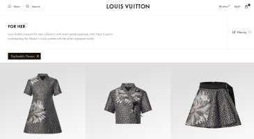
Psychedelic Flowers is beautifully interesting, but I can see why it isn’t the main focus. Asymmetrical and organic designs tend to be favored in the East. Western design tends to favor symmetry and geometrical compositions. Most mainstream/well-known fine art and design works follow Western aesthetics. It makes sense that a Western brand will favor Western aesthetic choices as ”the safer and more commercially-appropriate option.” Because of history, a lot of Westerners see exoticism and eclectic in non-Western art and design, and it’s not always in a positive way.
Dots are just “safer.“


