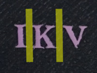
Digital devices use kerning to adjust spaces between letters, so we can feel that they have the same distances in between. Because the Vuitton letters used for hot stamping are made of copper, they have fixed sizes, and this way they'll have fixed spaces in between. As you can see on my pic, the spacing on your stamping is perfect, it is the nature of K and V next to each other that creates the optical illusion of having unreasonable extra space. The space in the "belly" of the K and the one on the left of the V makes a large hole together.
I am just saying this, because if you will have the same monogram on your future items (and you probably will), then they will look exactly like this. I recommend you to ask for vertical alignment next time, if possible. That will solve this problem.
On the other hand, the paint is not perfect, the V doesn't look neat. In their defense, the grained leather used inside these items are very hard to heat stamp, as you can see, the edges of the I and the K are also a little wavy. On softer leathers this is never a problem, but on this kind, it always is. I have 6 wallets with this grained inside, and all the monograms are a little imperfect.
When they finish a hot stamping for me, they always ask if I am satisfied with it. Right then, on the spot, so there would be no misunderstanding later. One time I told them that I was sorry but I didn't like it, so they made a new one on a fresh item.
But you are absolutely right if you are not satisfied with the missing color spot. If they are lucky, they can re-stamp it again, but an exchange would be more classy. Anyway, if you decide to get a hot stamp on the new one you'll get, consider my point on the letter spacing and maybe ask for a vertical option.
But the most important when you get it back: enjoy your folio, because it is gorgeous