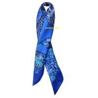
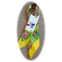
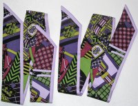
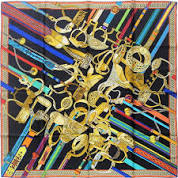
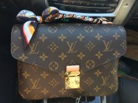
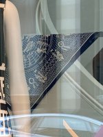
The brown one is fabulous! Wow!

Also the monotone jungle love sounds wonderful too. That may explain why I prefer jungle love in dip dye and the neutral JL rainbow. Beautiful scarves you have shown.

Here is my bizarre explanation of why JL works in mono/dip dye / rainbow
in the olden days when dinosaurs walked the earth ... There were ladies that wore REAL leopard skin clothing, there is a famous old photo of Barbra Streisand decked out in a leopard suit at a Chanel show - she was considered tres gauche for doing so even though it was real skin , it was OK to wear real fur then but leopard was a special case, it was a brash bourgeois statement to wear such loud patterns, not subtle like mink. The Queen wore mink, not leopard
In those days, it was even more of a faux pas to wear printed/fake leopard prints, they were considered flat out ugly
Times have changed, no one wears the real thing and prints are just fine ... from a social point of view
BUT, it is hard to design a good looking leopard print, a lot of them look ugly, so, the new issue is finding a good faux
Dallet did pretty good spots though ... but the spots depend on the printing , ie the exact combo of exact of blacks, whites, beiges etc. He got credit for the spots on Monsieur et Madame II, they are large spots and rather prominent , not my thing, to me, that rendering did not work
Getting back to the point ... dip dye and mono tone down the leopard spots so, minimizing any old-style social disapproval of a fake print but also hiding any flaws in the rendering

 Too funny Jbizzy!
