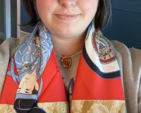
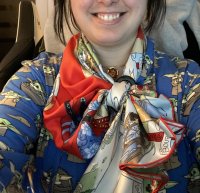
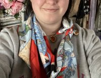
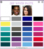
-I look best in bright/jewel tones, nothing pastel. So no pastel scarves for me no matter how beautiful they might be. The brighter the color, the better. I particularly love yellow and fuschia.
-I love scarves that have a bright contrast hem. This is something Hermes does so well. It's unexpected, it immediately captures the attention and adds pizzazz to an outfit.
-At the beginning of my H journey I bought a couple of classic designs with borders: Double Sangles and l'Ocean (vintage). Oooooh boy what a mistake. My clothing style is very casual, tomboyish and modern. Those classical designs clashed completely with everything I was wearing and aged me, I felt. Whenever I try to wear something more classical I feel like a little girl playing dress-up in her mother's closet. I'm 37 but I still feel like there will never come a day where I will look put together enough to carry off a classic, feminine outfitI still struggle with wearing 90s for this reason, as I can't find a way to make them seem casual. So lesson: no borders, no classical designs. I think I'm finally learning my lesson because I've only bought one 90 this season and it's to frame, not wear!
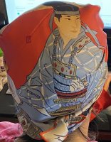
-I've discovered I actually love the way abstract or graphic patterns look on me: anything with stripes, polka dots, bandana prints... Hermes makes many many beautiful designs that are like paintings, but the truth of the matter is, when they're folded and tied, you can only see bits and pieces of the design. That bugs me somewhat. But it's not an issue with anything abstract or all over graphical. (Also, those kinds of designs match better with my casual wardrobe than, I dunno, imperial French carriages or noblemen or whatever.)
-This seems to be a general rule: If you're petite, avoid large patterns. And I'm only 5'1! So I could never wear something like the Three Graces CSGM with its enormous giraffes. I'd get lost.
-Hermes scarves are the best way to jazz up plain, neutral outfits in brown, grey, black, white... I love to use them as a pop of color. You can even do this with twillies!
-I like to wear earrings that match or complement the scarf in some way!
-In terms of formats, I like the ones that are longer/thinner rather than square: maxi twillies or losenges. A square is kind of a weird format for a scarf, you end up with extra material bunched up around your neck and I don't like the cowboy knot (just looks like a bib to me). I still have 90s and CSGMs, but they're never as easy for me to wear as the other formats.
A few illustrations:
View attachment 4892962
View attachment 4892963
View attachment 4892964
View attachment 4892965
View attachment 4892966
\View attachment 4892976
View attachment 4892970
View attachment 4892968
Your selections are really lovely. I really love the red/black scarf with a black sweater and the second image (blanking on the scarf name... is that something Pegasus?) Curious what your own favorite scarves aee
I’m so glad you joined in, Anna.
You definitely are the queen of red silks and look outstanding in them! Have you done any musing as to why (hair color & skin tone I’m guessing)? I love that your DH provides honest scarf feedback -my limited SA experiences were less than stellar and the most my DH will say is “nice scarf.” I remember you were on the fence about a non-red selection in SOTD not too long ago, but forget the details...
I appreciate your input on my shared pics and fully agree with you. I haven’t figured out how to wear those cooler, grayed tones near my face with success...
I *do* own non-red scarves, contrary to popular belief. But for me it’s like red lipstick, it’s more psychological than anything else.
Although I tend to wear warm, orange-based reds. I can pull off an occasional burgundy given a good lipstick and lots of under eye concealer, but not reds work well.
I have always gravitated towards color... I just like red more than other colors

If one follows the Color me Beautiful concept, it works and there will no longer be those instances where a scarf c/w does not work. iIf there is a dress or top that is not in your color scheme, using a scarf that is in your best colors will magically make the item come together. Hth
See, I have never found it that intuitive. I went on their website when I read your post. They have photos of Angelina Jolie and Reese Witherspoon to illustrate their methods; and I much prefer the ‘worse’ option for both of them
It's a bit like the rules that (good) stylists give:
1. There is a shade/tint/hue of most colours that someone can wear. Make sure you select the right one for you.
2. Know your face (even body) shape, shapes of patterns should echo, not compete.
3. Like 2, check whether you have high contrast, mid-contrast or low contrast colouring between features.
Silk reflects so make sure the reflective tones compliment your colouring too (and not just the flat colours of the scarf.
@turfnsurf I would guess that your colouring is probably more harmonious with rich, bright, clear tones (colour) geometrics and strength of features (hence good with wide border and bold pattern as in e.g. scarf 1) whereas perhaps less successful with muted tones and a melange-type pattern (e.g.2.)
I would add to all some tips I picked up through make-up artists (talking about wearing colour rather than makeup):
4. Try not to wear your shadow colour (the colour of your natural under-ye (mine is a red/ble mix that looks like a greyed-purple from a distance).
5. You can also treat scarves as makeup. E.g. wear your most natural blush or complimentary (opposite) colour as pick-up colour. If you blush pink (or look good with pink blush) go for pink or green (as strong or as subtle as your colouring) orange/peach go for peach/orange or blue, very golden go for gold or purple and so on.
6. Scale is also really important.
Can you come style my wardrobe and go through my makeup while you are at it?

I have dark blonde hair, a light neutral skintone (typically the lightest or second lightest "N" shade in any US-brand foundation, or a light to mid-range Asian-brand foundation), and dark brown eyes.
Ex: I chose a blue cw of Artisans even though I thought I'd prefer the red. It's not necessarily noticeable in this lighting/pic, but the red close to my face just didn't seem to work as nicely. I think that because I'm so fair, sometimes rich colors in certain tones can overpower me, the lighter pinks and blues seem to add some warmth and life to my skin.


Similarly, I really liked the light blue Plumes en Fete on me, and I figured the light pink Into the Canadian Wild would also suit me, given the similar color palette. It gave me the confidence to buy the ItCW blind, without the possibility of a return, and it worked out!


My totally unsolicited opinion
 without seeing the rest of your face, I really like the red (orange?) Les Artisans, and the pink-ish Into The Canadian Wild. I think they all work though, you clearly have a great sense of color.

