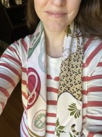
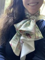
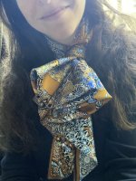
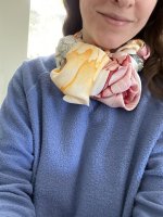
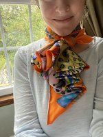
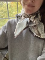
I'm really early in my scarf collecting, but I've already made a few observations:
1. The hem often makes or breaks a scarf for me; I love a beautiful contrasting hem, but some seem "too" contrasting for me and are off-putting
2. When debating between two cws, I've decided to keep scarves with lots of pinks/soft blues because they suit my coloring; these aren't the colors I gravitate towards in a vacuum, and it's made me reconsider some cws I didn't necessarily love online but know I'll like on
3. I'm learning to appreciate a design that has intricate corners or a design that runs to the edge, since the knots I prefer most tend to highlight this area of a scarf
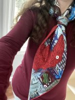


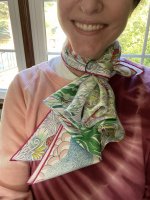
 a bit 'off'


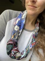
 Since we’re both neutral/brown/brown I imagine it’s possibly the warm-leaning vs. cool-leaning thing.