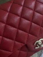
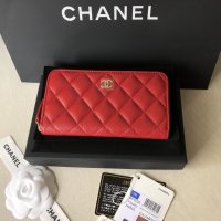
I must say I am underwhelmed with both red and burgundy classic flap this season. In store lighting, the burgundy is more of brownish to me and the red is less saturated red, a bit pale. I blame that to warm yellow lighting in store. Both bags seem to reflect the yellowish shade. The burgundy has to get a lot of light/sunlight to be a beautiful dark red, and the red should be seen in rather dark room so it will be a perfect deep reed. One is gorgeous outside while bleh indoor, and the other one is the contrary. Yes it’s confusing. I wish Chanel just make one red in between those two colors. I went home with the red instead. It doesn’t look dull against my skin.
Here is the red in a half covered balcony under gloomy morning light. I compare the real bag in this balcony with a picture a few pages ago from somebody who photographed burgundy in outdoor and they’re almost identical. One more thing, the pictures tend to capture more vibrant and shinier than the actual. I mean the color is not as vibrant as the picture.
View attachment 4511554
Definitely you must see them in person. It’s very hard to explain and one sees the shade differently from others and both colors do change shade a lot really depend on the light.
I’m happy with my choice but unfortunately my hunt for red Chanel doesn’t end yet


 Not yet sadly, had to get it shipped to me from one of the non-leased stores so it’ll be a few days. The wait is gonna kill me