Were not saying that a cool logo makes a rock band, but it sure doesnt hurt
Well, unless youre Mr. Mister.
Larry Dobrow
Blender April 23 2008
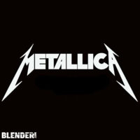
10. Metallica
As if Metallica werent intimidating enough already, what with their stern lectures about illegal music downloading and all, here comes their wrath-and-indignation logo. With it, the band took the AC/DC lightning-bolt motif to the next level, intensifying the eeeeeeevil via three-dimensional lettering and a few stray shards. Ten bucks says theres a humorless grad student out there somewhere working on a thesis about the semantics of lightning bolts within rock & roll visual tropes, or something.
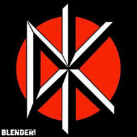
9. Dead Kennedys
A faux-classical font, plus a linear design that combines elements of the Japanese flag (the color scheme) and the New York Yankees logo (the intersecting letters)? Whoa! Were probably reading way, way too much into this.
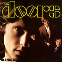
8. The Doors
Ooh, fun with stencils! Its kinda ironic how Jimbo M. and co. fancied themselves members of the artsy-fartsy underground, and yet their logo remains easily replicable by anybody with a ruler. Deep inside the soul of every boozy rocker lurks an art school dropout, it seems.
7. Aerosmith
Say what you want about the band itself that Steven Tyler oughta cut back on the embalming fluid, or that Joe Perrys appearance backing Sanjaya killed the bands credibility more than 1,000 Diane Warren ballads ever could but that logo, which pairs a wings-and-scratchy-font combo with the structural sturdiness of an imitation pilots pin, rocks as reliably and relentlessly as Mama Kin.
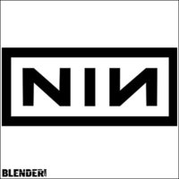
6. Nine Inch Nails
The world, as Trent Reznor reminds us with his every ominous synth squeal and funereal sentiment, is a totally messed-up place, dude. What better way to remind listeners of this than with a logo so sterile, so minimalist as to darken the day of even the most smiley and apple-cheeked fan? Hope is overrated. Death is near.
Larry Dobrow
Blender April 23 2008
10. Metallica
As if Metallica werent intimidating enough already, what with their stern lectures about illegal music downloading and all, here comes their wrath-and-indignation logo. With it, the band took the AC/DC lightning-bolt motif to the next level, intensifying the eeeeeeevil via three-dimensional lettering and a few stray shards. Ten bucks says theres a humorless grad student out there somewhere working on a thesis about the semantics of lightning bolts within rock & roll visual tropes, or something.
9. Dead Kennedys
A faux-classical font, plus a linear design that combines elements of the Japanese flag (the color scheme) and the New York Yankees logo (the intersecting letters)? Whoa! Were probably reading way, way too much into this.
8. The Doors
Ooh, fun with stencils! Its kinda ironic how Jimbo M. and co. fancied themselves members of the artsy-fartsy underground, and yet their logo remains easily replicable by anybody with a ruler. Deep inside the soul of every boozy rocker lurks an art school dropout, it seems.
7. Aerosmith
Say what you want about the band itself that Steven Tyler oughta cut back on the embalming fluid, or that Joe Perrys appearance backing Sanjaya killed the bands credibility more than 1,000 Diane Warren ballads ever could but that logo, which pairs a wings-and-scratchy-font combo with the structural sturdiness of an imitation pilots pin, rocks as reliably and relentlessly as Mama Kin.
6. Nine Inch Nails
The world, as Trent Reznor reminds us with his every ominous synth squeal and funereal sentiment, is a totally messed-up place, dude. What better way to remind listeners of this than with a logo so sterile, so minimalist as to darken the day of even the most smiley and apple-cheeked fan? Hope is overrated. Death is near.