10 Best Old-School Rock Band Logos Ever

caitlin1214

tPF Bish
O.G.
Jul 7, 2006
29,110
780
We’re not saying that a cool logo makes a rock band, but it sure doesn’t hurt … Well, unless you’re Mr. Mister.


Larry Dobrow


Blender April 23 2008


10. Metallica
As if Metallica weren’t intimidating enough already, what with their stern lectures about illegal music downloading and all, here comes their wrath-and-indignation logo. With it, the band took the AC/DC lightning-bolt motif to the next level, intensifying the eeeeeeevil via three-dimensional lettering and a few stray shards. Ten bucks says there’s a humorless grad student out there somewhere working on a thesis about the semantics of lightning bolts within rock & roll visual tropes, or something.


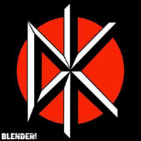
9. Dead Kennedys
A faux-classical font, plus a linear design that combines elements of the Japanese flag (the color scheme) and the New York Yankees logo (the intersecting letters)? Whoa! We’re probably reading way, way too much into this.


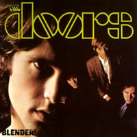
8. The Doors

Ooh, fun with stencils! It’s kinda ironic how Jimbo M. and co. fancied themselves members of the artsy-fartsy underground, and yet their logo remains easily replicable by anybody with a ruler. Deep inside the soul of every boozy rocker lurks an art school dropout, it seems.


7. Aerosmith
Say what you want about the band itself — that Steven Tyler oughta cut back on the embalming fluid, or that Joe Perry’s appearance backing Sanjaya killed the band’s credibility more than 1,000 Diane Warren ballads ever could — but that logo, which pairs a wings-and-scratchy-font combo with the structural sturdiness of an imitation pilot’s pin, rocks as reliably and relentlessly as “Mama Kin.”


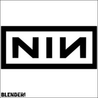
6. Nine Inch Nails
The world, as Trent Reznor reminds us with his every ominous synth squeal and funereal sentiment, is a totally messed-up place, dude. What better way to remind listeners of this than with a logo so sterile, so minimalist as to darken the day of even the most smiley and apple-cheeked fan? Hope is overrated. Death is near.
 

Attachments

  • Metallica.jpg
    Metallica.jpg
    12 KB · Views: 18,177
  • Dead Kennedys.jpg
    Dead Kennedys.jpg
    25.1 KB · Views: 3,917
  • The Doors.jpg
    The Doors.jpg
    44.2 KB · Views: 3,506
  • Aerosmith.jpg
    Aerosmith.jpg
    58.4 KB · Views: 4,110
  • Nine Inch Nails.jpg
    Nine Inch Nails.jpg
    41.5 KB · Views: 4,837
5. Van Halen
As sleek, lean and double awesome as the band’s first 5.5 records (we’re only giving half credit for Diver Down). Also, of all the logos on this list, it is by far the easiest to draw.


4. Grateful Dead
The Dead’s famous “Steal Your Face” logo, designed by longtime band consort Bob Thomas, led us to believe that the band members themselves were practicing metal heads and/or Satanists. Imagine our surprise, then, when Emily Deutsch played us “Sugar Magnolia” in seventh grade and clued us into the band’s messages of peace, love and better living through pharmaceutical enhancement. The Dead’s design minions deserve some props for their happy-dancing-bears artwork as well.


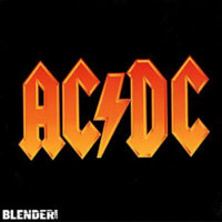
3. AC/DC
The pointy-ended goth letters say “we will jolt you.” The lightning bolt that connects them says “perhaps literally, should a low-pressure system happen to collide with the cool air mass creeping up from the southeast.” Cue the For Those About to Rock cannons, will you?


2. Yes
To be frank, we have no more idea what esteemed English artist Roger Dean was doing hanging around with the self-unaware prog-heads of Yes than you do. For their lively tales from topographic oceans, perhaps? Regardless, Dean’s wonderfully simple “bubble” logo found its way onto numerous album covers, T-shirts and concert bills, exposing his work to many a fan of sissy-voiced singers. Dean is also responsible for Asia’s much-much-much-better-than-the-band-itself logo and first album cover.


1. Rolling Stones
As bawdy and colorful as the Stones themselves were until the onset of menopause. True-ish fact: While Andy Warhol generally gets credit for designing the logo — he put together the Sticky Fingers zipper-iffic album package that marked its first appearance — the tongue itself was said to have been pinched from an image of the Hindu goddess Kali:
(http://www.dollsofindia.com/product/PB24).
 

Attachments

  • Rolling Stones.jpg
    Rolling Stones.jpg
    65 KB · Views: 5,646
  • Yes.jpg
    Yes.jpg
    83.3 KB · Views: 4,801
  • ACDC.jpg
    ACDC.jpg
    23.4 KB · Views: 16,234
  • Grateful Dead.jpg
    Grateful Dead.jpg
    39.4 KB · Views: 3,973
  • Van Halen.jpg
    Van Halen.jpg
    12.7 KB · Views: 9,900
When I read the subject heading the first thought that came to my head was Van Halen. I remember a lot of high school notebooks decorated with that logo. Classic! :biggrin:
 
When I first clicked on the link, the Stones logo was automatically the first thing I thought up.


I always liked the logo for Guns 'N Roses.


It's simple and to the point: It's guns and roses.
 

Attachments

  • Guns 'N Roses.jpg
    Guns 'N Roses.jpg
    20.1 KB · Views: 3,290
Best Band Logos

Posted Feb 15th 2008 5:00PM

by Spinner Staff

Filed under: The Hit List

(Spinner.com)


The Ramones

New York artist and band friend Arturo Vega chose the Seal of the President of the United States as the jumping-off point for the punk legends' logo. His intention was to represent the Ramones as an all-American band.


Public Enemy
When this politically charged hip-hop group is mentioned, LL Cool J is likely the furthest thing from anyone's mind. Yet LL's then-sidekick E. Love was Chuck D's inspiration when he drew PE's infamous crosshairs.


Korn
Hand-drawn in crayon by the godfather of nu-metal himself, Jonathan Davis' backward capital "R" was furtively carved into classroom desks across the nation after the band broke big with 1996's 'Life Is Peachy.' Limp Bizkit frontman Fred Durst tattooed the logo on Korn guitarist Brian Welch's back.


Black Flag
Bandleader Greg Ginn's brother, artist Raymond Pettibon, designed the punk band's trademark four black bars, as well as suggesting their anarchy-meets-bug-spray moniker.
 

Attachments

  • Phish.jpg
    Phish.jpg
    6.4 KB · Views: 36
  • Black Flag.jpg
    Black Flag.jpg
    8.8 KB · Views: 44
  • Korn.jpg
    Korn.jpg
    14.4 KB · Views: 35
  • Public Enemy.jpg
    Public Enemy.jpg
    9.3 KB · Views: 38
  • The Ramones.jpg
    The Ramones.jpg
    18.8 KB · Views: 40
H.I.M

Frontman Ville Vallo designed the metal band's "heartagram" logo, calling it a "modern yin-yang." 'Jackass' star Bam Margera oves the symbol so much he has it tattooed on himself several times, and Vallo allowed Margera to use it on his line of shoes and skateboards.


The Beatles


The logo for the most famous rock band of all time has perhaps the simplest origin story. It was designed in 1963 by Ivor Arbiter -- merely the man who sold Ringo Starr his drums -- and applied on Ringo's bass drumhead by London sign painter Eddie Stokes.


Bauhaus

When you're an art-rock band named after an architecture movement, you better get with the visuals. These British goth men were more than up to the challenge with this half-face, half-building.


The Cramps


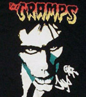
These psychobilly stalwarts announced their affinity with the lurid comic books of the 1950s when frontman Lux Interior cribbed the band's logo from EC Comics' gorefest 'Tales From the Crypt.'


ABBA

As the band's name is an acronym for the two couples in the group -- Agnetha & Björn, and Benny & Anni-Frid -- Swedish designer Rune Söderqvist wanted the two B's to face each of their respective partner A's.
 

Attachments

  • H.I.M.jpg
    H.I.M.jpg
    11.4 KB · Views: 42
  • The Beatles.jpg
    The Beatles.jpg
    8 KB · Views: 41
  • Bauhaus.jpg
    Bauhaus.jpg
    9.3 KB · Views: 38
  • The Cramps.jpg
    The Cramps.jpg
    16.1 KB · Views: 46
  • ABBA.jpg
    ABBA.jpg
    10.1 KB · Views: 39
10. Metallica
As if Metallica weren’t intimidating enough already, what with their stern lectures about illegal music downloading and all, here comes their wrath-and-indignation logo. With it, the band took the AC/DC lightning-bolt motif to the next level, intensifying the eeeeeeevil via three-dimensional lettering and a few stray shards. Ten bucks says there’s a humorless grad student out there somewhere working on a thesis about the semantics of lightning bolts within rock & roll visual tropes, or something.
Drummer Lars Ulrich dubbed the band, but it was guitar god James Hetfield who designed both of the group's logos. The original version made its first appearance in the early '80s on Metallica's first business card. The design got a face lift (after the band members got haircuts) for 1996's 'Load.'


7. Aerosmith
Say what you want about the band itself — that Steven Tyler oughta cut back on the embalming fluid, or that Joe Perry’s appearance backing Sanjaya killed the band’s credibility more than 1,000 Diane Warren ballads ever could — but that logo, which pairs a wings-and-scratchy-font combo with the structural sturdiness of an imitation pilot’s pin, rocks as reliably and relentlessly as “Mama Kin.”

Original Aerosmith guitarist Ray Tabano didn't stick arond very long, but he left quite a legacy when he designed the band's logo. The first album the winged-A motif appears on is the 1974 LP, 'Get Your Wings.'


6. Nine Inch Nails
The world, as Trent Reznor reminds us with his every ominous synth squeal and funereal sentiment, is a totally messed-up place, dude. What better way to remind listeners of this than with a logo so sterile, so minimalist as to darken the day of even the most smiley and apple-cheeked fan? Hope is overrated. Death is near.
No '90s alterna-kid worth his or her Doc Martens was without the industrial band's patch on their backpack. NIN mastermind Trent Reznor co-designed the logo, inspired by the Talking Heads' 'Remain in Light' album sleeve.
 
Last edited:
Wu-Tang Clan

The groundbreaking Staten Island hip-hop collective got its unmistakable trademark from DJ Allah Mathematics. Already well-versed in the art of graffiti when he joined with the Wu, his design found its way onto countless Clan album covers.


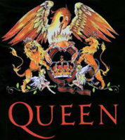
Queen

Lead singer Freddie Mercury, a London art-school graduate, designed the Queen Crest. Surrounding the letter "Q" are the four band members' zodiac signs.


The Misfits


As befitting the band's horror-punk sound and image, the skull motif was appropriated from a poster for the movie serial 'The Crimson Ghost,' and the typeface mirrors the logo of the movie magazine Famous Monsters of Filmland.


Scissor Sisters

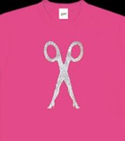
These New York rockers scored an indie hit with their version of Pink Floyd's 'Comfortably Numb' ... and darn it if their logo doesn't look like a creature from 'The Wall.'


The Who

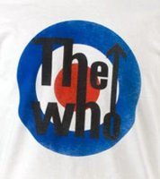
In 1964, Brian Pike designed this pop-art-inspired logo for a poster advertising the group's gig at London's Marquee club. Though it never appeared on a single Who album, it has been featured on hundreds of badges worn by fans, solidifying the Who's stature as the pre-eminent mod band.
 

Attachments

  • The Who.jpg
    The Who.jpg
    12.4 KB · Views: 36
  • Scissor Sisters.jpg
    Scissor Sisters.jpg
    5.5 KB · Views: 35
  • The Misfits.jpg
    The Misfits.jpg
    11.8 KB · Views: 41
  • Queen.jpg
    Queen.jpg
    21.8 KB · Views: 54
  • Wu-Tang Clan.jpg
    Wu-Tang Clan.jpg
    10.4 KB · Views: 40
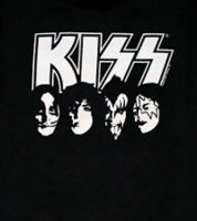
Kiss


Lead guitarist Ace Frehley came up with the logo, which first appeared on the band's second album, 'Hotter Than Hell.' Frehley's masterstroke was rendering the final two letters in Kiss as stylized lightning bolts.


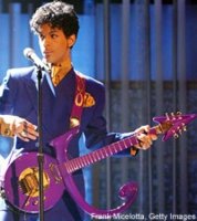
Prince

As a form of protest against his record label, Prince felt the need to abandon his moniker. In 1993, he adopted his logo, which he termed the "Love Symbol" and incorporates the glyphs for Mars (male) and Venus (female), as his actual -- and unpronounceable -- name. He even turned it into several custom guitars.
 

Attachments

  • Kiss.jpg
    Kiss.jpg
    9.1 KB · Views: 72
  • Prince.jpg
    Prince.jpg
    18.1 KB · Views: 52
5. Van Halen
As sleek, lean and double awesome as the band’s first 5.5 records (we’re only giving half credit for Diver Down). Also, of all the logos on this list, it is by far the easiest to draw.
As iconic as the California rockers' logo is, they changed its wings from straight to curvy to announce the arrival of Sammy Hagar and the departure of David Lee Roth. They must have been inspired by their singers' hair.


4. Grateful Dead
The Dead’s famous “Steal Your Face” logo, designed by longtime band consort Bob Thomas, led us to believe that the band members themselves were practicing metal heads and/or Satanists. Imagine our surprise, then, when Emily Deutsch played us “Sugar Magnolia” in seventh grade and clued us into the band’s messages of peace, love and better living through pharmaceutical enhancement. The Dead’s design minions deserve some props for their happy-dancing-bears artwork as well.
Jerry Garcia and Co. had the legendary "Steal Your Face" symbol painted on all their gear so that, during festival shows, fellow hippies wouldn't accidentally swipe their guitars.


3. AC/DC
The pointy-ended goth letters say “we will jolt you.” The lightning bolt that connects them says “perhaps literally, should a low-pressure system happen to collide with the cool air mass creeping up from the southeast.” Cue the For Those About to Rock cannons, will you?
Fans have been saluting this band logo for thirty years. Designed by Atlantic Records VP and creative art director Bob Defrin, it made its debut on the international edition of 'Let There Be Rock.'


2. Yes
To be frank, we have no more idea what esteemed English artist Roger Dean was doing hanging around with the self-unaware prog-heads of Yes than you do. For their lively tales from topographic oceans, perhaps? Regardless, Dean’s wonderfully simple “bubble” logo found its way onto numerous album covers, T-shirts and concert bills, exposing his work to many a fan of sissy-voiced singers. Dean is also responsible for Asia’s much-much-much-better-than-the-band-itself logo and first album cover.
English artist Roger Dean has made a name for himself with his fantasy landscapes, many of which adorn Yes album covers along with the "bubble" logo he debuted on the band's 1972 LP 'Close to the Edge.'


1. Rolling Stones
As bawdy and colorful as the Stones themselves were until the onset of menopause. True-ish fact: While Andy Warhol generally gets credit for designing the logo — he put together the Sticky Fingers zipper-iffic album package that marked its first appearance — the tongue itself was said to have been pinched from an image of the Hindu goddess Kali:
(http://www.dollsofindia.com/product/PB24).
Though often purported to have been designed by Andy Warhol, actually British graphic artist John Pasche devised the "tongue and lips" motif in 1970. The logo was inspired not just by Mick Jagger's famous mouth but also that of the Hindu goddess Kali.