New Balenciaga Logo

ManilaMama

Member
Mar 5, 2016
1,770
1,939
I saw this announced on Instagram days ago and waited for it to become a topic here as I wanted to see what you guys thought about this.

Is this old news? I can't find the thread.

I am shocked they made a new logo. Especially after they had a line of Bazaar bags emblazoned with logos.

It looks like a change of font. Slight change. It's taller now. Will this make it harder to counterfeit? What about the value of our older bags with the old logo?

Thoughts?

IMG_1506897213.038105.jpg
 
  • Like
Reactions: Vidalita
Not sure I get what the point of redesigning the logo this way is, so I looked it up and found this,

"“Conceived in-house, the development process was inspired by the clarity of public transportation signage. The result is a visually shortened logo which gives a simple, bold stamp to the timeless deluxe Balenciaga signature,” it said."

I feel like Balenciaga has just turned into Vetements 2.0 and I personally think that's a bad thing. Vetements is cool as Vetements, but Balenciaga should be something else.
 
What boggles my mind is how the difference is SOO tiny. It seems so minuscule.

Small enough to make me think that one is a bad fake of the other. Or to make me think that the printer did not get a proper print-ready vector file of the logo and used a stretched web-version [emoji23]

Why "redesign" when all you're (seemingly) doing is making the font a millimeter taller and the font spacing a touch less?
 
Hmmm, I am a graphic designer and I'm not sure about this. I'm not saying updating your logo is a bad thing, and there is a lot of great transportation signage out there. But if I read this correct, the press quote is saying the old logo was "timeless", which confuses me. If the old logo was timeless, then why update it? And why is a more pedestrian and "Bold" look so critical to the brand?

On a side note, the kerning (the spacing between the letters) is off to my designer's eye. The "C" and the "I" are too close together when compared to the spacing throughout the rest of the logo.
 
I made this so I can see them side by side.

@bellebellebelle19 is right. It's very Vetements. :sad: I prefer old logo. Seems more sophisticated.
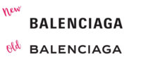
View attachment 3841005

And I can't unsee the kerning @BalenciagaKitte mentioned!
Thank you for this, ManilaMama. I'm no graphic expert but the old logo is definitely easier on the eye while the new one is harder. I can't explain this technically but the new one is straining to look at while the old one "flows".

At this point I feel Gvasalia is just out to mark his territory on everything pre-Gvasalia. I wonder if it was his idea to try and discontinue the classic hardware on the City.
 
New font just looks squashed and clunky compared to the old one.

Wait - does this mean we get a redesign of the bags from last season with the Bal logo plastered all over, now that it's outdated? Oh lordy :shocked:
 
New font just looks squashed and clunky compared to the old one.

Wait - does this mean we get a redesign of the bags from last season with the Bal logo plastered all over, now that it's outdated? Oh lordy :shocked:

I know right? Those bazaar bags with the watermark logos.. and the scarves and the sweaters...

How quickly they will become passé! Ouch for those who just spent! (But then again maybe they will increase in value since they're "old school"). Meh. Who knows. Much ado about nothing, this logo change.

And how about this logo? What is this, even? Is this a throwback from before or is this something they came up with this year too?

IMG_1507001748.270235.jpg
 
  • Like
Reactions: Vidalita
I know right? Those bazaar bags with the watermark logos.. and the scarves and the sweaters...

How quickly they will become passé! Ouch for those who just spent! (But then again maybe they will increase in value since they're "old school"). Meh. Who knows. Much ado about nothing, this logo change.

And how about this logo? What is this, even? Is this a throwback from before or is this something they came up with this year too?

View attachment 3841884

This one is inspired by Bernie Sanders' 2016 presidential campaign logo.IMG_1507004610.952361.jpg
 
  • Like
Reactions: Vidalita