Which Dooney Are You Carrying Today?

Fabulous bag. I would own way more than the one Pebble/Belvedere satchel I have now if either of those collections ditched the metal nameplate. I've grown to hate the metal nameplate and it has spared me many purchases. There are three different colors I'd love to own in a Pebble satchel on offer right now on the sites, but alas...
Yes! My thoughts exactly! I feel the same way about the metal nameplate. I so wish they would do it in the leather. My wallet is happy they don't. [emoji28]
 
@Joopy-Snoopy My eyes are popping over this color! :eek: 
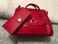
I just noticed some pebble leather satchels on Ebay. The only thing that keeps me from getting this style is wondering about the weight and how easy it is to carry.

I think it's the same as any small satchel. I didn't feel the difference switching from samba to this one. I also own a medium florentine and I would say that the florentine is much heavier.
 
I just love this color. Enjoy your new Dooney treasure. I have a turquoise small satchel from the Samba leather collection. But the color of mine is much stronger. I like yours better.

The color is much richer in person. The color is very true to the pic posted on the dooney and Ilovedooney websites. It's very hard to get the true color of my bag with my camera. I tried indoor. outdoor, flash, no flash... everything.. lol
 
  • Like
Reactions: Lilybarb
I saw you railing against the metal nameplate!!! There’s such a breadth of opinion in the bag world, I love it!
See, I’m the other way, I love the square metal, but ONLY the text one! I dislike the square metal plate that says DOONEY above, BOURKE along the bottom and then has the duck in middle...and I don’t have a great reason. It’s just too much ‘negative space’ maybe? I prefer the old-school leather oval most of the time, but I acknowledge on some designs the leather nameplate would be very out of place. I love the plate that says DOONEY above, BOURKE below but has the...it’s like a coat of arms, I guess, between instead of the duck. And I think the plate that is just script, like the Barlows/Dawsons/etc have is just okay. It’s very tasteful but mine often catch on things and I fear tearing one off the bag.

You caught me! Well, I don't exactly hide my increasing distaste for the square metal nameplate. I adore any iteration of the duck because I think visual branding is so much more effective and memorable than letters/script (think the Mercedes Benz symbol or the Jaguar instead of the company name printed out on a plaque on the car hood.)

I like the cursive Dooney & Bourke that appears on the long rectangular leather patch (which is often now on the inside of bags near the internal zipper pocket). oh yes, and I also love the "coat of arms" you mention. Cursive or decorative text is more like a visual logo than plain print.

Yes, I agree that I worry about the newer 3-D text on the City collection catching on things and breaking off.

It's very frustrating to increasingly hate the square metal plate because it seems to be on 80%+ of new and recent releases! Sometimes I need a non-Florentine for practicality and unfortunately most non-Flos now seem to have the plate.

But I'm glad there are others out there like you who have many fine styles to choose from with the metal plate!
 
Yes! My thoughts exactly! I feel the same way about the metal nameplate. I so wish they would do it in the leather. My wallet is happy they don't. [emoji28]
It seems to be everywhere! ! I admit I recently bought one bag with it but that's because I actually did need a style like that and wanted leather but not Flo for low-maintenance reasons.
 
You caught me! Well, I don't exactly hide my increasing distaste for the square metal nameplate. I adore any iteration of the duck because I think visual branding is so much more effective and memorable than letters/script (think the Mercedes Benz symbol or the Jaguar instead of the company name printed out on a plaque on the car hood.)

I like the cursive Dooney & Bourke that appears on the long rectangular leather patch (which is often now on the inside of bags near the internal zipper pocket). oh yes, and I also love the "coat of arms" you mention. Cursive or decorative text is more like a visual logo than plain print.

Yes, I agree that I worry about the newer 3-D text on the City collection catching on things and breaking off.

It's very frustrating to increasingly hate the square metal plate because it seems to be on 80%+ of new and recent releases! Sometimes I need a non-Florentine for practicality and unfortunately most non-Flos now seem to have the plate.

But I'm glad there are others out there like you who have many fine styles to choose from with the metal plate!
I’m visualizing the car with the City-style nameplate in metal horizontally across the front and back hoods. Bwahaha!!
I’m reminded of an athletic shoe brand that had its moment when I was in...idk, middle school...? Called Kaepa, and the gimmick was that there were rubber triangles on the sides, shaped and placed kind of like the ‘fast forward’ symbol, and they snapped in and out. They sold boodles of colors and you could mix and match.

Maybe they should do the same with the metal plates!!
 
  • Like
Reactions: DaffodilDuck