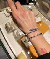
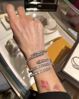
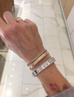
Will share pic once I receive. Agree on the turning. My loves are very loose and turn easily. Need full around pave.I’ve been looking for non-branded 18k with and without diamonds, but haven’t had much success, bc they don’t tend to make them in multiple sizes, so I can find what fits me
I do want to see your stack when they arrive though
@BigAkoya and @lynne_ross I also don’t like 1/2 diamonds. Annoys me as most tend to turn.
You are using an out of date browser. It may not display this or other websites correctly.
You should upgrade or use an alternative browser.
You should upgrade or use an alternative browser.
What Other Jewelry Brands Do You Buy/Wear?
- Thread starter Emily1830
- Start date
TPF may earn a commission from merchant affiliate
links, including eBay, Amazon, and others
More options
Who Replied?


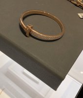
If you are thinking of stacking, Picchiotti makes these Xpandable bracelets that stack neatly.I’ve been looking for non-branded 18k with and without diamonds, but haven’t had much success, bc they don’t tend to make them in multiple sizes, so I can find what fits me
I do want to see your stack when they arrive though
@BigAkoya and @lynne_ross I also don’t like 1/2 diamonds. Annoys me as most tend to turn.
Their website stinks and only shows very pieces, but they have a whole line of Xpandable.
Series – Picchiotti
Here is a screen shot

ThanksIf you are thinking of stacking, Picchiotti makes these Xpandable bracelets that stack neatly.
Their website stinks and only shows very pieces, but they have a whole line of Xpandable.
Series – Picchiotti
Here is a screen shot
View attachment 5178100
 I love them! I’m going to check them up.
I have very recently started considering Tiffany’s (previously I thought of them as mainly a sterling silver brand), and am now appreciating they have some interesting gold/diamond designs. I was also surprised that the RG pave T1 bangle seemed “good value for money” compared to other luxury brands.
Also tried on some Bvlgari in my quest to find good RG options.
I love seeing everyone’s try on / modelling pieces so here are a few from me!


Also tried on some Bvlgari in my quest to find good RG options.
I love seeing everyone’s try on / modelling pieces so here are a few from me!
I really like the T1 wide on you.I have very recently started considering Tiffany’s (previously I thought of them as mainly a sterling silver brand), and am now appreciating they have some interesting gold/diamond designs. I was also surprised that the RG pave T1 bangle seemed “good value for money” compared to other luxury brands.
Also tried on some Bvlgari in my quest to find good RG options.
I love seeing everyone’s try on / modelling pieces so here are a few from me!
View attachment 5178212View attachment 5178213View attachment 5178214View attachment 5178215
I also like this, also in RG. It’s clean but sparkly too. I tried it on in WG, and it’s a very unique bangle look. is also full circle diamonds.
And yes, I wouldn’t underestimate Tiffany. Yes, they do silver, but they have fine jewelry and are famous for their colored gemstones. I posted a photo of a Paraiba Tourmaline ring a few posts above. They have beautiful colored gemstones. And you probably know they were recently purchased by LVMH, so there will be changes which I hope are for the good.
Here is another that I like the design, but it’s half circle. This is the RG version.
Bracelets for Women | Tiffany & Co. US
Explore classic and modern Tiffany bracelets for every occasion. Discover diamond bracelets, charm bracelets and stackable bangles in silver and 18k gold.
@chiaoapple l I agree with you. I think Bvlgari offers some really lovely options. I am adding a couple pics here for reference from visits I had a while back. I especially liked the Serpenti Viper (snake) paired with the Serpenti Viper (non snake) bracelet. It adds a little something to the single wrap version without upgrading to the full double wrap Viper (snake) - which I might add is pure heaven.I have very recently started considering Tiffany’s (previously I thought of them as mainly a sterling silver brand), and am now appreciating they have some interesting gold/diamond designs. I was also surprised that the RG pave T1 bangle seemed “good value for money” compared to other luxury brands.
Also tried on some Bvlgari in my quest to find good RG options.
I love seeing everyone’s try on / modelling pieces so here are a few from me!
As for the T1: I tried a few versions and this I feel is better suited either with other T1 bracelets (as you can flip one in the other direction but they still will not be flush but at least a bit better stacked) or with chain bracelets. The T portion, which protrudes, impedes the ability to stack it with other bracelets for fear of scratches. On its own, however, I think it is quite lovely. I have to say I have a soft spot for the Hardware Collection but its certainly a different look (more rock/harder - lol hence name) in comparison to the feminine nature of VCA.
@BigAkoya I tried the T pave as well and it is very elegant and sophisticated. Ive attached a pic for reference. I'm no wrist model but Im adding pics here incase someone wanted to see pics of it in person.
Of the above, I still love the Serpenti Viper (snake) the most. The double version is so beautiful but it certainly would be a "worn-alone" piece as pairing it with something else, I think, could come across ostentatious and gaudy.
Attachments

WOW! So much eye candy and you are definitely a wrist/hand model. I really love the serpenti with (non snake) version. And the last pic with Tiffany and VCA took me by surprise. STUNNING!@chiaoapple l I agree with you. I think Bvlgari offers some really lovely options. I am adding a couple pics here for reference from visits I had a while back. I especially liked the Serpenti Viper (snake) paired with the Serpenti Viper (non snake) bracelet. It adds a little something to the single wrap version without upgrading to the full double wrap Viper (snake) - which I might add is pure heaven.
As for the T1: I tried a few versions and this I feel is better suited either with other T1 bracelets (as you can flip one in the other direction but they still will not be flush but at least a bit better stacked) or with chain bracelets. The T portion, which protrudes, impedes the ability to stack it with other bracelets for fear of scratches. On its own, however, I think it is quite lovely. I have to say I have a soft spot for the Hardware Collection but its certainly a different look (more rock/harder - lol hence name) in comparison to the feminine nature of VCA.
@BigAkoya I tried the T pave as well and it is very elegant and sophisticated. Ive attached a pic for reference. I'm no wrist model but Im adding pics here incase someone wanted to see pics of it in person.
Of the above, I still love the Serpenti Viper (snake) the most. The double version is so beautiful but it certainly would be a "worn-alone" piece as pairing it with something else, I think, could come across ostentatious and gaudy.
Thank you for posting these pics. I have to try it next time.
You are too sweet! Im dropping you ideas @Rami00WOW! So much eye candy and you are definitely a wrist/hand model. I really love the serpenti with (non snake) version. And the last pic with Tiffany and VCA took me by surprise. STUNNING!
Thank you for posting these pics. I have to try it next time.

The bracelets are gorgeous on you. I really like the T and T1 collection (T1 more than T), but my hesitation has been that it's a bit logo-y, and you know, I'm really anti-logo for fine jewelry. Iconic, ok, but logo is not me.@chiaoapple l I agree with you. I think Bvlgari offers some really lovely options. I am adding a couple pics here for reference from visits I had a while back. I especially liked the Serpenti Viper (snake) paired with the Serpenti Viper (non snake) bracelet. It adds a little something to the single wrap version without upgrading to the full double wrap Viper (snake) - which I might add is pure heaven.
As for the T1: I tried a few versions and this I feel is better suited either with other T1 bracelets (as you can flip one in the other direction but they still will not be flush but at least a bit better stacked) or with chain bracelets. The T portion, which protrudes, impedes the ability to stack it with other bracelets for fear of scratches. On its own, however, I think it is quite lovely. I have to say I have a soft spot for the Hardware Collection but its certainly a different look (more rock/harder - lol hence name) in comparison to the feminine nature of VCA.
@BigAkoya I tried the T pave as well and it is very elegant and sophisticated. Ive attached a pic for reference. I'm no wrist model but Im adding pics here incase someone wanted to see pics of it in person.
Of the above, I still love the Serpenti Viper (snake) the most. The double version is so beautiful but it certainly would be a "worn-alone" piece as pairing it with something else, I think, could come across ostentatious and gaudy.
That said, wow... I love the double Serpenti on you. I have not been a fan of Bvlgari in the past as they mostly did YG and had too much metal in their designs. I also have not been a fan of Serpenti as the snake's eyes are a bit scary for me to look at.
But this WG Serpenti is really nice. A bold bracelet is what I like on my wrist. Plus, no scary eyes!
 I just went to the website and see this double wrap is new! I am going to stop in Bvlgari next time I'm in NYC. I usually never go in, I just walk right past them... too much YG! . But not anymore... you inspired me.. Serpenti looks really great on your arm!
I also completely agree with your assessment of T and T1. I love the look, especially T1 Wide tne T pave, but it's not me. The design is a hard look, and the pieces are structured with sharp edges (e.g. 90 degree edges). I prefer more a softer look for jewelry (my role model is Elizabeth Taylor bling.
). I also agree T and T1 do not go well with VCA. VCA is softer, more feminine.I do love the Serpenti on you. If you stack, the two in your first photo are gorgeous. For me, I'm not a big stacker and prefer one bold piece. I like the double Serpenti and would wear it alone.
Did you find it has too much metal? When you tried it on, did you get the sense of a "diamond bracelet" or a "bracelet with diamonds". For example, I think of the Tiffany Metro bangle as a "diamond bracelet", but the VCA Clover bangle as a "bracelet with diamonds."
Thanks for sharing these photos!

UPDATE: Surfing the Bvlgari website... I like these two pieces, but I'm getting scared again. Those eyes are so scary to me.
Serpenti White gold Bracelet 356522 | Bvlgari (bulgari.com)
Serpenti White gold Ring 355339 | Bvlgari (bulgari.com)
Last edited:
Honestly, it is one of the few bracelets that have stood out to me (both the single wrap and double wrap versions) from all the different ones I've been looking at. It was the primary competitor to the Perlee for me and choosing was hard for me. It still is on my wishlist.The bracelets are gorgeous on you. I really like the T and T1 collection (T1 more than T), but my hesitation has been that it's a bit logo-y, and you know, I'm really anti-logo for fine jewelry. Iconic, ok, but logo is not me.
That said, wow... I love the double Serpenti on you. I have not been a fan of Bvlgari in the past as they mostly did YG and had too much metal in their designs. I also have not been a fan of Serpenti as the snake's eyes are a bit scary for me to look at.
But this WG Serpenti is really nice. A bold bracelet is what I like on my wrist. Plus, no scary eyes!
I also completely agree with your assessment of T and T1. I love the look, especially T1 Wide tne T pave, but it's not me. The design is a hard look, and the pieces are structured with sharp edges (e.g. 90 degree edges). I prefer more a softer look for jewelry (my role model is Elizabeth Taylor bling.
I do love the Serpenti on you. If you stack, the two in your first photo are gorgeous. For me, I'm not a big stacker and prefer one bold piece. I like the double Serpenti and would wear it alone.
Did you find it has too much metal? When you tried it on, did you get the sense of a "diamond bracelet" or a "bracelet with diamonds". For example, I think of the Tiffany Metro bangle as a "diamond bracelet", but the VCA Clover bangle as a "bracelet with diamonds."
Thanks for sharing these photos!
I know what you mean regarding "too much metal" and I feel this is a diamond bracelet not a white gold bracelet with diamonds. Especially in white gold, the metal blends into the diamonds (if that makes sense) and the metal isn't the primary feature with just some diamonds added. To me it is the other way around. I find the carat weight is good in comparison what you get at Cartier/VCA for the same price point. The plus for this piece is that the diamonds go right around and because of that it is like a little beacon under lights - for sure a stand alone piece. Another plus -like you said - no face!!!!
 The versions with the eyes are unappealing to me as well.
I think a stop in the store is definitely warranted. Worst case scenario, you can say that this design is not of interest to you. I feel Bvlgari is making a bigger break through in North America than in the past. I know in some countries (ex: Middle East and Europe) I think the brand has been more "popular" than it has been here. I find we are a bit "slow" over here....
Oh and re: Elizabeth Taylor - I mean she was epic in the jewelry world! A true collector in a world where access to luxury, fashion and jewelry was/is often taken for granted.

Since we are talking about animals...
Cute cats! I love fuzzy cats, especially ones with round fat faces.
With brings me to... big cats! The Panthere collection is speaking to me. I like the WG pave/oynx/emerald bangle a lot.
Here is a link to Panthere bracelets in case anyone might be interested: Panthère de Cartier Bracelets
For fun... here is a photo of a pendant. The photo is not me. I don't live near a Cartier, so this is the SA I'm working with who was gracious to send me mod shots of the necklace I asked about.
CRHP700480 - Panthère de Cartier necklace - White gold, emeralds, onyx, diamonds - Cartier
Thank you for your thoughts. I will definitely drop by to try on Serpenti. Your Perlee is gorgeous! I think maybe the single wrap will look with your Perlee if you want to bling up your arm. Not sure though as the edges on the Serpenti are sharp. It may still work.Honestly, it is one of the few bracelets that have stood out to me (both the single wrap and double wrap versions) from all the different ones I've been looking at. It was the primary competitor to the Perlee for me and choosing was hard for me. It still is on my wishlist.
I know what you mean regarding "too much metal" and I feel this is a diamond bracelet not a white gold bracelet with diamonds. Especially in white gold, the metal blends into the diamonds (if that makes sense) and the metal isn't the primary feature with just some diamonds added. To me it is the other way around. I find the carat weight is good in comparison what you get at Cartier/VCA for the same price point. The plus for this piece is that the diamonds go right around and because of that it is like a little beacon under lights - for sure a stand alone piece. Another plus -like you said - no face!!!!
I think a stop in the store is definitely warranted. Worst case scenario, you can say that this design is not of interest to you. I feel Bvlgari is making a bigger break through in North America than in the past. I know in some countries (ex: Middle East and Europe) I think the brand has been more "popular" than it has been here. I find we are a bit "slow" over here....
Oh and re: Elizabeth Taylor - I mean she was epic in the jewelry world! A true collector in a world where access to luxury, fashion and jewelry was/is often taken for granted.
And yes on Elizabeth Taylor... she loved jewlery, not logos. A true collector as you said! She had the most amazing emerald, ruby, sapphire collections. I'm building my collection to be a humble mini-mini version.
Here is a great book on her collection, written by her so her stories are wonderful: Elizabeth Taylor: My Love Affair with Jewelry: Taylor, Elizabeth: 8601416075631: Amazon.com: Books
When her collection went up for auction at, I just had to fly to Christie's and see her pieces in real life before they were sold off. Wow.. so beautiful. And that humongos Asscher cut diamond ring. She is truly my jewelry icon.
I don’t often find myself drawn to Cartier pieces but the Panthere line is an exception. I particularly find the rings amazing, so bold and “powerful”. Once you start getting into the pave pieces such as this one you have linked here it becomes like a piece of art.Since we are talking about animals...
Cute cats! I love fuzzy cats, especially ones with round fat faces.
With brings me to... big cats! The Panthere collection is speaking to me. I like the WG pave/oynx/emerald bangle a lot.
Here is a link to Panthere bracelets in case anyone might be interested: Panthère de Cartier Bracelets
For fun... here is a photo of a pendant. The photo is not me. I don't live near a Cartier, so this is the SA I'm working with who was gracious to send me mod shots of the necklace I asked about.
CRHP700480 - Panthère de Cartier necklace - White gold, emeralds, onyx, diamonds - Cartier
I’ve never seen this piece in person but it is beautiful.
Oh so many beautiful pieces - how can one ever decide!!!!
Loving all the Bvlgari pics. Does anybody own these Diva’s dream earrings? I have been seriously considering this to venture out of VCA. What do you all think?
Just ask WF to custom make one. They can easily. And I’m sure they. Can make a full bangle if you like as well.WOW! I can tell it has a lot of fire. Regarding sizing, Whiteflash told me it only comes in 7” circumference. SO sizing was not an option. I’m guessing they said the same to you? Such a shame! It’s a stunner!
Register on TPF! This sidebar then disappears and there are less ads!