VCA ~ Van Cleef Arpels Discussion thread!

TPF may earn a commission from merchant affiliate
links, including eBay, Amazon, and others

Keep in mind that length is not the true usable length. This is because the motifs are thick, about a quarter of an inch, and that takes away from the total wearable circumference which then makes it nearer to a 6.5" (using her bracelet example above).

I think that's a common mistake people do, forgetting this is not a simple thin link chain where you get the full usable length. From other posts, it seems a lot of people size it too small and then have to add links back.

You may like four links out and prefer a tighter fit. Can you get to a store and try it on? It not, maybe take two links out first and try it. A big worry for me is putting it on by myself. I do not want to depend on anyone to have to help me with my bracelet, nor do I want to jump through hoops and try for 10 minutes to get it on. I almost had my SA add back the two links as it annoyed me to put my bracelet on. I got good at it and now have my trick, so I can put it on in a few seconds. I know if it were four links out, no way could I put it on myself.

Another idea since you have two bracelets... send both in, but size one bracelet to remove two links and the other to remove four links. You can then decide in the comfort of your own home! If I could not get to a store, I would probably do this for peace of mind. I know it's splitting hairs, but I think you and I like to split hairs to get it exact. :nuts: My SA told me no one has ever been so precise to ask for ear clips to be loosened by an additional 1mm. :biggrin:

Yes, we definitely have some things in common! :lol: I am a deliberator and almost drive myself crazy trying to make THE RIGHT DECISION!!! I am unfortunately nowhere near a boutique. I don't like a tight fit. My 7" tennis bracelet hangs with plenty of extra room. But I wasn't thinking about the motifs making the inner circumference less. I put mine on similarly to the way you do, and when I am in a hurry, it seems to be harder, so I definitely don't want it to be too short! I think the issue is, I'd mentally like even spacing between motifs. It's too long as it is and might be too short with 4 taken out. Then taking two out means uneven chain lengths. So you can see why I have never actually shortened my bracelets!!!!

VCA won't do what I really want according to my SA. I want one link taken out between each motif, and one link added back near the clasp. 3 out should make it the 7" I'd prefer!
I would take two out if it were me. Four is tight as others have mentioned, and I like movement.
Plus, you will go nuts putting it on yourself with four out which means you will wear it less which will be a shame given those special bracelets you have. Plus, keep in mind these are lobster clasps which means you have to over hook them to get them in the clasp due to the nature of the design. When putting it on by yourself, this means you have to pull the bracelet in even “tighter” to get the loop to fit through the curve of the hook. I really hate lobster clasps, but they are secure which is why they are so often used.

You will not even notice the distance between each motif once it is on your wrist. I am like you that I don’t like tight.

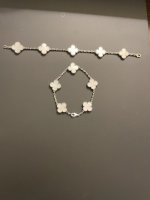
For fun and to help ease your mind, here are my bracelets, one laid out straight and the other closed in a loop as it would look when worn. I think you will find it ok and you will love the fact it fits better on you.

UPDATE: And by the way, you do not want too many links near the clasp as the clasp itself is already equivalent to TWO links long.

Hope this helps.
8B01002A-A7FD-4056-B285-868967B3429D.jpeg
 
Last edited:
I would take two out if it were me. Four is tight as others have mentioned, and I like movement.
Plus, you will go nuts putting it on yourself with four out which means you will wear it less which will be a shame given those special bracelets you have. Plus, keep in mind these are lobster clasps which means you have to over hook them to get them in the clasp due to the nature of the design. When putting it on by yourself, this means you have to pull the bracelet in even “tighter” to get the loop to fit through the curve of the hook. I really hate lobster clasps, but they are secure which is why they are so often used.

You will not even notice the distance between each motif once it is on your wrist. I am like you that I don’t like tight.

For fun and to help ease your mind, here are my bracelets, one laid out straight and the other closed in a loop as it would look when worn. I think you will find it ok and you will love the fact it fits better on you.

Hope this helps.
View attachment 5230404
Those are so beautiful! Thank you! Actually, the spacing difference isn't very noticeable when the bracelet is clasped. I should just go ahead and at least have one shortened by two links. Then I can send the others later. I need to ask my SA if she has any MOP anyway. Then maybe I could just have that one shortened and send the others after the holidays.
 
Those are so beautiful! Thank you! Actually, the spacing difference isn't very noticeable when the bracelet is clasped. I should just go ahead and at least have one shortened by two links. Then I can send the others later. I need to ask my SA if she has any MOP anyway. Then maybe I could just have that one shortened and send the others after the holidays.
Right... the clasp adds to the the distance between the motifs if you will.
I'm not sure if you saw my update above, but you have to also factor in the actual clasp.

This is what I posted above, but you may not have seen:
UPDATE: And by the way, you do not want too many links near the clasp as the clasp itself is already equivalent to TWO links long.

Then you'll have this big empty air gap at the clasp. VCA has really thought this through.
 
Those are so beautiful! Thank you! Actually, the spacing difference isn't very noticeable when the bracelet is clasped. I should just go ahead and at least have one shortened by two links. Then I can send the others later. I need to ask my SA if she has any MOP anyway. Then maybe I could just have that one shortened and send the others after the holidays.

You mentioned your’s have not been shortened at all right? And I read your wrist is 6” so same as mine. Do you have a picture of your bracelets on your wrist? I’m curious to see what they look like (: I’m starting to think BigAkoya is right though and I think I’d rather have 2 links removed than 4 for comfortability.
 
Hopefully this is appropriate to post here and won’t get deleted, but in relation to yesterday’s discussions, here is my fiancé’s current stack. I think malachite or onyx would be a perfect addition :heart:

View attachment 5230425
I vote oynx! It really pops. Also, your fiance's stack is very architectural, not soft. I think the harshness of oynx against the softness of the Alhambra motif would look great added to the stack.

Malachite is nice, but my gut feel says malachite against that stack would look a bit more "lucky charm" soft and cutesy.
With malachite, depending on how it's worn, there is a fine line between the eye seeing the elegance of the green vs. the "oh, you're wearing a cutesy green lucky charms bracelet"

Hope that makes sense. It's all preference of course, but for your fiance and that stack, I vote oynx.

By the way, if you fiance is Irish, the malachite would be kind of cool in a way. My husband is half Irish, half British which is why I thought of that. :biggrin:
 
You mentioned your’s have not been shortened at all right? And I read your wrist is 6” so same as mine. Do you have a picture of your bracelets on your wrist? I’m curious to see what they look like (: I’m starting to think BigAkoya is right though and I think I’d rather have 2 links removed than 4 for comfortability.

Yes, I have not shortened my bracelets. I only have pictures of the top of my wrist. I agree, and I think I will try two removed first. I have a feeling that will be the best size. I definitely wouldn't want them to be harder to put on!
 
I vote oynx! It really pops. Also, your fiance's stack is very architectural, not soft. I think the harshness of oynx against the softness of the Alhambra motif would look great added to the stack.

Malachite is nice, but my gut feel says malachite against that stack would look a bit more "lucky charm" soft and cutesy.
With malachite, depending on how it's worn, there is a fine line between the eye seeing the elegance of the green vs. the "oh, you're wearing a cutesy green lucky charms bracelet"

Hope that makes sense. It's all preference of course, but for your fiance and that stack, I vote oynx.

By the way, if you fiance is Irish, the malachite would be kind of cool in a way. My husband is half Irish, half British which is why I thought of that. :biggrin:

Actually it’s funny you say that, we are both part Irish!! I can’t believe I’ve never thought about this! But my vote is onyx for him too I think it will look so cool!
 
  • Like
Reactions: DS2006 and BigAkoya
Hey guys! I'm a total VCA newbie and just got my first piece today, the Sweet Alhambra Carnelian necklace in rose gold. In the store, the SA showed me two to choose from and I noticed that there seemed to be tiny gaps between the stone and the setting, which I noticed because it was placed on a light grey display tray and immediately noticed the gaps due to the colour contrast. I told the SA about it and she said it was completely normal and kind of pressured me along when I was unsure, saying these two pieces were the last ones they have and stock is very limited so not sure when they'll get more in. This kinda pushed me to overlook the gaps and convince myself I'm being too picky and it's fine. So I purchased it and went home, and decided to take it out for closer inspection (this time without pressure in the store haha) I noticed the gaps/air lines seem to be more obvious than I had remembered (probably due to the indoor lighting vs natural at home). Like it's defs very visible when placed against a light source which I thought is ok as long as it's not noticeable when worn normally, but upon closer look even when not against the light and in it's box (against the black backing) I could ever so slightly make out the gap line on the top half (which is the half with more noticeable gap).

I'm just not sure if I'm looking too much into this, and this is totally normal thing? As it's my first time buying from them so I don't know what to expect. Can you guys make out your gaps even not put against a light?

Does anyone else own a sweet alhambra carnelian necklace with the same issue? Gap/air lines very noticeable against a light, and if looking really close can still make them out even in normal settings, against a dark background?

Would be great if you guys could help! I'm not sure if I should exchange, as I don't wanna come off as an annoying customer and ask my SA to find a few more for me to choose from, where hopefully one will have a less noticeable gap.

Thanks!

Here are two threads on the gap issue. Hope they help.

https://forum.purseblog.com/threads/air-lines-gaps-getting-worse-in-va.1033019/

https://forum.purseblog.com/threads/air-lines-gaps-in-m-o-p-alhambra-jewellery-unavoidable.1002787/
 
Hey guys! I'm a total VCA newbie and just got my first piece today, the Sweet Alhambra Carnelian necklace in rose gold. In the store, the SA showed me two to choose from and I noticed that there seemed to be tiny gaps between the stone and the setting, which I noticed because it was placed on a light grey display tray and immediately noticed the gaps due to the colour contrast. I told the SA about it and she said it was completely normal and kind of pressured me along when I was unsure, saying these two pieces were the last ones they have and stock is very limited so not sure when they'll get more in. This kinda pushed me to overlook the gaps and convince myself I'm being too picky and it's fine. So I purchased it and went home, and decided to take it out for closer inspection (this time without pressure in the store haha) I noticed the gaps/air lines seem to be more obvious than I had remembered (probably due to the indoor lighting vs natural at home). Like it's defs very visible when placed against a light source which I thought is ok as long as it's not noticeable when worn normally, but upon closer look even when not against the light and in it's box (against the black backing) I could ever so slightly make out the gap line on the top half (which is the half with more noticeable gap).

I'm just not sure if I'm looking too much into this, and this is totally normal thing? As it's my first time buying from them so I don't know what to expect. Can you guys make out your gaps even not put against a light?

Does anyone else own a sweet alhambra carnelian necklace with the same issue? Gap/air lines very noticeable against a light, and if looking really close can still make them out even in normal settings, against a dark background?

Would be great if you guys could help! I'm not sure if I should exchange, as I don't wanna come off as an annoying customer and ask my SA to find a few more for me to choose from, where hopefully one will have a less noticeable gap.

Thanks!

Hi there and welcome! Congratulations on your new VCA piece! Unfortunately the gaps between the stones and setting (referred to as airlines) are quite common, some pieces are worse than others and my personal benchmark is if I don’t notice it without holding it up against the light, and the gaps aren’t too large that I can see it while it’s on a normal surface, it passes my visual test and I keep it.

However since this is your first piece I feel like you’ve already shared doubts & you clearly notice the gaps even while it’s not held up against the light which seems to bother you and will probably continue to bother you since you know it’s there. If you’re ok with waiting longer, I would personally do an exchange and wait until you get the carnelian shade & overall shape that you like (everyone has different tolerances for gaps so it’s really up to you). Personally if I could see the gap even when it’s just in the box it would bother me.
 
Hey guys! I'm a total VCA newbie and just got my first piece today, the Sweet Alhambra Carnelian necklace in rose gold. In the store, the SA showed me two to choose from and I noticed that there seemed to be tiny gaps between the stone and the setting, which I noticed because it was placed on a light grey display tray and immediately noticed the gaps due to the colour contrast. I told the SA about it and she said it was completely normal and kind of pressured me along when I was unsure, saying these two pieces were the last ones they have and stock is very limited so not sure when they'll get more in. This kinda pushed me to overlook the gaps and convince myself I'm being too picky and it's fine. So I purchased it and went home, and decided to take it out for closer inspection (this time without pressure in the store haha) I noticed the gaps/air lines seem to be more obvious than I had remembered (probably due to the indoor lighting vs natural at home). Like it's defs very visible when placed against a light source which I thought is ok as long as it's not noticeable when worn normally, but upon closer look even when not against the light and in it's box (against the black backing) I could ever so slightly make out the gap line on the top half (which is the half with more noticeable gap).

I'm just not sure if I'm looking too much into this, and this is totally normal thing? As it's my first time buying from them so I don't know what to expect. Can you guys make out your gaps even not put against a light?

Does anyone else own a sweet alhambra carnelian necklace with the same issue? Gap/air lines very noticeable against a light, and if looking really close can still make them out even in normal settings, against a dark background?

Would be great if you guys could help! I'm not sure if I should exchange, as I don't wanna come off as an annoying customer and ask my SA to find a few more for me to choose from, where hopefully one will have a less noticeable gap.

Thanks!
Hi and congratulations on your first VCA piece. VCA stones are all unique, so there will be slight differences in every stone, in exact shape as well as color/shading.

My honest opinion is that you are scrutinizing it too much. Based on what you wrote that you can see it "ever so slightly", it seems you are really staring at it super close. If I did that with anything, jewelry, bags, clothing... I could find fault in everything.
I think you need to ask yourself if you can enjoy this piece. If it really really really bothers you, exchange it.

I will say this though... Carnelian is very tough to get a nice color. Some are too orange, too brown, too burgundy, too whatever.
If I were you, if you love the color of your Carnelian, I would keep it. The next piece may be too orange or too brown (unless you like orange or brown tinted Carnelian). To me, for Carnelian, the stone color is THE most important thing. You will not see that tiny gap when you wear it, but you will always see that it's too brown or too orange.

I would look at the pendant when standing in front of a mirror. That is how one typically sees the pendant, not at 2" distance staring at it under a strong light. If you love the color while looking in the mirror (look at it under natural light as well), I would keep it.

If you are still obsessing over the gap and losing sleep over it, exchange it to get closure. When thinking of VCA, it should be happy thoughts, not thoughts that cause you anguish. :smile:

Just my two cents. I hope this was helpful. Congrats again on your first piece! :heart:
 
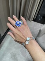
As promised, I am reporting back on the Hellebore ring and the visit to the boutique.
First, the Hellebore ring... I tried it on... it's so big, it's so blue, it's so me! :nuts: It was love in 3 seconds. :biggrin:
The one I tried on fit me, but I like to wear my rings loose, so I ordered the next size up. SA said it will take 6 months.
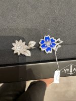
I posted a photo of the Hellebore next to my Lotus so for those who are interested so you can see a size comparison. The Hellebore definitely has a bigger look than Lotus.

I then tried on the Medium Clover bangle. Did not fall in love. I do not what it is about that bangle, but I love it on everyone else except me! :shocked: On me, it makes my wrist look like a big shapeless log. I think it's the metal, I think it's too much flat metal for me, hence giving the illusion of a shapeless log wrist. My SA suggested the one row or three row Perlee, neither of which he had, so we decided we would deal with a bangle on the next visit. Medium is my size for sure, so at least the size was settled.
Next up was to work on my oynx set dilemma. I tried on the oynx pave bracelet. I wanted more a punch with all oynx motifs, so he faked out the look for me. It was not bad, but not sure about two all oynx bracelets though. I was wearing all black (my winter look), and it looked fine, probably too harsh for me in the summer.

Next as part of the oynx dilemma was Cosmos...
No Cosmos oynx to try on, but he was able to bring in a pair of small Cosmos MOP earrings for size and for me to see the bezel. As part of my oynx set, I was thinking of getting the Cosmos oynx earrings and matching Cosmos oynx BTF ring to go with the oynx 20 The bezel, which I thought would be annoying, is actually not bad in real life. It adds a bit of character, so Cosmos oynx is a maybe. I took a photo of the earrings placed on my finger, so if anyone is interested in how it would look as a BTF ring, you can visualize. I also tried on the VA WG pave earrings as an option to go with the 20 oynx. It was nice, but I think I want something oynx on my ears to match the oynx 20 (the matchy matchy obsession runs strong in my veins). Cosmos oynx is also quite three dimensional which I really like.

Other items...
- The Zodiac pieces are here. It's very gold, one must have to love gold metal. It's a disc, almost like wearing a gold coin. There is a separate thread on these pieces if anyone is interested.
- I looked at the HP. It was a medium pink with a drop of blue. I'm not a pendant nor RG gal, so pass for me. There is also a separate thread on this as well with tons of photos/commentary. Side note… SAs are getting tons of calls from people who have never purchased from them demanding, and even yelling at them for not getting a HP. Crazy.
- SA brought in for me the Sweet 16 WG pave. Not bad, it's dainty, but still has presence if one wants something smaller than VA.
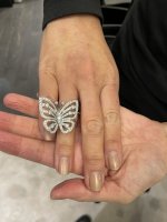
- I'm not really a butterfly person, but the Flying Butterfly ring is nice and big. The butterfly's antenna though are a bit scary to look at (friendly butterflies should not have scary looking antennas sticking out). :biggrin:

Here are photos of the Hellebore ring. I truly love this ring!
I also posted other photos as well in case some of you are thinking of getting these pieces so you can visualize what it looks like on a real person... no photoshop, nothing... wrinkles, dry winter hands, and all! :nuts:

Hope this was helpful for you to see the pieces in real life.

833225D0-3AEF-4ABC-905D-6F5A10F976A6.jpegA47B058B-2503-40DA-AAEF-878F16D00370.jpeg6ABFDCEB-2D60-4C05-B710-A216CC78AADD.pngF4ACBDF8-A5D7-49B0-A67F-7FF6ADC4AAC2.pngC6E14868-7AB2-422E-97AF-E2DE6DB9BF18.png99B11B5D-156A-4794-85B0-9FC4DF4F1BD5.jpeg
 
I completely agree with @BigAkoya , your purchase should be happy thoughts and a good experience and to me that comes first. If it’s bothering you and it makes you anxious or unhappy I wouldn’t settle, but like she said color for Carnelian is important to get the right shade that you want. I have tiny gaps on my VCA pieces but they make my heart sing and spark joy so I overlook the gaps! I hope you find the one that’s right for you.
 
Top