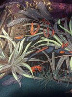
The blues in this are really nice. I'm not into browns at all but it looks like you can drape it in ways where you don't even see any brown? Would you say so? I may have to get this. Are the blues on the lighter side? Does the scarf feel Spring or feel darker?
Thank you, I love the blues myself! They're deeper blues in my opinion, and the scarf feels darker, rather than spring-like. But, there are pops of paler blue shades mixed in that help to make it look brighter. I was initially worried that the scarf would look too dark, what with all the darker blues and the browns, but it was much brighter than I was expecting and hence my fears were vanquished.
To me, it's actually brighter than the 90 silk version. If you look closely, the colors are not identical. The leaves in the lower right corner are slightly different- darker blue leaves on the 90, lighter blue on 140. I thought the Jaguar 90s and 140s were identical CWs to each other, but I think there are tiny variations in each if you really examine.
In these set of photos, I feel like the blues came out a TAD paler in comparison to real life. I did the best I ever can with my current camera skills, but I'm not completely satisfied with the accuracy. I'm happier with how it looks in the comparison pics I posted with the gray Jaguar shawl. Have you seen those? I think the blues looks more accurate there, at least it's how I see the scarf when I'm looking at it with my own eyes.
I don't think there is a way to completely avoid the brown, but I'm not very good at tying scarves. Picture 6 is where the upper left corner (the portion of the scarf with the most blue) is shown. Depending how loosely you drape it, you might get away with not showing any brown in the front. But when you pull the "ends" down (kind of like when you do a cowboy knot), you would probably see the brown that way.
Personally I like showing the brown spots, so I've only ever tried to figure out ways to show it, not hide it

Haha. There is so much brown in the design, I'm not sure if you could avoid it completely... maybe someone else who has this can chime in on the subject?


 Haha. There is so much brown in the design, I'm not sure if you could avoid it completely... maybe someone else who has this can chime in on the subject?
