Scarves The Hermès Spring Summer 2018 Scarves

TPF may earn a commission from merchant affiliate
links, including eBay, Amazon, and others

It is my opinion that they messed up on the colours/description once again. Believe they changed the indication of the CW-family to an actual colour. Noticed this first with the ME (méditerranée) scarves, where there are clearly just two colours (navy and white for example). All of these scarves have menthe as a first colour.
So when this first colour is mentioned online, the colour actually refers to a “CW-family”:
Quetsche = Quadrichromie (QU)
Menthe = Méditerranée (ME)
Vert = Veggie (VE)
Pistache = Plein Soleil (PS)
Purple = Purplish (PU)
(No mess-ups with Dans un Jardin (DJ), probably because they could not think of a colour with those letters.)
The tags on the scarves do not have the extra “colour”, just the two added letters first.
:hs:

By George ! I think you have got it !
H , of course, did not implement the new system consistently , typical ,
Some tags have 4 words , others don’t
We can only hope for 2018aw to have a full implementation
Some sites have 4 words , others don’t
 
Scarf mail today! I managed to order this from h.com during the few hours it was available.
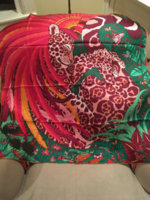
The Savana Dance mousseline stole, CW 3 quetsche/ rose bonbon/ turquoise/ciel.
Yes, it has same giant label as the 90s.
Despite all the pastels this season, this has deeper colors. It has a bit more orange( but dark) than I expected. One pleasant surprise was that the leopard is beautiful blues, the monkey a charcoal black. The h.com pix do not show that part of the design! A very happy, summery CW. The pink is a very pretty deep pink.
Goes with turquoise, cornflower Blue, navy, black, cream, white.

Hopefully, I will enable someone, LOL!View attachment 3943762 View attachment 3943763

Shown with a few bangles- the blue clic is “azur”View attachment 3943764 View attachment 3943765 View attachment 3943766
View attachment 3943768
View attachment 3943769
Thank you for posting all these images,
So much more helpful than the ones at h.com. They should hire you for marketing!
 
  • Like
Reactions: scarf1
Agree with BBC and others about why H would make all the cws so homogenized. This season’s designs are almost all hits, but color is equally important. Whoever made that decision should be flogged with a wet noodle. Or made to wear all the similar cws and forced to guess which is which while hooked up to a machine that gives ‘em a slight shock every time they get an answer wrong. Heh heh.

LOL.... Joannadyne, you are so funny. The wet noodle and shock machine ideas made my day. :nuts::biggrin::angel::p:yucky:
 
  • Like
Reactions: Joannadyne
Pictures of the Robe du Soir! (cw 18, menthe/marine/encre/blanc )

In my bedroom, directly under the light fixture, box corner left in for color calibration:

View attachment 3944326

See? Closeup:

View attachment 3944327

The section that includes the circles is "navy". Reminder, here is the photo on h.com:
View attachment 3944329
Ok, here is where it gets interesting. I took it to the window (grey day but natural light) and to my eyes it looked the same, maybe a little more contrast, but here is what the camera saw:
View attachment 3944330

Look, I don't think I'm color-blind, but I swear that is not what it looks like in real life, even in natural light.

I'm contemplating if I need a black/black-to-the-visible-eye scarf. I am dubious.

ETA: I must admit, the lighting in my bedroom is apparently way off natural light, as you can see from the whites. I will think about my light bulbs.

Oh wow- I see what you mean! Does it do that under any manmade lighting source, or just incandescent? How is it under fluorescent lighting? It looks a lot more like the online pic in the natural light shot (with discerable blue and black areas).

You are too kind, Moma! Next time I’m at a store I will try on some “wash-me-out!” cws and take some pics just for you. [emoji12]
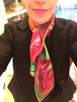
Is there a particular cw of Favolosa you’re considering? This is the one I was talking about - the colors are gorgeous but it’s too bold - you can’t see practically any elements of the design.
View attachment 3944405

ETA: At second glance, maybe that’s just because of the way I tied it... will have to look at it again.

BUT - this is the same cw as the Sea Surf and Fun one.
View attachment 3944406

And although Im chomping at the bit to see it, Modernisme Tropical 140 comes in a similar cw too.

Agree with BBC and others about why H would make all the cws so homogenized. This season’s designs are almost all hits, but color is equally important. Whoever made that decision should be flogged with a wet noodle. Or made to wear all the similar cws and forced to guess which is which while hooked up to a machine that gives ‘em a slight shock every time they get an answer wrong. Heh heh.

I must be in the minority, but I really like the Favolosa on you in that CW. I hope they do that one in pocket square....

But I agree with y'all completely about the limited color palette. It's like they picked 4 main colors for a color family and ran it through all the scarf designs instead of seeing what colors would look best with each scarf. And since I'm the kind of person who doesn't like to repeat colors in scarves much less buy multiples, it doesn't encourage people like me to purchase much, since this lovely Favolosa is the same color combination as my JQ scarf. For a person who purchases in a similar fashion, they'd be forced to move to a different scarf in a different color family whether or not any other colors worked for them...
 
Top