Love the Duo Cosmique and the cw you purchased. Even though I don't buy 90's, I feel like giving this a try. Might be too much pink for me, but then again the orange shows up nicely.
You are using an out of date browser. It may not display this or other websites correctly.
You should upgrade or use an alternative browser.
You should upgrade or use an alternative browser.
Scarves ........The Hermès Fall/Winter 2021 Scarves...........
- Thread starter Angelian
- Start date
TPF may earn a commission from merchant affiliate
links, including eBay, Amazon, and others
More options
Who Replied?

Soooo beautiful.A few quick and messy mod shots. La Danse des Amazones 140 H243593S 08, Bleu/gris/vert, borught on the French website: https://www.hermes.com/fr/fr/product/chale-140-la-danse-des-amazones-H243593Sv08/
The colors are very true to the image on the website. Definitely a keeper.
View attachment 5116443View attachment 5116444View attachment 5116446View attachment 5116445
Both are stunners but I like the blue best, Bunny. Did you ever try the old rose cw?Hello ZP fans! I'm back with new information and some more IRL pics. I wanted to see at least one more CW before making my mind up completely so I changed direction entirely and called to order the vermillion colorway.
Here are some comparison shots between the blue and vermillion. I'd say the website is pretty true to life on the colors. The vermillion is a bright red-orange shade, probably almost too orange for me, but just squeaks over the line in to workable. The red and orange feathers are what drew me here, so if you can wear this color, and don't want black feather outlines, have look at this one. I've put them both back into boxes for the day while I decide. (Pardon the piles of shirts. I pulled out a bunch to try out.)
The vermillion looks GREAT (IMO) on beige, soft grey, coral, geranium, brick/terra cotta and dark grey/black. None of the red winter sweaters I have matched, so that was a bummer and I used some summer t-shirts to find color coordination.
View attachment 5176241View attachment 5176242View attachment 5176243View attachment 5176244View attachment 5176245View attachment 5176246
Thaaaank youSoooo beautiful.
") The only reason I am looking forward to autumn...
The only reason I am looking forward to autumn...Me too!I've actually been eyeing this one Foxy! Stay tuned!

I can’t wait to start wearing 90s, 140s and GTs, both silk and CS, and my CS losanges! All I wear right now are small silk formats: twillies, ‘danas, gavs and 70s. You will look so beautiful in that CSGM.Thaaaank you
YOU make both of them look wonderful ! The dark blue one beautilly reflects the color of your eyes, but the vermillion one looks more young, more lively, more vibrant and gives a glow, as Fowytrini said. Keep both of them if you canHello ZP fans! I'm back with new information and some more IRL pics. I wanted to see at least one more CW before making my mind up completely so I changed direction entirely and called to order the vermillion colorway.
Here are some comparison shots between the blue and vermillion. I'd say the website is pretty true to life on the colors. The vermillion is a bright red-orange shade, probably almost too orange for me, but just squeaks over the line in to workable. The red and orange feathers are what drew me here, so if you can wear this color, and don't want black feather outlines, have look at this one. I've put them both back into boxes for the day while I decide. (Pardon the piles of shirts. I pulled out a bunch to try out.)
The vermillion looks GREAT (IMO) on beige, soft grey, coral, geranium, brick/terra cotta and dark grey/black. None of the red winter sweaters I have matched, so that was a bummer and I used some summer t-shirts to find color coordination.
View attachment 5176241View attachment 5176242View attachment 5176243View attachment 5176244View attachment 5176245View attachment 5176246
 ...
...Duggi, I love this on you - itlooks so good on you. I’ve never seen these.I read through the comments here and realize nobody is that excited about them, but I ordered one of the Froufrou 70 scarves with the ruffled edges. I've been inspired lately by men's fashion from the 17/1800s and thought this might be able to help me play around with some of those elements (frilly neck stuff). I got the Washington's Carriage detail, which was the one I was hoping for the least, but I also know it won't matter once worn. It's quite hard to deal with and fold/tie, but the construction method is very cool...they've used an elastic thread to stitch a three-row pattern of inter-connected circles that makes it scrunch-up and expand quite nicely. The stitches are more noticeable from the back, so 2 of the 3 detail photos are of the reverse side. I don't see myself wearing it a lot, but it's a cool unique piece to play with that very few people will have (maybe for good reason HAHA), so am excited to have it in my collection.
Also...I'm clearly not dressed for it today, but wanted to try it on regardless..tags even still attachedI prefer it tied the second way of the two ways I've tried so far.
View attachment 5174617
View attachment 5174619
View attachment 5174618
View attachment 5174620
View attachment 5174621
Last edited:
Are you in US? I am trying to locate the Grand Theatre in the same CW.
I LOVE these colors! Hmmmmm….
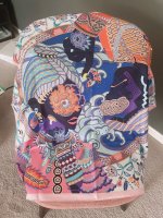
Scarf mail. Pretty color. Maybe a bit too cute for professional outfit, but good for causal use
Attachments


YOU make both of them look wonderful ! The dark blue one beautilly reflects the color of your eyes, but the vermillion one looks more young, more lively, more vibrant and gives a glow, as Fowytrini said. Keep both of them if you can
Your summary is perfect, I was trying to define the difference with navy being more "formal" and highlighting Ms. Bunnycat's eyes and with the red one being more "casual" and matching lipstick colour. Both look great and may be useful depending on the occasion and mood
I have seen it on the US site 3-4 times, including yesterday. I got mine from the US site tooAre you in US? I am trying to locate the Grand Theatre in the same CW.
Has anyone been tracking faubourg party on the us site? I mulled too long and missed the color I wanted… wondering if it will come back. Is there a meme for H problems? I need one!
What? I’ve been looking for one for a friend and I can’t catch it on the site at all.I have seen it on the US site 3-4 times, including yesterday. I got mine from the US site too
Register on TPF! This sidebar then disappears and there are less ads!