Thank you, Croisette! So happy to be your twin! I can get styling tips from you!Congratulation on your new acquisition, Ladybaga! The CW is so soft, I'm your twin in twill. Perfect with your turquoise jewelry!
Two wonderful carrés, FugitiveRouge ... congratulation and enjoy!
You are using an out of date browser. It may not display this or other websites correctly.
You should upgrade or use an alternative browser.
You should upgrade or use an alternative browser.
Scarves ........The Hermès Fall/Winter 2019 Scarves...........
- Thread starter Angelian
- Start date
TPF may earn a commission from merchant affiliate
links, including eBay, Amazon, and others
More options
Who Replied?
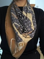
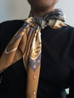
View attachment 4469877 View attachment 4469876 Here is one of my A/W 90cm silk purchases.
Kachinas Wash in cw 14.
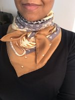
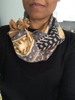
And an up close pic of the details.
Looking fresher than ever, you look good in everything but pleased you've found a gap in your enviable scarf wardrobe.
Thank you so much, papertiger! I think this cw would look beautiful on you!Looking fresher than ever, you look good in everything but pleased you've found a gap in your enviable scarf wardrobe.
View attachment 4469877 View attachment 4469876 Here is one of my A/W 90cm silk purchases.
Kachinas Wash in cw 14.
And an up close pic of the details.
So pretty with the orange t-shirt.

Thank you so much, papertiger! I think this cw would look beautiful on you!
Me too
 . Very pretty. Really like many of the Kachina cws. I was wearing one of my Wash scarves yesterday from the current season and really loving how soft and comfortable they are.
Thanks for the comparison with PdS. I did not buy that CW, so for me the blue pink kachinas fills a void. Both beautiful !What a small world. It was lovely to meet you. (Even though I didn't know it was you at the time!)
I got the blue/green Jungle Love and the denim/pink Kachinas (neither of which are new to the thread): View attachment 4470200 I really like how the white lines are not mathematically precise, but the colored stripes look and feel hand-drawn.
The Kachinas colorway is very similar to the pink and blue Samourai. (Pics for comparison):
View attachment 4470201 It was (unusually for me) not a strategic purchase. As soon as I saw it, I was "yes please. That's mine now. Thank you very much." I think it was partially because it reminds me of my favorite scarf. But I also love the print and it's sufficiently different from my other Kachina. You might not even think they're the same scarf! View attachment 4470202
Me too
I am very excited to buy my first wash scarf. My favourite silk shirt is a sort of wash texture and is softer than kitten fur.
The bolduc looks so wearable in this cw. It will pair well with Fall/Winter outfits.
Thank you, Hermes Nuttynut! If I could find a blue atoll or lagon tshirt, I'll be set! Are there any designs on your radar? This fall season will drain my bank account!So pretty with the orange t-shirt.

I know! These are so soft! I love the offerings of colors for the Kachinas wash. They seem very vintage!Me too
 I love how the coral rolled hem of mine looks a little faded, like I have had it for years.
I’m also very biased - I love Jan’s art, I bought 3 cw of Animapolis (1, 8, 11) and already one of Cosmographia. I’m drawn to bright colors, and intricate but graphic patterns often. Animapolis 8 in the more muted cream and blue looks like a different scarf, and reads as pretty neutral. I wear lots of solid color clothes so I enjoy the patterns and life. And 90s are my favorite.
I justify them all because I love the color variation and ways to tie, the fact that Animapolis was based on one of his dreams (love that about so many artists and how their dream lives figure in) and features his rescue puppy Kluska. I hang different scarves on my scarf hanging system as I rotate a different scarf through that every week or two to see the full scarf and enjoy that way.
I’ve had more compliments on Jan’s scarves than any others in my collection. I have some more traditional patterns and neutrals, like petit duc tyger tyger Dallet etc. (As an animal lover I’m often drawn to animals on scarves too!) I really love all my scarves, except for a few that I’m more meh about as I bought early and they weren’t as “me”. Now I don’t buy a single piece unless I absolutely love it. I don’t typically go for the very traditional patterns that H seems to release over and over, though I appreciate them as works of art and history nonetheless and know those scarves sing to many here. I also run warm, so no cashmere for me (and thank goodness for that - my wallet is happier!)
Didn’t mean to write a book! Guess my point is I think those two scarves are quite different even though you can clearly tell they are the work of the same artist. So cosmographia seems different enough for me.
Bottom line though is if YOU don’t love it or wear your Animapolis as much, maybe it’s not for you. There’s plenty more on the way!!! I still love how we can all find our unique style and “voice” as we build our collections. And I love seeing every single scarf and photograph and modeling pics you lovely tpfrs share. You all rock your own styles. Thank you!
I agree, a very classic item.The bolduc looks so wearable in this cw. It will pair well with Fall/Winter outfits.
I really appreciate this reply, because I am hankering after one of these designs, ever since I tried on an Animapolis,a couple of weeks ago, in the coral lavender, turquoise CW...but I wanted just one, so have been waiting to try a Cosmographia before deciding...It seems to me that the biggest difference with two , besides the actual subject matter, seems to be the greater variation in design in Cosmographie. While Animapolis’ drawings seem generally densely and evenly packed into the 36 square silk, Cosmographia’s lower half is busy and crowded, but the more you ascend the larger and airier the drawing, and the lighter the tones, so when you fold it you really get a different effect with each bias and corner.Dr. Tre showed that in her mod shots a while back..so it’s going to come down to colours or design. If Cosmographia has as pretty a colorway as Animapolis, though, I’ll know which way to jump!I’m also very biased - I love Jan’s art, I bought 3 cw of Animapolis (1, 8, 11) and already one of Cosmographia. I’m drawn to bright colors, and intricate but graphic patterns often. Animapolis 8 in the more muted cream and blue looks like a different scarf, and reads as pretty neutral. I wear lots of solid color clothes so I enjoy the patterns and life. And 90s are my favorite.
I justify them all because I love the color variation and ways to tie, the fact that Animapolis was based on one of his dreams (love that about so many artists and how their dream lives figure in) and features his rescue puppy Kluska. I hang different scarves on my scarf hanging system as I rotate a different scarf through that every week or two to see the full scarf and enjoy that way.
I’ve had more compliments on Jan’s scarves than any others in my collection. I have some more traditional patterns and neutrals, like petit duc tyger tyger Dallet etc. (As an animal lover I’m often drawn to animals on scarves too!) I really love all my scarves, except for a few that I’m more meh about as I bought early and they weren’t as “me”. Now I don’t buy a single piece unless I absolutely love it. I don’t typically go for the very traditional patterns that H seems to release over and over, though I appreciate them as works of art and history nonetheless and know those scarves sing to many here. I also run warm, so no cashmere for me (and thank goodness for that - my wallet is happier!)
Didn’t mean to write a book! Guess my point is I think those two scarves are quite different even though you can clearly tell they are the work of the same artist. So cosmographia seems different enough for me.
Bottom line though is if YOU don’t love it or wear your Animapolis as much, maybe it’s not for you. There’s plenty more on the way!!! I still love how we can all find our unique style and “voice” as we build our collections. And I love seeing every single scarf and photograph and modeling pics you lovely tpfrs share. You all rock your own styles. Thank you!
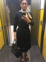
Ok. Here are some bad(!) mod pics, a little later than promised- sorry everyone!
I wore the scarf today, and yes, it’s very wrinkly but the tag is tiny so... I guess it balances out?
Edit: I’d say that the last 3 pics shows the colors most accurately.
I wore the scarf today, and yes, it’s very wrinkly but the tag is tiny so... I guess it balances out?
Edit: I’d say that the last 3 pics shows the colors most accurately.
Attachments
-
 7F236F54-0D74-4464-9B6D-1355A9C88810.jpeg129.5 KB · Views: 696
 -
 5955FE26-8446-42AB-B627-E154E93999D9.jpeg130.2 KB · Views: 696
 -
 4DA4ADC6-CA1C-4950-9F27-B372E144DD19.jpeg149.6 KB · Views: 702
 -
 34419160-FAE4-48A1-827C-1DBBACFC9C23.jpeg134.9 KB · Views: 696
 -
 F9F7C658-F006-49D0-B606-2CA0EA51E2B0.jpeg124.3 KB · Views: 695
GORGEOUS! I think this scarf is going to be the star of the season! You look amazing!!!Ok. Here are some bad(!) mod pics, a little later than promised- sorry everyone!
I wore the scarf today, and yes, it’s very wrinkly but the tag is tiny so... I guess it balances out?
Register on TPF! This sidebar then disappears and there are less ads!