I like the grey, you'll still have the smashing blue eyes!
Those blue eyes are great, aren't they? I definitely need to see this one IRL!
TPF may earn a commission from merchant affiliate
links, including eBay, Amazon, and others
I like the grey, you'll still have the smashing blue eyes!
The designs back then were so wonderful and like you I ended up doubling on my first CSGM, I found a LFASDV in Noisette to keep the black one company.
I bought a Sieste this Season which means that now I have seven shawls and that's more than enough, so I'm trying hard not to look too hard at this Season's Atelier Dallet which is so beautiful!
Thank you Luvbolide! I hope you are doing well!!! I have one Kachinas 90 which I was given by a sweet woman who entered into Assisted Living. She knew how much I adore H scarves, so the 90 in that pattern and the "turkey scarf" came home with me. When I took a closer look at the Kachinas scarf, I saw that KO sign it! She had gone to an art opening and had him sign her scarf with a thin Sharpie marker. I was so excited! Since then, my DH and I purchased one of his small sheep paintings and have had the opportunity to meet him on two occasions. Very shy, dear man.
Hi Luvbolide! Wanted to come back and say that you are my Kachinas Hero! WOW! THREE???? I agree that the 140 sized format is better than my 90, too! I also have a summer silk 140cm that came out a few years ago. Love the colors of that one...vibrant turquoise, yellow, fuchsia, and brown against a white background. I need to get that out and wear it more. Are you getting any of the reissue Kachinas shawls this season? I am still in awe of your collection of 3 Kachinas shawls!
I love this too. I'm drawn to CW 04, but want to see IRL. There's also one extra CW on the French site. Here's the painting on which the design in based.
Can't wait to see it tied. as a Cal grad, I have to at least give this one a try.
Oops. Thanks for showing it tied.
p.s. In the photos above, the middle one with the lazy cowboy tie and mostly polka dots showing is the closest to the real-life color. My iPhone is bad at capturing blues accurately!
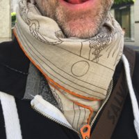
Here are some better modeling photos in the daylight if my mors cashmere 05
View attachment 3410818View attachment 3410819View attachment 3410820View attachment 3410821View attachment 3410822View attachment 3410823View attachment 3410824
Mumbai 90cm cashmere/silk fringe
02

03

04

08

09

10

Thanks! I think it has a ton of versatility due to the polka dots and how the bear is printed at an angle. I tied it a couple of different ways to demonstrate.
View attachment 3410856
View attachment 3410858
View attachment 3410861
I debated over using the expression «comic book» and hedged my bets by also saying graphic. I was not trying to be pejorative in any way just descriptive and «comic book» is spot on
But, a good example are Toutsy's coconuts: the almond shaped things in the corners of the vintage design Aloha and the recent Mythiques Phoenix. Vastly different look with (Aloha) and without (MP) the detailed shading on the coconuts
View attachment 3410243 Aloha - see shading on orange coconut
View attachment 3410244 Mythiques
The electric colors in this cw of MP also add a graphic - dare I say «comic book look »
I have no pix to accompany this post, as I didn't buy a thing (even after the very kind SAs helped me lookey-lou for about an hour!!)
The CSGMs Dans L'Atelier two light c/ws that are on the US H.com site are not quite as I expected. Well in particular the c/w that I thought had a warmer background (with the dark red hem) was lovely but not what it appeared to be online.
The rose poudre/parme/beige c/w 31 of Lalbhai was really beautiful, as was a light blue c/w 25 of Lalbhai.
Not sure why I'm posting this as it's all opinion and not the least informative. Other than the lesson in all of it is, as has been mentioned by others, the colors IRL are not accurately enough depicted in H.com photos. So you may find something appealing or not online, and have the opposite reaction when you see it IRL.