Scarves Scarf of The Day 2023- Which Hermès scarf are you wearing today?

TPF may earn a commission from merchant affiliate
links, including eBay, Amazon, and others

Status
Not open for further replies.
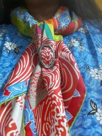
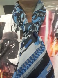
Chaine d'ancre 90 in 58% cotton and 42% silk...the replication of the jewelry icon in the carré substantially complies with the week's theme, no?

John in DFW

View attachment 5693710
Looks great with your shirt @hermesguy
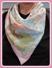
@Nomad, love the pink border with the bright pink top
Now dogs don't hunt anymore but are free to move En liberté!
View attachment 5693925
Great hot pink hem on this, @Coco2606, makes it pop
A post and a little challenge today...
The wonderful Annie Faivre has made the most economical scarf (maths H of course as we then want all of them) and the most beautiful cover.
Can you help me find the 18 designs hidden in "Au fil du carré" ?
View attachment 5694186View attachment 5694187View attachment 5694188
1. Dômes célestes
2. Tapis volants
3. Cavaliers du Caucase
4. Ors nomades
5. Libre comme l'air
6. Art des steppes
7. Au fil de la soie
8. La danse du cheval Marwari
9. Rencontre océane
10. Tapis de selle
11. Légendes de l'arbre
12.... Etc
I'm drying!
Another cw...
View attachment 5694189
And now I’ll have to look for Au fil du carré. I didn’t know it depicts snippets of all theses other scarves. Thanks @Coco2606
 
Taking off from @xincin's post this morning, I am posting two examples today. Two by Ledoux! The first, Carrick a Pompe, was issued in 1953 and so is on my list of birth year scarves. I was delighted that Hermes released a reissue last fall in the vintage 70 format. The original had already been reissued over the years in additional cws, but this one features a very cute border and a navy contrast hem.
View attachment 5694210View attachment 5694212
My second example is a 140 silk-- Harnais de Cour en Patch. This design had already been reissued in CSGM, bandana and in tattoo redesigns over the years. Here is the description of the recent (2020?) 140 from the website.
"Philippe Ledoux is part of Hermès history. His Harnais de Cour design is reinterpreted here. The single harness from the original is multiplied by four to form a patchwork of pairs facing off. The richly decorated pieces from Ledoux’s composition are rendered here with a stark two-tone motif that covers half of each section."
I like this design very much for the blend of the traditional look with the two-tone patches-- which remind me of the saturated colors of dip-dye scarves and also of the bi-color tattoo version (although that was a jacquard). This is my SOTD.
View attachment 5694215View attachment 5694216
@LKBNOLA, that is a lovely border on Carrick a Pompe and tied so nicely to highlight it
Jeu d‘Omnibus ... I regret I miss the 70 in my collex

gavroche

View attachment 5694226

CSGM

View attachment 5694228

View attachment 5694227
@Croisette7, This CSGM with the the gold, grey, and black is gorgeous, great color combination “sehr schön”
Some vintage designs reimagined and even reordered!
Les Mustangs bandana and a vintage design of those amazing running horses.
View attachment 5694277
View attachment 5694281
Promenade de Paris updated with a jazzy hem:
View attachment 5694285
Dallet’s cat studies “finessed” in stripes and gingham:
View attachment 5694286
DF Della Cavelleria Favolosa:
View attachment 5694283
Washington’s Carriage reimagined into a losange:
View attachment 5694282
Omnibus Remix:
View attachment 5694280
Brides de Gala in a GT and also transformed into En Desordre Multico Fleuri:
View attachment 5694278View attachment 5694287
And finally, one iteration of the much loved Ex Libris design:
View attachment 5694288
I love your blue Les Mustangs bandana, @Karenska, I saw it on H.com but dilly-dallied and ‘poof’ it was gone.
Love the current iteration of JL. And while JL has been a favorite design of mine for a long while now, it's always been a little hard to wear (or downright frustrating) mainly because of the big blank border, the difficulty of featuring the "main feature" (for me) of the cats, and the problem that most of the other interest was fairly well hidden by folds leaving you with mainly blank areas or just foliage featured.

I originally solved that by getting the big CSGM so I could feature the cats and other creatures more more easily. And also the DD since I at least LIKED the border color, so didn't feel like it was as much of an albatross as it was for me on other releases.

View attachment 5694294
View attachment 5694295


But Pagni's reinterpretation this season neatly solves all the problems in one go with the addition of the stamped foliage. Border interest? Check! I can see the cats? Check! Updates design with the tattoo printing? Check! Pickles added for extra interest. It was Kiss Your Ginger day last week, and I am behind on kisses! He really wanted to just go play with his favorite toy.... :lol:


View attachment 5694303
View attachment 5694299

View attachment 5694301
I want a Mr. Pickles. He’s cute, sounds entertaining, and looks good with scarves, @bunnycat
 
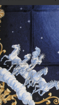
Just two vintage silks from Dimitri R. in advance of the new Lunar Year. Galop Volant which was posted last week -and the special edition version retitled Heavenly Horses for an exhibition.

View attachment 5694383

View attachment 5694384

View attachment 5694385

View attachment 5694386

View attachment 5694387
Your Galop Volants are beautiful. Love the grey that @Redbirdhermes has also. Happy Lunar New Year, @lanit!
I was excited to wear a gold shirt with a bottle green blazer today. Potager Extraordinaire was a good choice to take things down a notch :smile:

View attachment 5694470
Nice color combination @Teaforparrots
Fleurs d’indiennes in dwindling evening light.

View attachment 5694612
Sisters with you on this one, @Maedi , also on the selfies in the dark. Mine have been bathroom pics because of the good light in there
Hermes opened their store at 24, rue du Faubourg Saint-Honoré in 1880.

View attachment 5694584

Over time the building was updated. By 1975 a roof terrace had been added. Here is Robert Dumas standing on it.

View attachment 5694585

And, later the horse mounted artilleraryman was added.

View attachment 5694586

Looking at my scarves, I find that I own at least six different designs featuring the 24 Faubourg building.

The oldest design from 2004 is Dimitri Rybaltchenko's delightful Christmas snow globe in Noel au 24 Faubourg.

View attachment 5694587

In 2007 came Benoit-Pierre Emery's fantastic kaleidoscopic design in Faubourg by Night.

View attachment 5694599

In 2014 the rooftop artilleryman became the caped crusader in Dimitri Rybaltchenko's Minuit au Faubourg.

View attachment 5694602

Three years later Rybaltchenko featured the building again as extraterrestrials invade Hermes in Space Shopping au Faubourg. This is one of my very favorite designs.

View attachment 5694604

The following year Ugo Gattoni featured the building as the Formula One Grand Prix race came to Paris, Gattoni style, in Le Grand Prix du Faubourg.

View attachment 5694609

In 2021 we find that 24 Faubourg has been overgrown by the jungle in Octave Marsal and Theo de Gueltzl's Faubourg Tropical.

View attachment 5694611

In addition, the men's scarf Faubourg Party, by Tibor Karpati, is currently available and features the building transformed into a fantastical nightclub.

My scarf of the day is Space Shopping au Faubourg.

View attachment 5694839
Great post, @Redbirdhermes, informative and with a great collection of Faubourg scarves
 
Good morning. I am so happy to introduce my third 1953 design scarf which just arrived in the mail yesterday! This is Mail Coach by Hugo Grykar, first issued in 1953 and reissued in 1984, according to Fontan. No other dates are given so I am assuming this scarf is from 1984 (remarkable!). It celebrates the Mail Coach and its coachman/driver with nine postcard vignettes on a background featuring top hats, cockades and jacket buttons in the corners-- all features of the coachman's uniform, as well as that badge of honor, his whip. Perhaps Grykar was influenced by his own work-- just the year prior he had designed another scarf celebrating means of public conveyance! Grykar is considered "the father of Carre Hermes-- he designed the very first carre and of course, the iconic Brides de Gala. Here's the link to a marvelous post by Carre de Paris; worth the moment to read: https://carredeparis.me/2013/05/19/hugo-grygkar-the-father-of-the-carre-hermes/ Huge thanks to @momasaurus for inspiration on which cw to search for and @Nomad for stellar assistance in my successful hunt!
View attachment 5695359
View attachment 5695360
I’ve seen this scarf many times on the resale market and thought it was okay, but it looks sooo good the way you’re wearing it
 
Good morning. I am so happy to introduce my third 1953 design scarf which just arrived in the mail yesterday! This is Mail Coach by Hugo Grykar, first issued in 1953 and reissued in 1984, according to Fontan. No other dates are given so I am assuming this scarf is from 1984 (remarkable!). It celebrates the Mail Coach and its coachman/driver with nine postcard vignettes on a background featuring top hats, cockades and jacket buttons in the corners-- all features of the coachman's uniform, as well as that badge of honor, his whip. Perhaps Grykar was influenced by his own work-- just the year prior he had designed another scarf celebrating means of public conveyance! Grykar is considered "the father of Carre Hermes-- he designed the very first carre and of course, the iconic Brides de Gala. Here's the link to a marvelous post by Carre de Paris; worth the moment to read: https://carredeparis.me/2013/05/19/hugo-grygkar-the-father-of-the-carre-hermes/ Huge thanks to @momasaurus for inspiration on which cw to search for and @Nomad for stellar assistance in my successful hunt!
View attachment 5695359
View attachment 5695360
Oh, how pretty. I adore this design and your color way is spectacular. Doesn't @turfnsurf have this, too?
 
Thank you for the lovely shots of Dimitri Rybaltchenko's Galop Volant, @lanit . I want to compare the artist's older design with his new Sur Mon Nuage, which also features people and creatures up in the clouds.

But first, since imitation is the sincerest form of flattery, here is my Galop Volant, which I sought out after seeing yours.

View attachment 5695170View attachment 5695171

Last season Sur Mon Nuage was released and I fell in love with this quirky design.

View attachment 5695418

Rybaltchenko's clouds strike me as being much more complex, and the scarf is quite full with a variety of people, animals and objects. Like many recent Hermes scarves, the design goes closer to the edge, and the scarf features a fancy bicolor hem. I like picking out different features and thinking about their meanings, such as this barefoot guy walking along with his head in a cloud.

View attachment 5695419

Sur Mon Nuage is my scarf of the day.

View attachment 5695420
Thanks for showing the design details. That man with his head in a cloud is fascinating.
 
  • Thanks
Reactions: Redbirdhermes
Your Galop Volants are beautiful. Love the grey that @Redbirdhermes has also. Happy Lunar New Year, @lanit!

Nice color combination @Teaforparrots

Sisters with you on this one, @Maedi , also on the selfies in the dark. Mine have been bathroom pics because of the good light in there

Great post, @Redbirdhermes, informative and with a great collection of Faubourg scarves
So happy to be your twin and thank you for comisserating with the dark selfies :)
Clair de Lune in this color makes me reflect on my scarves. Most are more colorful yet this is so simple, impactful and easy to wear.
 
  • Like
Reactions: Marie-the-Mary
Glad to see The Return of the Turtleneck, by the recognized expert in the field! :tup:
Thank you, Hermesguy!

Classy, Agrume!

Splendid in these colours, EtsyBoss!
Thank you, Croisette!


Twins on this wonderful TlBdM ... and here are the Jonques:

View attachment 5695602

View attachment 5695603

OT today with Early America

View attachment 5695606

Both are wonderful, Croisette, and love the colours of your EA!


Lovely, @Agrume-- and the little ring :smile: ...
Thank you, LKBNOLA !


Wonderful comparison and post! please let me add the this little gav to your spectacular examples. Un Jardin sur le Toit.

View attachment 5695399
Hello twin!


I think I was on theme yesterday with Brandebourgs, reissued a few times and in different sizes. This is a Surteint.
View attachment 5695805
Beautiful colour!


Every time I see this one, I wonder why I don’t have it. Such a simple and elegant piece.


Lovely. This moody colourway is my favourite of the Faubourg Tropicale CSGMs. The pastels are beautiful, but there’s so much depth in the darker rendering.


A fabulous red! While the borders on bateaux are possibly my favourite of any design, I think I prefer the central motif and the colourways of jonques.
Thank you, Lellabelle!


Clair de Lune could be inspired by LeDoux’ Cosmos (photo not mine)View attachment 5695852View attachment 5695855. I used to have Cosmos but gave it to my mom. Both designs are dreamy.
Lovely, Maedi!
 
Apologies for my absentee hosting this week. After getting through the pandemic in relatively good health, I caught the flu bug this week :sad:

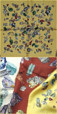
Scarfies who have been on SOTD for a while will notice that I have an obsession with rocks and gems. So it was only natural that I would find that vintage design Mineraux.
PicsArt_03-28-09.38.54.jpg
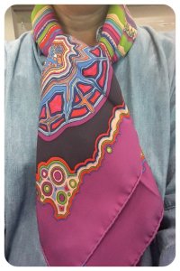
It was therefore a foregone conclusion that when H released a design on the same theme, I would jump on it. My three cws of Mineraux are quite naturalistic, so my SA was surprised when I chose the dark pink cw for Pierres et Cristaux. It reminded me of rock slabs which gemologists put under tests to check if they are natural, enhanced or synthetic.
PicsArt_02-26-02.56.31.jpg
Several scarfies have shown the multiple iterations of BdG old and new. I like H's remakes of Ex Libris, some of which are so different that they look nothing like the original. A few are on my wishlist.

An Ex Libris with grail status is EL en Kimonos.
PicsArt_02-09-01.24.32.jpg
I have two.
PicsArt_02-02-09.06.33.jpg
And inspired by @Julide's full array of this design, I recently acquired a third which is still in the mail.
Gattoni created a cute version EL Atlantis with the groom at the bottom of the ocean.
Picsart_22-10-13_14-07-29-810.jpg
When I travel, I sometimes bring along EL Globetrotter which is in lightweight silk, a nifty smaller size and and shows the 4 points of the compass.
PicsArt_03-11-01.26.16.png
And one of my fave EL-based designs is Glitch. It depicts EL on a very staticky old TV screen. If you do not take a closer look, you would miss the pattern altogether. A techno interpretation of a very traditional design!
PicsArt_07-24-04.29.37.jpg
 
Oh thank you so much for showing this scarf and the large flat picture to see the design so clearly. This is so beautiful the color is just gorgeously watery -- perfect. And of course you were a big enabler/influence on the Bateaux... :flowers:

And so very different in the red!

Ah, so happy to see this beautiful mod shot for inspiration and always happy to be twins @Croisette7 -- I just adore the button corners and the lovely saturated cherry red on this one!

Beautiful-- such a warm and lovely autumnal look. I just became a sister on this in a different cw. If other scarfies are searching for this design, and on the topic of reissues, I found this useful information on the Poupishop website-- very handy to identify the scarf and year. I can't tell from this tie if @Croisette7's has the Washingtons or the circle of squirrels at the center...Here's the info:
1970: 1ST ISSUE WITH CIRCLE OF SQUIRRELS
1979: WITH LADY & GENERAL GEORGE WASHINGTON
1984: WITHOUT LADY & GENERAL GEORGE WASHINGTON (CIRCLE OF SQUIRRELS)
2001: 100TH ANNIVERSARY, ART INSTITUTE OF CHICAGO, ILLINOIS
My CSGMs are without the Wahsington‘s in the center.
Wonderful comparison and post! please let me add the this little gav to your spectacular examples. Un Jardin sur le Toit.

View attachment 5695399
In love with your smocked blouse, MAGJES!
Every time I see this one, I wonder why I don’t have it. Such a simple and elegant piece.


Lovely. This moody colourway is my favourite of the Faubourg Tropicale CSGMs. The pastels are beautiful, but there’s so much depth in the darker rendering.


A fabulous red! While the borders on bateaux are possibly my favourite of any design, I think I prefer the central motif and the colourways of jonques.
Thank you Lellabelle!
@LKBNOLA, that is a lovely border on Carrick a Pompe and tied so nicely to highlight it

@Croisette7, This CSGM with the the gold, grey, and black is gorgeous, great color combination “sehr schön”

I love your blue Les Mustangs bandana, @Karenska, I saw it on H.com but dilly-dallied and ‘poof’ it was gone.

I want a Mr. Pickles. He’s cute, sounds entertaining, and looks good with scarves, @bunnycat
Dankeschön Nhare!
Thank you, Hermesguy!


Thank you, Croisette!


Both are wonderful, Croisette, and love the colours of your EA!


Thank you, LKBNOLA !


Hello twin!


Beautiful colour!


Thank you, Lellabelle!


Lovely, Maedi!
Bedankt, dear Agrume!
Sotd, joining the faubourg love. I don’t wear this moody cw nearly enough.
I will eventually get to no black in my wardrobe. It is horrible on me. Truly. So I am thankful for colorful scarves to go near my face during my closet transition :happydance:
View attachment 5696014
Lovely Nomad ... you‘re twins with Pirula, I think?
 
Taking off from @xincin's post this morning, I am posting two examples today. Two by Ledoux! The first, Carrick a Pompe, was issued in 1953 and so is on my list of birth year scarves. I was delighted that Hermes released a reissue last fall in the vintage 70 format. The original had already been reissued over the years in additional cws, but this one features a very cute border and a navy contrast hem.
View attachment 5694210View attachment 5694212
My second example is a 140 silk-- Harnais de Cour en Patch. This design had already been reissued in CSGM, bandana and in tattoo redesigns over the years. Here is the description of the recent (2020?) 140 from the website.
"Philippe Ledoux is part of Hermès history. His Harnais de Cour design is reinterpreted here. The single harness from the original is multiplied by four to form a patchwork of pairs facing off. The richly decorated pieces from Ledoux’s composition are rendered here with a stark two-tone motif that covers half of each section."
I like this design very much for the blend of the traditional look with the two-tone patches-- which remind me of the saturated colors of dip-dye scarves and also of the bi-color tattoo version (although that was a jacquard). This is my SOTD.
View attachment 5694215View attachment 5694216
This is such an interesting post, Lkb, and both scarves are beauties, especially Harness de Cour en Patch. It’s dual qualities make it very special. The way you tied it makes it look smaller than a 140. Would you mind giving a description of the knot you used?
 
Status
Not open for further replies.
Top