Excellent points! I hadn't considered the darker interior of the monogram speedy 25 and having a hard time seeing things. I do really like the personalization of adding colors and initials tbh.I think if you already have the Speedy 25 in the two other prints (as stated in another thread), I would go for something different with the initials for the monogram one. But I like to have more individuality and variety in my collection!
Also one reason I sold my monogram speedy 25 was that the inside was so dark and the opening was so small, it was really hard to find anything. At least with My Heritage speedies you can pick a nice brightly colored interior. Maybe why I like my damier azur speedy 25 a lot more and kept it -- the inside is light colored.
You are using an out of date browser. It may not display this or other websites correctly.
You should upgrade or use an alternative browser.
You should upgrade or use an alternative browser.
Personalized/ Mon Monogram Club
- Thread starter LVuittonLuvr
- Start date
TPF may earn a commission from merchant affiliate
links, including eBay, Amazon, and others
More options
Who Replied?Hmm.. I like playing around in the customizer and couldn’t help but notice the Mini Pochette is now “Call to Purchase,” but when I checked Neverfulls and Speedys they’re still “Place In Cart.” I checked multiple browsers (not logged in) so I don’t think this is something tied to my specific account. I wonder what’s going on? 

Attachments
I was able to place the mini pochette in my cart. I'm in the US.
How strange! Maybe it’s tied to my IP. I checked multiple browsers and it wasn’t working for some reason, but then again I ordered a Mini Pochette recentlyI was able to place the mini pochette in my cart. I'm in the US.
Looks more balanced with two initials, imo. Also you might just search this thread for keywords to find photos people have shared of items with fuchsia.
Thank you! I'll try searching.Looks more balanced with two initials, imo. Also you might just search this thread for keywords to find photos people have shared of items with fuchsia.
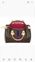
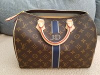
I agree with @jane, the "J" on its own has an uneven "weight" distribution, it leans to the right. "JD" has no such issue, and in fact it is an optically very fortunate combination.Contemplating the classic speedy 25. Do I keep with the monogram or do I order the my heritage with either my two initials or just first initial? Here's what I'm considering. Anyone have a my heritage bag with fuschia they can post for reference? I'm torn y'all.View attachment 5206382
View attachment 5206383
But since both the Fuchsia and the Bleu Marine are darker colours, and the canvas is also a darker tone itself, I'd recommend you to consider a lighter colour instead of the Bleu Marine. It would help to retain definition and readability. But this is just designer tip, at the end of the day there are no wrong answers here.
Very good points! Thank you so much!I agree with @jane, the "J" on its own has an uneven "weight" distribution, it leans to the right. "JD" has no such issue, and in fact it is an optically very fortunate combination.
But since both the Fuchsia and the Bleu Marine are darker colours, and the canvas is also a darker tone itself, I'd recommend you to consider a lighter colour instead of the Bleu Marine. It would help to retain definition and readability. But this is just designer tip, at the end of the day there are no wrong answers here.
With the price increase Friday, made to order pieces are increasing 10-20%. Get your orders in NOW!
Well....I've decided the fuschia may be too bright for me. I currently have a my heritage speedy 30 with color combo navy/gris with gris interior. I love the combo but sorta wish I had maybe gotten the blue de france or fuschia interior color instead. The only other color combo I've been drawn to recently is the navy/blue de france with the blue de france interior. Would it really be worth it to get a speedy 25 in the same color combo but different interior color...other than gris...OR the color combo navy/blue de france if I already have the 30? Maybe it's me panicking over the price increase looming. Here's a pic of my current bag.
Attachments
Personally I wouldn't buy the same bag in a different size just for the different interior, but that's just me. What about the reverse? Gris with Navy..then they match but are slightly different. The interior colour would be whatever your heart desires.Well....I've decided the fuschia may be too bright for me. I currently have a my heritage speedy 30 with color combo navy/gris with gris interior. I love the combo but sorta wish I had maybe gotten the blue de france or fuschia interior color instead. The only other color combo I've been drawn to recently is the navy/blue de france with the blue de france interior. Would it really be worth it to get a speedy 25 in the same color combo but different interior color...other than gris...OR the color combo navy/blue de france if I already have the 30? Maybe it's me panicking over the price increase looming. Here's a pic of my current bag.
That's a great idea. I honestly didn't even think to reverse it. I was also playing around with burgandy/ivory with the burgandy interior but recall reviews that sometimes the burgandy bled into the ivory....I'm guessing from the burgandy interior. I could do navy/ivory with a different color interior such as blue de france possibly. I had thought of moutarde and ivory as well. Too many possibilities tbh. I just hate that with tax included (my local taxes) it will probably be $300 more by tmw.Personally I wouldn't buy the same bag in a different size just for the different interior, but that's just me. What about the reverse? Gris with Navy..then they match but are slightly different. The interior colour would be whatever your heart desires.
Well it's been two weeks since I placed my order .... 

So I either have another two weeks to wait... or another six... or another ten??
Anyone know the lead time lately?


So I either have another two weeks to wait... or another six... or another ten??
Anyone know the lead time lately?
Register on TPF! This sidebar then disappears and there are less ads!


