Origins of the Céline Luggage and other Trivia!

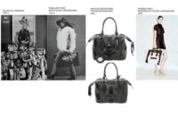
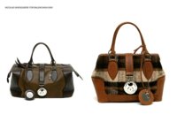
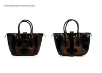
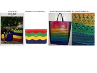
My personal introduction to the luggage was in 2005 when Balenciaga by Nicolas Ghesquiere did this bag in two tone or leather, back then i did not know more of its orgin than a vintage inspired bag.

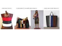
Fast forwad to 2009 when phoebe presented her Celine efforts i notice the luggage side pannel lines where kind of familiar, but paid not much attention.

I was thinking about vintage appropriation of design houses looking at vintage and sometimes when it goes to far is when you mix one code/history of a house thought to be dead only for it to become totaly alive 4 years later.

This shows also the corporate hunger for the new, for designers teams to produce the new best sellers items in these case bags in order to make the next big money generator for these houses that are now brands that sell to millions hungry luxury shoppers world wide.

Its also a classic testament that the right design at the right time can become a classic or best seller.

Round 2005 Balenciaga made some versions of this Celine luggage inpsired bag, back then Celine was not at the forefront of fashion nor was it wide spread knowledge that this luggage vintage bag in Penelopee Tree picture was a vintage Celine.

Screen shot 2014-04-20 at 9.44.48 PM.jpg

Screen shot 2014-04-20 at 9.45.09 PM.jpg

Screen shot 2014-04-20 at 9.45.23 PM.jpg
 
Last edited:
^^ Interesting that she didn't include this reference in the season's notes! I love it and how she retained the original print and size of it. Genius.

PS: shared this on Instagram. Too good to pass up.
 
oPrv4ci.jpg


XbQNveN.jpg


l6sDz5I.jpg


X85J3Y1.jpg


Nht6i3m.jpg


Vintage Luggage from the 1970s. Available on eBay​
 
#WordWeek: Five Favourite Fashion Logos

14mq9nm.jpg


1. Céline by Peter Miles (2008)
“I just thought I’d clean it up, make it strong and powerful – a kind of contemporary minimalism.” said Phoebe Philo when she joined the French design house in 2008. The same approach was applied to the logo. The capital letter logo was already in existence but was refined under Philo's direction. “I don’t think I’ve ever worked with anyone so precise and detailed as Phoebe,” said Peter Miles, the New York-based art director designer who developed the new brand identity. “She sees things microscopically. ‘Can you just make the logo two millimeters shorter?’ ‘Can you move it down there by three millimeters?’ I had to change things by the smallest margins... but always for good reason.”
The house of Céline was originally founded in 1945 by husband and wife Richard and Céline Vipiana, which was originally a made-to-measure children's shoe business. The house's first logo was a red elephant created by Raymont Peynet. In 1967, the company opened its first store on the St.-Germain des Prés and the first collection of elegant sportswear for women was launched, as well as the equine Sulky logo, based on an American 19th-century engraving found by Richard Vipiana in the Handbook of Early Advertising Art: Mainly from American Sources. A number of other house's have also featured horses in versions of their logos including Hermès, Coach and Longchamp. In 1973, the ‘Blazon Chaine’ logo debuted, consisting of two skinny Cs seperated by an intricate design in the middle. Vipiana was inspired her inspiration in the lowly chains which encircle the Arc de Triomphe. It usilises the same back-to-back Cs approach as the Chanel logo.

2wojcy9.jpg


Vintage Céline advertising campaign

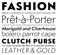
In 2005, typographic designer Hannes Famira was commissioned by art director Peter Miles to create a custom typeface for the corporate design of Céline. It is based on a typeface called Semplicità (1931), created for the Fonderia Nebiolo by Italian type designer Alessandro Butti, the head of the foundry’s Studio Artistico. "Following an initial conversation, Peter sent me a number of scans of the original metal type specimens pages", explains Famira. "While the resolution was great for the entire specimens page, when zoomed in to the individual character it turned out to be quite course for the intended purpose. I quickly realised how fortunate I was that there were no higher resolution scans available as this provided me with some considerable room for interpretation. After all, the translation from the original to the revival is where the fun lies. The weights of the styles of Semplicità went from quite light to very heavy causing thick-thin contrast issues for the interpolated instances. So I decided to make visual corrections in the Semibold style and re-insert it as an in-between master. The third leg delivered an interpolation with the desired, subtle transitions of weight and contrast between Light and Bold."
In 2009, Peter Miles continued work on the logo under the direction of Phllo. "So far so simple, but then come the details", reported The New York Times in a profile on Miles. "Céline appears in what Mr Miles calls “a left in the sun black” on creamy white with splashes of dark red detailing. Rather than emboss the logo onto the packaging as other brands tend to, he has debossed – or carved – it into the surface, to create subtle shadows."

A T-shirt featuring a handdrawn version of the "CÉLINE PARIS" logo featured in Philo's Resort collection and was later worn by Rihanna. Countless counterfeght versions are now widely available.

ir6rtk.jpg

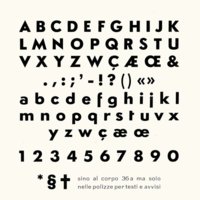
The original type specimen page 36pt Semplicità used for the Céline logo

2enp91g.jpg

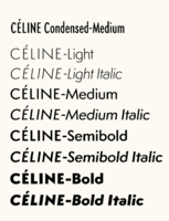
Styles of the Céline font by Famira Hannes, 2008

zn4eo4.jpg

Céline carrier bag designed by Peter Miles

Laura Bradley is the Editor of anothermag.com. She is a writer specialising in fashion, fragrance, arts and culture and contributes to NOWNESS, Dazed & Confused and The Gourmand.
- AnOthermag.com
 
www.famira.com

Since graduating from the Royal Academy in The Hague in 1996, Hannes Famira worked on Marc Jacobs corporate typeface • Custom typeface for the National Dutch lottery tickets• Studio Dumbar corporate design on the Dutch Euro coins • Studio Peter Miles - custom typefaces •


Céline

→ In 2005 I was commissioned by the Studio Peter Miles to create a custom typeface for the corporate design of the French fashion label Céline. It is based on a typeface called Semplicità (1931), created for the Fonderia Nebiolo by Italian type designer Alessandro Butti, the head of the foundry’s Studio Artistico.

The original type specimen page 36pt Semplicità
celine_simplicita-all.jpg

All styles of the new corporate font
celine_styles.png


Following an initial conversation Peter sent me a number of scans of the original metal type specimens pages. While the resolution was great for the entire specimens page, when zoomed in to the individual character it turned out to be quite course for the intended purpose. But after some initial bellyaching I quickly realized how fortunate I was that there were no higher resolution scans available as this provided me with some considerable room for interpretation. After all, the translation from the original to the revival is where the fun lies.

Semplicità was the most popular sans serif in Italy during the Fascist era, but it is little known outside of the country. The interwar sans serifs all have geometry at their core but they range from Euclidean severity to Art Deco frivolity. Semplicità is closer to the first pole but not as much so as Futura.”
— Paul Shaw in Overlooked Typefaces at Imprint, February 10, 2011


Metal type detail
This scan of the 36pt Semplicità specimens page shows the original resolution
celine_simplicita-a.jpg


Hinting
Manually hinted web fonts for a seamless integration of screen based media
celine_simplicita-hinting.jpg

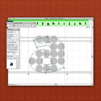
The digital font was to serve in print as well as on screen in all sizes, ranging form the small print to store signs. The originals however were cut for 36pt. letterpress and contained visual corrections that tailored the letterforms specifically to this one particular text size, anticipating ink spread. Many proved too extreme for larger sizes and I had to tune them back considerably.

The weights of the styles of Semplicità went from quite light to very heavy causing thick-thin contrast issues for the interpolated instances. So I decided to make visual corrections in the Semibold style and re-insert it as an in-between master. The third leg delivered an interpolation with the desired, subtle transitions of weight and contrast between Light and Bold.
Screen Shot 2014-07-30 at 21.46.39.png
 
www.nytimes.com

DESIGN
Peter Miles Applies His Quirky, Simple Style to a Range of Platforms


By ALICE RAWSTHORN
Published: December 20, 2009
NEW YORK — One letter complained about the shoddy state of a road. Another about a stagnant pond. A third accused a detective from Police Station Precinct 17 of stealing a ball. A fourth demanded that a neighbor’s radio be confiscated.


Céline
Peter Miles has designed the new packaging for Céline.
The potholed street, stinky pond, missing ball and blaring radio were the subjects of letters written by disgruntled New Yorkers to the city’s mayor between 1751 and 1969. The American artist, Matthew Bakkom, chose 132 of the thousands of letters in the municipal archive and worked with the graphic designer, Peter Miles, to turn them into a book, “New York City: Museum of Complaint.” Mr. Miles has designed lots of books before, but he also commissioned and edited this one, which is the first to be published by Steidl-Miles, the new imprint he has established with Steidl, the German art book publishers.

“I don’t think it gets better for a graphic designer than books — they’re just the best things to put together,” he said. “There are none of the constraints with Steidl that you have with other publishers. You can do pretty much whatever you want. We’re still figuring out Steidl-Miles as we go along but, for me it’s about not just working as a designer, but to be reading and interpreting work beyond how it is on the page.”

The first book in the series has all of the hallmarks of Mr. Miles’s designs. It sports a plain white cover enlivened only by a photograph of a shabby 1918 postcard addressed to “The mayor, City Hall. n.y.” on the front, and the title spelled out on the back in the spindly black lettering with seemingly awkward gaps between the words. “Peter’s work is very assured, and distinguished by its quirks: the odd use of type, the strange spacing and sizing,” observed a fellow graphic designer, Paul Neale of Graphic Thought Facility. “He always pitches it perfectly, never taking things too far.”

You can spot the same mix of simplicity and idiosyncrasy in the other projects produced by Mr. Miles, a 43-year-old Briton, in his studio on New York’s Lower East Side. Most of his work is for people with whom he has collaborated for years, including books for Steidl and the photographer Juergen Teller; film graphics for the director Sofia Coppola; and advertising campaigns for the fashion designer Marc Jacobs. Working together for so long has enabled them to define a visual language, and refine it.

“Peter has an editor’s sensibility, he pares things down and cleans them up,” said the design historian, Emily King. “The Marc Jacobs ads appear like neatly shaped instalments in a long-running, almost Dickensian tale. The presentation and framing are all about restraint, but the overall project is about anything but.”

If Mr. Miles had his way, his designs would be even cleaner. “I want to be less and less visible in my work,” he said. “My feeling is that graphic design should be reduced right down. I don’t want to be aware of it in any circumstances. I’m working on Sofia’s new film, ‘Somewhere,’ now, and the graphics are stripped right back, which is how I like it. I saw Michael Haneke’s film ‘The White Ribbon’ recently, and the titles look as though they were done in the crappiest Times Roman typeface on a PC. They look perfect.”

He wasn’t always quite so restrained. After leaving the Royal College of Art in 1991, he founded the design group Fuel in London with two college friends, Damon Murray and Stephen Sorrell. Fired by what he describes as “a healthy hatred for what we were doing,” Fuel championed an aggressively purist graphic style in a backlash against the theatricality of the 1980s. “The three of them worked together all day every day, all alone, no assistants, no secretary from the same room in Fournier Street,” recalled Ms. King, who likened Mr. Miles’s sudden departure for New York in 2004 to “a divorce.”

Mr. Murray and Mr. Sorrell stayed in Fournier Street, and have thrived. “What they do is great,” said Mr. Miles. “They’re still the most interesting designers out there. But I wanted another challenge, and to see if I could do it without the safety net of two partners. I thought I should give it some distance, so I moved to New York.”

Five years later, his English accent is unscathed, as is his devotion to the Arsenal soccer club. He arrived planning to work on Marc Jacobs’s campaigns and occasional projects for Steidl, Mr. Teller and Ms. Coppola. A few months later, he started a three-year assignment for the auction house, Phillips de Pury, and has since taken on The Journal, an indie art magazine based in Brooklyn.

Much of the last year has been devoted to designing a new identity for Céline, the French fashion label now being reinvented by a new creative director, Phoebe Philo. Mr. Miles has worked with Mr. Teller on the ad campaigns, and designed dozens of boxes, bags and other stuff needed by Céline and its 300 stores. The logo itself consists of the name in a digital font, inspired by a mid-20th-century Italian one found in an old type specimen book.

So far so simple, but then come the details. Céline appears in what Mr. Miles calls “a left in the sun black” on creamy white with splashes of dark red detailing. Rather than emboss the logo onto the packaging as other brands tend to, he has debossed — or carved — it into the surface, to create subtle shadows. Designing a font was new to him, as was working on such a big scale and navigating the corporate politics of Céline’s owner, the luxury giant, LVMH.

“The logistics take away from what you can do,” he said. “But I still feel I’ve managed to get something into it. It’s the sense I always try to find of making something that looks as though it should be right, but it isn’t, and you don’t know why.”