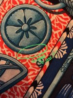
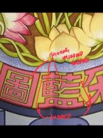
Scarves need help from orange Turandot scarf owners

Hi, Ladies, thank you for your contribution to this post:heart::heart:, I take it as my learning opportunity

some updates: I began the returning process, ebay told me that as the scarf is a cross-border purchase, they don't want me to return it to France at this moment for blablabla reasons, so they found me an authentication service (photo authenticated), and go from there. I am still waiting for this second opinion.

I will update my post later:biggrin::biggrin:

Please do post the names of the scarf authentication services and your experiences - perhaps the eBay seller thread would be a good place for future reference
I am always asked for outside paid services since I know a freebie authentication here carries no weight at eBay
 
I am fortunate to have had four different cws of this design - two from the original issue, two from the Opera Carolina issue. All of them have the variation in border thickness/shading, and it is more evident in some colorways than others.

Even now there is variation in appearance based on colorway. For example, in the Samourais CSGM, the artist’s signature is nearly impossible to see in the black cw 05:

IMG_2497.jpg

But is clearly visible in the gray cw06:

IMG_2498.jpg

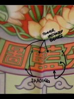
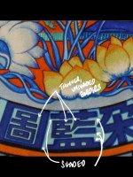
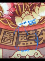
So, here are my photos of various cws of Turandot where I have pointed out the variations in shading. HTH!!!

IMG_2493.jpg

IMG_2494.jpg

IMG_2495.jpg

IMG_2496.jpg
 
An interestingg paradigm - from the realm of quality control and quality engineering
We commonly accept that certain scarves had obvious macroscopic printing errors - garbled titles, Lack of accents - that has been obvious and well documented for decades - it is widely accepted that macroscopic errors were made- those are undeniable
But microscopic printing nuances - A whole other ballgame. Hermes has preached the doctrine of quality for so many years that we Believe them hook line and sinker - they don’t make errors. Yet, if they can make big errors - cf Supra - why is it difficult to accept that they could make tiny errors?
It is only recently that hi res photos are available to show the tiny stuff - they were not avail previously in 2002 and 2007 at the time of the Turandot issues - we might have noticed a missing accent in 2002-2007 but not tiny printing nuances
 
I am fortunate to have had four different cws of this design - two from the original issue, two from the Opera Carolina issue. All of them have the variation in border thickness/shading, and it is more evident in some colorways than others.

Even now there is variation in appearance based on colorway. For example, in the Samourais CSGM, the artist’s signature is nearly impossible to see in the black cw 05:

View attachment 4110013

But is clearly visible in the gray cw06:

View attachment 4110014

So, here are my photos of various cws of Turandot where I have pointed out the variations in shading. HTH!!!

View attachment 4110017

View attachment 4110018

View attachment 4110019

View attachment 4110020
I will hasard a technical opinion - the width of the borders has to do with
1. The color and width chosen for the finesse screen, if used, it can hide more of less of the phenomenon below
2. The exact colors adjacent to each other - which depends on cw. For ex, adjacent lime an purple may react chemically/spread more/less will Red & Blue, if adjacent, are chemically inactive and the junction will of course be purple
There are lots of possibilities given such vast palette, Hermes probably tests them all (yes! it is like 65,000 possibilities) and tells the colorists avoid putting REd next to blue or whatever
Every cw can be different
And if your mind is not boggled enough ...
It also depends on how the screens age with use. We know the 2007 Special Issue was printed later than any of the 2002 cws, so the 2007 issues may have used new screens or the old abraded 2002 screens.
In neither case, one might expect micro-differences between the 2002 & 2007 issues due to wear and tear on the screens - they are not immortal
 
Last edited:
I am fortunate to have had four different cws of this design - two from the original issue, two from the Opera Carolina issue. All of them have the variation in border thickness/shading, and it is more evident in some colorways than others.

Even now there is variation in appearance based on colorway. For example, in the Samourais CSGM, the artist’s signature is nearly impossible to see in the black cw 05:

View attachment 4110013

But is clearly visible in the gray cw06:

View attachment 4110014

So, here are my photos of various cws of Turandot where I have pointed out the variations in shading. HTH!!!

View attachment 4110017

View attachment 4110018

View attachment 4110019

View attachment 4110020
Hi, BBC, thank you for sharing your turandots and samourais. yes, I mean those borders you pointed out. Some have thinner frames and some have thicker frames and shaded. As I know several far eastern languages, they catch my eyes easily. That's why I am a little bit stubborn on it :angel::angel::P:P
 
  • Like
Reactions: BBC
Hi, Ladies, finally I got the result from the second authentication service, they said it is authentic, I will forward the information to eBay once I get the CoA.
This is like a baseball game ... gotta have a score card ...
1. Paid authentication service 1 said it is fake
2 Paid authentication service 2 - suggested by Ebay - said it is authentic
So, difference of opinion, fair enough, good to know,
 
  • Like
Reactions: BBC
This is like a baseball game ... gotta have a score card ...
1. Paid authentication service 1 said it is fake
2 Paid authentication service 2 - suggested by Ebay - said it is authentic
So, difference of opinion, fair enough, good to know,
paid authentication service 1 is a4u: their opinion is "the (c) hermes print font is off; The print of the artists name is unclear, tag is incorrect".
paid authentication service 2 is a1st. I am still waiting for the CoA,

The seller is from France, has been on ebay for years.She said she's a collector and seller, she happened to be consulted privately, and her name is mentioned on the book "Carré d'Art III" because she gave them some pictures of rarities.
To me, the difference of paid authentication opinion is important for this grail - that speaks volumes
And thank you for not mentioning the name of the seller , in the case of a difference of opinion, that is good , very politic
I hope you get peace about this scarf
 
An interestingg paradigm - from the realm of quality control and quality engineering
We commonly accept that certain scarves had obvious macroscopic printing errors - garbled titles, Lack of accents - that has been obvious and well documented for decades - it is widely accepted that macroscopic errors were made- those are undeniable
But microscopic printing nuances - A whole other ballgame. Hermes has preached the doctrine of quality for so many years that we Believe them hook line and sinker - they don’t make errors. Yet, if they can make big errors - cf Supra - why is it difficult to accept that they could make tiny errors?
It is only recently that hi res photos are available to show the tiny stuff - they were not avail previously in 2002 and 2007 at the time of the Turandot issues - we might have noticed a missing accent in 2002-2007 but not tiny printing nuances

Hi marietouchet, is there a thread about the obvious errors? I've heard of reprint changes for copyright issues (faces on Maharajas, name of the Venice Carnival) but not of garbled titles, etc. This sounds like fun!
 
Hi marietouchet, is there a thread about the obvious errors? I've heard of reprint changes for copyright issues (faces on Maharajas, name of the Venice Carnival) but not of garbled titles, etc. This sounds like fun!
Sorry no thread exists
By garbled titles, I meant a myriad of stuff - a catch all term - all sorts of accent errors - mais oui, titles which were mysteriously lengthened/shortened at some time of other, corrected titles, typos, and surely there must have been at least one (?, if memory serves) where the tittle did not print well / at all in at least one cw the subject is com0icated by cw - some stuff is obscured in some cws
These scarves with title issues are generally held to be authentic scarves, but is there proof of this ?
 
Last edited: